As an inbound marketer, optimizing websites, landing pages, content, opt-in forms, etc. is your top priority. And this is what your clients expect from you.
Improving conversions and generating sales is every business’s dream. This is the reason why 56% of marketers test their landing pages (especially the opt-in forms) to improve conversions.
Conversion rate optimization takes the guesswork out and you’re left with pure actionable data.
The important question is how to get started with conversion rate optimization? What it is, why it is important, what’s its process, best practices, tips and tricks, and more?
Well, this is what exactly you’ll find in this detailed guide.
What is conversion rate optimization?
Conversion rate optimization (CRO) is a systematic approach to increasing the percentage of website visitors who take a desired action such as filling a form, creating an account, buying a product, etc.
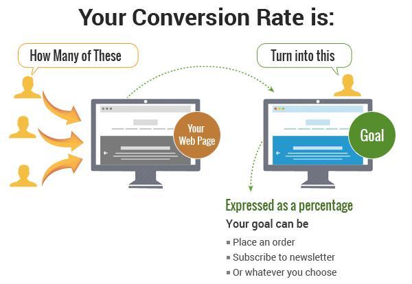
Let’s assume, your landing page gets 500 visitors and 12 of them download the lead magnet, your conversion rate will be:
12/500 = 0.024 x 100% = 2.4%
The conversion rate is expressed in percentage. This means your landing page converts at 2.4%. This means for every 100 visitors, you’ll (on average) get 2.4% subscribers.
In order to increase the conversion rate, you’ll use some techniques, tools, or approaches. For instance, you might end up changing the headline on the landing page. This process refers to conversion rate optimization.
Whenever a marketer tries to increase the conversion rate of a website or a landing page, he is technically involved in CRO.
Let’s take a real-life example.
Highrise Marketing tweaked their website’s design to improve conversion rate. Switching from long-form design to a personal short design increased conversion rate by a whopping 102.5%.
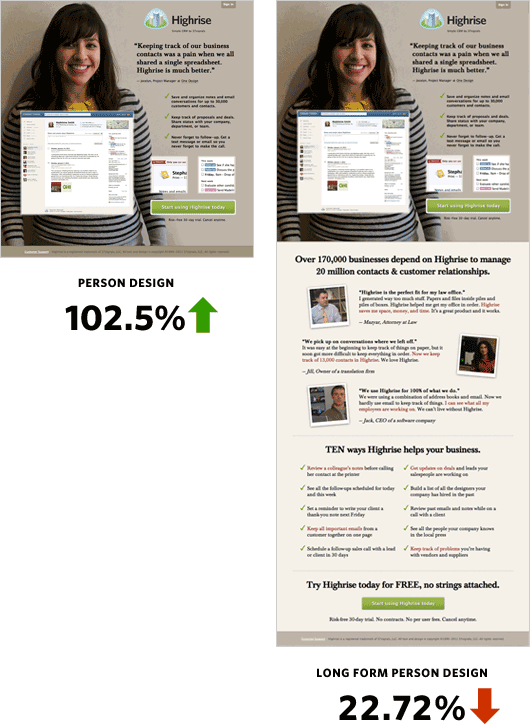
Changing the image had a huge impact on conversion rate.
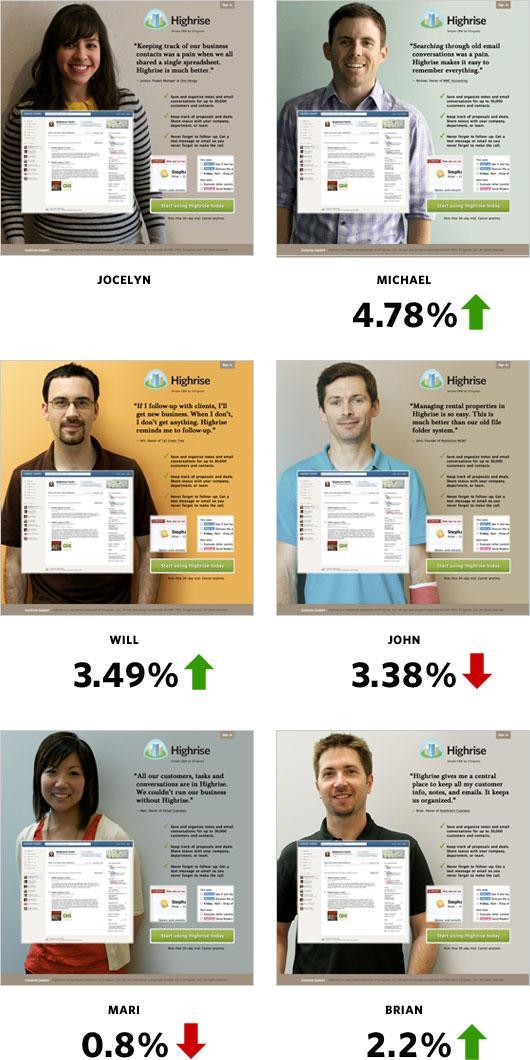
This is what we call CRO.
CRO is directly related to leads and sales. This is what makes it a top priority for every business and this is why inbound marketers should know the ins and outs of CRO.
Conversion rate optimization process
So how you can do CRO for your clients? How to improve conversion rate?
Here is how it works.
CRO process has three stages:
- Analysis and planning
- Testing
- Review
What exactly you have to do in each of these stages will be discussed in the following sections.
Stage 1: Planning and analysis
The first stage is all about data collection and it is the most crucial stage. Everything rests on the data you collect for testing.
This is why it is the most time-consuming stage in the entire CRO process because you don’t want to end up collecting irrelevant or useless data that will lead to nothing at the end of the day.
So what type of data you have to collect?
You have to collect all sorts of data from all possible sources. This includes technical analysis, analytics, user testing, surveys, mouse tracking, and more.
1. Web analytics
Google Analytics should be your starting point. It provides with a wealth of knowledge. You have tons of data available there, and practically, you cannot (and shouldn’t) analyze all of it for CRO. Here is the most crucial analytics that you should analyze:
- How much traffic does the website get from each source?
- What are the demographics of the visitors?
- Identify pages with highest and lowest bounce rates.
- Average exit rate and bounce rate analysis.
- Average page views and time on site analysis.
- Device and geographic analysis.
This data will help you identify leading traffic sources, demographics, bounce rate and page views, and how visitors and customers are actually interacting with the website.
2. Technical analysis
Is your website performing equally well across all the devices and browsers?
The data from the previous step will help you better understand if the website has any technical issues. For instance, if conversions from tablets are fairly low as compared to conversions from other devices, this surely is a red flag.
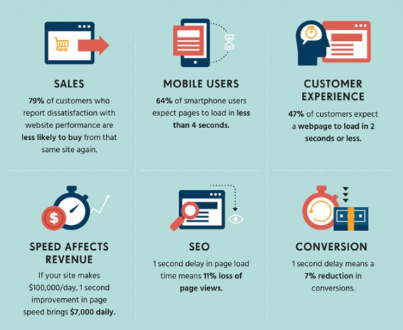
Similarly, a speed test via PageSpeed Insights will help with determining the load time which is a critical variable that is correlated with conversion rate.
3. Heat maps
Click maps or heat maps are your best friend since they show you where exactly visitors click on any given web page. This makes your life, as a CRO expert, a lot easier.
For instance, if a lot of visitors click text CTA while only a few click CTA button, this clearly means CTA button isn’t doing well.
Tools like Crazy Egg and Hotjar will help you see complete mouse movement on the entire website.
4. Surveys
Conduct surveys, focus groups, and interviews so as to understand website issues from your customer’s point of view. The purpose of every survey and interview should be to get the answer to one core question:
What’s the biggest hurdle that stops visitors from converting?
You can conduct surveys on your website via popups by using tools like Qualaroo. Better yet, use an exit intent popup that asks the visitors what makes them leave the website.
Even if you get responses from a hundred visitors, you’ll know what’s bothering them.
Also Read: How to Use Big Data in Content Marketing for Improved Results
5. User testing
This is an interesting phase. You have to analyze visitors in real-time. You have to identify several test users and assign them different tasks such as downloading a lead magnet, ordering a product, filling a form, etc.
This will help you see how they move from one step to the next and what grabs their attention.
What to test
After you have gathered all the data, you have to decide what you’ll test.
The analysis will reveal several weak areas and powerful areas. Identify what will be tested, where it will be tested, and who it will be tested for.
- What you’ll test such as headlines, CTA, button color, form size, etc.
- Who you’ll test for such as which type of traffic, visitors, or customers.
- Where you’ll test such as on which pages on the website.
This means you have to identify pages for tests, elements to be tested on these pages, and will you test for social traffic.
By the end of this stage, you’ll have several hypotheses ready for testing.
Let’s take an example.
The data analysis revealed that visitors prefer a list type headline on the landing page. You can create a hypothesis that converting headline to a list will increase conversion rate on this specific landing page for all types of traffic sources.
Similarly, you have to create several hypotheses that should be derived from the data.
Get A Powerful Landing Page For Maximum Conversions
Stage 2: Testing
You’re done with the hardest part, this is relatively an easy stage.
It is all about outlining and implementing your tests.
But before you do, you have to consider all of the following:
Does making changes need any technical expertise?
Are changes consistent with brand’s strategy and marketing?
Are changes relevant to objectives?
If all looks good, you can proceed with the implementation.
You have to create A/B tests. You have to use one of the following tools to create A/B tests and implement your tests:
- Optimizely
- VWO
Make sure everything is set properly and the variations are live and complete.
Also Read: How to do A/B Testing like an Expert – A Beginner’s Guide to Improve Website Conversion
Stage 3: Review
The final stage is all about reviewing your tests. Did they work and how significantly they performed.
Check the results of the A/B test. One of the two things will happen:
- The conversion rate will increase.
- The conversion rate will decrease or stay the same.
When conversion rate increases, you have to check the significance as well. A testing tool will tell you if the results are significant. If conversions increase and the results are significant, you can start sending all the traffic to the winning variation.
When conversion rate decreases or stays the same, that’s where you’ll have to conduct a new test with a different variation. A decrease in conversion rate doesn’t mean the test was unsuccessful, it means that the element you tested doesn’t impact conversion rate.
In either case, it is a win-win.
The whole point of CRO process is to continuously and regularly test and implement several small changes throughout the website.
You just cannot stop once conversions increase. You can create another version of the same element with an intention to further increase conversion rate.
For instance, if the list headline started converted better, you now have a winning headline that converts better than the old one. You can now test another list type headline to see how it works. You can test an even and an odd list.
Inspect what happens when you increase or decrease the list number.
Same goes true for all the other variations.
It is a never-ending process.
CRO principles
There are certain principles without which spending resources on conversion rate optimization will be nothing but waste. The following CRO principles will make your life a lot easier. You can certainly go without these principles but it will take time and your process will be flawed.
You cannot do it well with a flawed process, right?
So let’s stick to these principles.
1. One offer per page
When it comes to CRO, less is more.
Every page should have one offer and a single CTA. You could have multiple CTAs but all of them should promote the exact same offer.
The page should have fewer options and distractions so that visitors know what this page is all about.
Whirlpool increased its CTR by replacing four CTAs with one focused CTA. Click through rate increased by 42% with a single CTA.
Conversionxl compared two different landing pages for CTAs and offers.
Intuit’s TurboTax has over 15 different CTAs including buttons and text on their landing page.
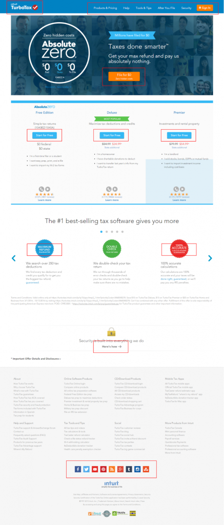
On the other hand, E-file promotes a single offer on their landing page with a couple powerful CTAs. The purpose of the entire page is to Create an Account.

If you have multiple offers to promote, use different landing pages. Refrain from putting all the offers on a single landing page hoping that one of them will sell. You can never sell anything on this type of landing page that offers too much.
Visitors lose attention and they get confused.
You can, though, use multiple CTAs but they should lead to a single offer. This will help you keep the message on the page consistent.
2. Be simple
Keep pages simple, clutter-free, and ensure that there is plenty white space.
If the purpose of a page is to get visitors to download your free guide by entering their email address, that’s what the page should be all about.
Get rid of everything else from the page. No distractions.
One rule of keeping pages simple is to remove all the distractions. When the page is complicated, you start losing visitors.
That’s what happened with Sticker Mule. This is their original landing page that offers their top products above the fold.
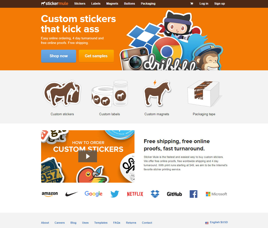
In order to increase conversion rate, they moved all their products on the home page.
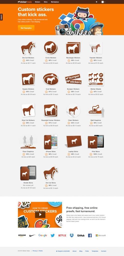
The variation resulted in a 48% drop in revenue. Why?
Because they made it complicated for the visitors to make a choice.
Don’t do it.
3. Test one element at a time
A single A/B test should measure one and only one element. If it is measuring 2 or more elements, you won’t know which element affected the conversion rate.
For instance, testing headline and CTA button size in a single test won’t tell you whether increase/decrease in conversion rate was due to the headline or button size.
Of course, you’ll have to repeat the test individually to figure out what impacted the conversion rate.
In reality, testing multiple elements in a single test increases your work instead of reducing it.
Also Read: Colors & Conversions of a Website have a Deep Connection
Best CRO strategies and tactics
Most often, inbound marketers don’t know what they’re supposed to test that will have a significant impact on conversion rate.
If you’re new to CRO and have no clue where you should begin, following proven CRO strategies and tactics will help you get started by testing what really works.
1. Benefit-driven CTA
Call to action shouldn’t be boring. People are sick of seeing traditional CTAs like click here, sign up for a free trial, get instant access, etc.
These don’t work.
Benefit-driven CTAs that tell people what they will get work far better than any other types of CTAs.
Kaya Skin Clinic replaced their CTA to benefit driven by changing it from:
For Skin Consultation, Register Here:

…to I want an expert opinion, sign me up. And it worked.

Conversion rate increased by a whopping 137.5% with a 22% increase in sales.
Instead of telling visitors to click here, you need to provide them a strong reason as to why they should click and what benefit they will get once they will click on the button or link.
This works.
2. Best place for CTA
This is one thing that you should definitely check. There are three places on any landing page where you can put a CTA, these include:
- Above the fold
- Bottom of the page
- Below the fold
There is no good or bad place for a CTA, you have to test what works for your website. This is one strategy that will definitely help you improve conversion rate by finding the best place for CTA.
3. Use contrasting colors
Contrasting CTA button color improves conversion rate. In one A/B test for Performable website, changing the button color from green to red increased conversion rate by 21%.

This doesn’t mean that red CTA button will always outperform green CTA button on all the website. No.
It means that using contrasting colors and a button color that is prominent increases conversion rate. This is another area that you should always test when dealing with CRO.
4. Get more landing pages
As discussed above, one landing page should have one offer. This means you’ll have multiple landing pages. But CRO requires you to create several landing pages for a single offer.
According to a HubSpot report, companies that use 40 or more landing pages generate maximum leads.
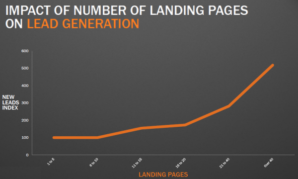
Creating a lot of landing pages definitely means a lot of work on your part but it pays off. It lets you check every aspect and every element. There are several benefits associated with an increase in the number of landing pages:
- More variety
- Conversion opportunities for visitors
- Multiple targeting opportunities
The best approach is to have 5 to 10 landing pages for a single offer. Test them simultaneously and run A/B tests on all of them to find a winning page – and then create its variations and move on.
5. Test videos
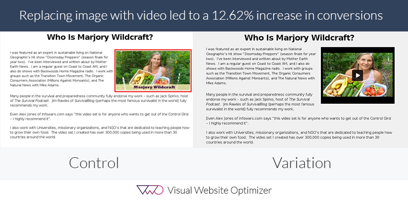
Videos are known to increase your landing page conversion rate significantly. There are several case studies like this and this that show that using a video in a landing page increases conversion rate.
In one test, replacing the image with video on the landing page increased conversion rate by 12.62%.
When you have multiple landing pages, you have a lot of room to test videos and images.
CRO checklist
If you just started out with conversion rate optimization, the checklist below will help you keep track of where you should begin and what to test.
Landing page
The landing page is the first thing that you should test. There are several elements on a landing page that you need to test. Some of the major ones include:
- Color scheme
- Clarity with white space
- Remove unnecessary links
- Benefit-driven headline
- Contrasting CTA button
- Includes testimonials and social proof
- Form has only necessary fields
Copy
The landing page is related to visuals while the copy is what helps with conversion. The color scheme, CTA button, or the form won’t help with conversions alone.
A visitor will read the text and will make a decision on the basis of the text whether he should proceed or exit. The copy has to be impeccable.
Here are a few tips on optimizing copy for conversions.
- Copy should be relevant to the ad or search term that sent a visitor to your landing page.
- Grab attention right from the first sentence with a powerful opening.
- The copy should be benefit driven and must fulfill visitor’s need.
- Make it easy-to-read by using bullets, short paragraphs, and lots of white space.
- No use of jargons.
- No errors whatsoever.
- Test different variations of copy with formatting, font size, font family, and more.
Offer
Offer is the crux. This is what visitors will get be it a free guide, a product, or a newsletter. The offer is the reason why a person visited a landing page in the first place.
The way how you present the offer is related to conversion rate – the offer itself has nothing to do with the conversion rate.
Because visitors get to check the offer after they has converted.
For instance, once a visitor has submitted his email address for a free eBook, the conversion has taken place. It is a different story whether eBook delivers or is useful or not.
But it doesn’t mean that you should start making false claims on your landing page just to increase conversion rate. Remember, it is the beginning – not the end.
So play fair.
Here are a few tips to tweak your offer to test it.
- The offer should be relevant to copy, headline, and the ad.
- The way how you present your offer will make all the difference.
- Clearly explain your offer above the fold as to what it is all about.
Also Read: Gamify Copywriting To Detach Buyers’ Resistance And Win Sales
User experience
Often overlooked but it is one of the most crucial elements that directly impact conversion rate. A landing page that isn’t user-friendly won’t convert no matter how hard you try.
There are several elements that you should test.
- Improve page load time.
- Make sure all the landing pages are responsive and work well on all the devices.
- Landing pages should be cross-browser compatible.
- Design and layout should be tidy.
Conclusion
Conversion rate optimization isn’t a quick fix. It is not a silver bullet. It’d be best if you don’t treat it like this. It is a complete process that never ends. It is a journey towards improvement.
I hope this guide will help you get started with CRO, analysis, and improving the conversion rate of any website or web page.
Once you’ll get started, you’ll fall in love with it because it feels awesome when one of your hypothesis is accepted.
Simple Changes Can Lead To Huge Increase In Conversions



Comments (2)
 Shafi Khan
 Manish Bhalla Post author
Excellent write up Manish.
You’ve shared some awesome strategies and I’ve learned a lot from this guide.
Thanks Shafi!
Keep coming back for more posts on Conversion Rate Optimization and Online Marketing Tips.
Have a nice day!