Looking for a brick and mortar shop to add offline value to your online e-commerce shop or booth space to display your unique creations? There are online brands that help you with the task. Businesses, entrepreneurs and emerging brands use such online marketplaces to discover rental space for short period of time without the hassle of a lease. With millions of users and nearly thousands of brand associations, such sites have surely captured the niche market.
Due to the growth potential of such space listing marketplaces, FATbit analysts did a detailed analysis of their business & revenue model, website functionality, and prominent features to help aspiring entrepreneurs gain critical insights. First let’s discuss the business & revenue model in detail.
Business and Revenue Model
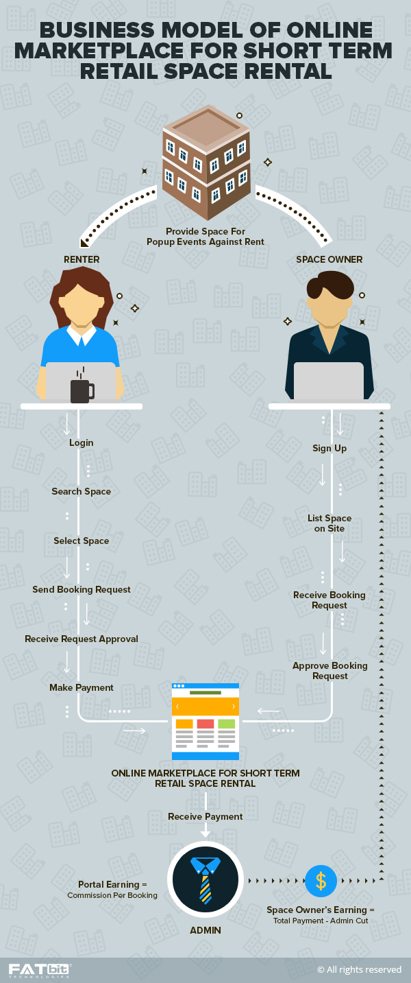
Shop owners list their standalone shops and event spaces for a short period of time. The basic business model of such online portals revolves around making it easier for merchants to find physical stores in their chosen region.

As far as the revenue stream is concerned, online space listing portals generate money from featured listings and Analytics insights. Referral income can also be earned by pitching relevant store products to merchants.
Leading industry players
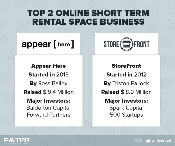
Finding rental space is a serious business, and there are many companies trying to build a brand in it. Here are the biggest players:
- Storefront
- Appear Here
- Thisopenspace
Now that we have discussed business & revenue model, let’s take a look at the website features that you need to for your space discovery and listing site.
Website Overview
To get the homepage right, focus on user experience is must. Your space search and renting marketplace should be easy to navigate and highly intuitive.The site components should be well-designed with no vagueness throughout the site. Let’s start from the start:
Homepage
As soon as the user lands on the homepage, give him a clear idea of what the website is all about with along with a search bar, and highly communicative tagline in the banner section. The top banner can house a signup/login along with Menu buttons. The images ought to be ‘real’ in nature, something visitors can connect with.
Brand Associations
Showcase prominent brands on the homepage to entice new businesses to use your short-term property search platform. This is very important to build user-trust for your portal. Obviously you will not something to flaunt in the very beginning. That’s why you need to show your media coverage initially.
Success stories
There is nothing better that a user testimonial when it comes to generating user confidence in your service. Incorporating a video from a prominent user on the homepage can be a wonderful option for the success of your online store. This also increases the eagerness of a user to know more about you. FATbit analysts also believe that a similar feature can do wonders for an event and gallery space listing clone.
How it works Section
It is important to note that each and every online portal catering to a niche market must have a “how it works” section. It not only helps users to get an overview of the platform, but also creates user engagement. This section should be beautifully designed with separate tabs for finding and listing space. This makes it easy for the user to differentiate between both the processes.
Signup/Login
The login form can be embedded into the website as a popup. This is not only preferred by most these days, but is also convenient for end users. Visitors can also be allowed to login through social media accounts.The signup process should be simple, fast and effective. Users should be able to register through email or social media profiles. AppearHere doesn’t have social login functionality but has planned an impressive signup form.
Search
Search is one of the most important attributes of any online store. It allows users to search for rental spaces in their chosen region. Search functionality of your online store should be perfectly designed. The auto-complete feature can simplify the search process further. If building your space listing portal on a script, make sure it brings powerful search functionality.
Search listing
The search results page must be highly intuitive. Divide it into different sections and include features like:
- Detailed map along with pins.
- Filters and listing.
- Filters like location, space types, daily price, and size to streamline the search process.
- The space listing.
- Each listing depicting sample image, daily price, size, and location.
- An option to add listing to favorites.
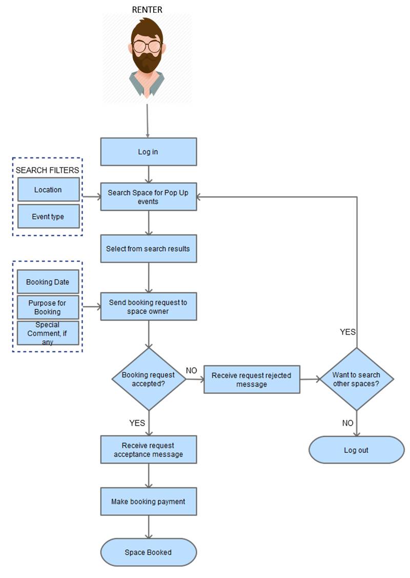
Flow process diagram for renting a space
Listing Page
Each and every listing must have an out-and-out page displaying all the important information. It should include:
- Banner images
- Title of the listing
- Estimated daily price
- Size, location and type of space.
- Send inquiry button
- Last activity of the owner
- Description
- Map showing location
Send Inquiry
In order to book space on rent, users must send an inquiry to the space owners. Users should add some information about themselves and how they intend to use space so that the users are able to take an informed decision. This is a useful strategy which works on bridging the gap between the user and the owner.
The inquiry form should be planned with much thought so that space seekers don’t find it an exhausting task.
Create Listing
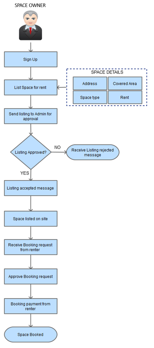
Create Listing form must be simple and should allow users to find and list spaces easily. The information must include:
- Banner pictures
- Title of the listing
- Address
- Type of space
- Features available
- Rentable space size
- Minimum day of lease
- Starting daily price
- Make the listing public or private
Lengthy and confusing form often spoils the conversion game for websites. So walk a fine line between descriptive and minimal form. Incorporate a similar form while creating a rental store clone website.

Listing review
In order to diminish spam or irrelevant listings, incorporate a review process that checks each and every listing. The review process may require dedicated team but it will play a crucial role in maintaining the authority of your space listing portal.
Inbox
Every peer to peer marketplace needs a communication channel where users can interact with each other. Inbox must give all information to the user pertaining to messages, inquiries, connections, pending offers, payments, and history. Sending an Inquiry can be a good option to start the conversation.
Favorites
This section must contain all the listings marked as favorites. The overall design of this page needs to be highly intuitive and user-friendly. Favorite feature can be complimented with property sharing functionality through social media. This will be great add-on and put you in league of AppearHere and Thisopenspace.
Feedback
Help chat has become an integral part of online portals. Novice users who might have difficulty in understanding the store functionality or come across any other query can use this feature to get expert assistance. Storefront has implemented this quite efficiently and benefits from it as well.

End note
Platforms like Storefront are based on a unique idea, and have immense growth prospect. There is a huge scope for other startups to capture market with more advanced features. Starting your space renting and listing venture for a region where established players are not active can be a smart idea too.
If you too are planning to build a similar marketplace, then, we would love to discuss your idea and add value to it with our design, development and marketing expertise. Contact us today to find out how much a rental store website will cost you.
