Material Design was announced back in 2014 Google I/O Conference, and since then Google is weaving it into its products. In 2015, design community started experimenting with it, and websites inspired from concepts of Material Design started surfacing on internet.
Website owners too got interested but as soon as they went through the Material Design literature, most were impressed less and confused more. It turned out that the vision and principles behind Google’s Material Design wasn’t cooked for masses.
FATbit’s team of designers has been working with Material Design concepts for a long time and shared its views to un-complicate its concepts. Read on and learn:
- What Material Design is all about?
- What are core features of Material Design?
- What benefits come with Material Design?
- How to balance Material Design and uniqueness?
- What are the best Material Design website samples?
Let’s start from the definition and move ahead from there.
What’s Material Design?
Let’s first sum up Google’s goal with Material Design in its own words:
“Create a visual language that synthesizes classic principles of good design with the innovation and possibility of technology and science.”

Clearly, Google wants to evolve something that can be looked up to for creating good websites and applications. From animation to style, layout, components, typography, patterns, usability, and even color palettes, Google has defined rules and pointers for everything. In short, Google has explained how good design should look and work to guarantee better user experience.
Core principles of Material Design
It is worth highlighting that Google didn’t materialize design principles and concepts from thin air. They already existed and were being used by leading designers and web design companies. With Material Design, the technology firm just put them in writing and stated the elements that form the core of its philosophy. Have a look at them!
- Tactile surface – Material Design is about adding the real world feel to regular design. Neat shadows, floating action buttons, and quantum paper are the most critical elements that add fluidity and real world element.
- Print design – There are clear guidelines how you should use colors, typography and fonts to improve UX. Bright accent colors, and accent color serve different purposes and ought to be used accordingly.
- Intelligent animations – Animations are central to Google’s Material Design vision. Authentic motion, action response, and various other concepts have influenced Google’s thoughts on meaningful animations.
- Adaptive design – It is a known fact that Google loves websites that offer enhanced experience. So, its MD philosophy also has a chapter on guidelines related to indents, whiteframes, dimensions, blocks, and toolbars.
What’s the need and benefits?
- People have to abide by rules when part of a web ecosystem (like iOS) but there is no regulation when it comes to independent sites. There are some best practices but nothing in terms of clearly defined guidelines. Google probably realized this and filled the void. Post MD, you know what will make your design tick in terms of usability and effectiveness.
- Google was never known for design. It has always been known as a technology company. But in the last 5 years, its design stance has changed and now is a critical part its vision. It has realized that its products need to score in terms of design to gain wider acceptance. Material Design can generate the same benefit for you.

- We no longer access internet only on desktops. There are tablets and smartphones as well. The experience however is different and needs to be adjusted with every device & platform. With Material Design, Google is trying to bring uniformity across devices. By integrating MD principles in your design philosophy, you can improve device experience of your website or application.
- Material Design eliminates the need to develop separate websites for desktops and smaller devices. The language delivers websites that promises optimal experience throughout platforms and devices. This can be highly beneficial for small and mid-size businesses.
- The growing listicles of Material Design samples show that website owners are welcoming Google’s design vision with open arms. Besides benefits underlined by Google, it is also getting the benefit of being new, modern, and perhaps even the future of design.
In addition to above mentioned points, Material Design has also simplified the development process further. This is also fueling its popularity.
Tips for crafting unique Material Design inspired sites
Just like Apple, Google too has its share of loyalists, and this group has taken Material Design to its heart. The result is lookalike websites that have very little to claim for uniqueness. To help you stand apart while embracing MD, we have aggregated tips from our team of designers as well as industry experts.
Read on to discover ideas for unique Material Design:
Break the color code
Material Design is hailing highly saturated color palette. We like it too but if darker shades are better suited to your brand identity, then, stick with them. Don’t hesitate to go for pastels as well.

Make a cocktail
Going full MD will make your business site look like a Google sidekick. Our recommendation is to pick what you like from Google’s guidelines, and manage the rest on your own. For instance, if you like the tactile surface ideas but have some other ideas for print design, then, go ahead with it!
Experiment with typography
Your favorite font style didn’t make it to Google’s Favorite list? There is no need to be worried. If you think that your typeface matches your design and doesn’t compromise readability, then, go for it.
Material Design is about making websites beautiful, practical, and easier to use. However, it doesn’t come with the condition of ‘my way or the highway’. Pick the ideas and concepts that fascinate you; leave the rest.
Want to look at Material Design samples before starting your website upgrade? Here they are!
Examples of Material Website Design
Thousands of websites have implemented concepts of Material Design to achieve vast range of objectives. Here are the five websites that we think got the best of MD:
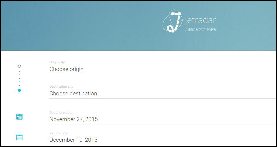
Jetradar.com

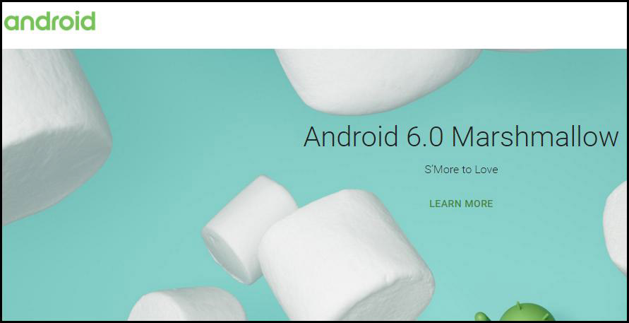
Android.com

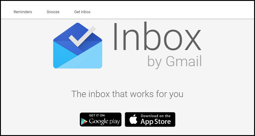
Google Inbox

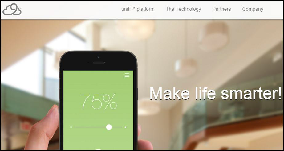
Nimbusnine.co

Lifeaweso.me

While Material Design is a surely garnering interest for Google’s efforts, different opinions exist in design community. Some state that websites inspired from MD are not unique in nature and lack creativity. We on the other hand want to know what you have to say!
What do you think about Material Design? Do you think it will be replaced by some other trend or is here to stay? Share your thoughts in the comments section and let’s have a healthy discussion.
