Entrepreneurs, freelancers, startups and small businesses are in a constant lookout for one common thing. Workspaces are one of the most important aspects for any business as well as an individual looking to enter the corporate world. As the price of workspaces is rising, finding ideal location can become a hassle. This has resulted in the rise of shared workspaces. Platforms like WeWork, GrindSpaces and Regus have already created a name for themselves in this niche market. however the need for shared workspaces is rising at a phenomenal rate, resulting in a huge void.
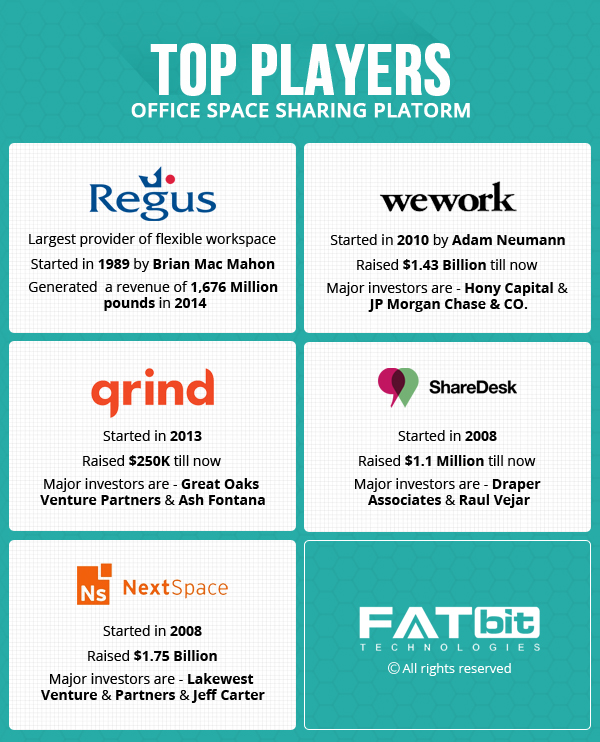
FATbit analysts did an in-depth analysis of this business model, vital website functionality, and market dynamics. Before we move ahead, let’s take a closer look at this business model to understand how it works and how platforms can make money out of it.
Business model of Workspace Sharing Website
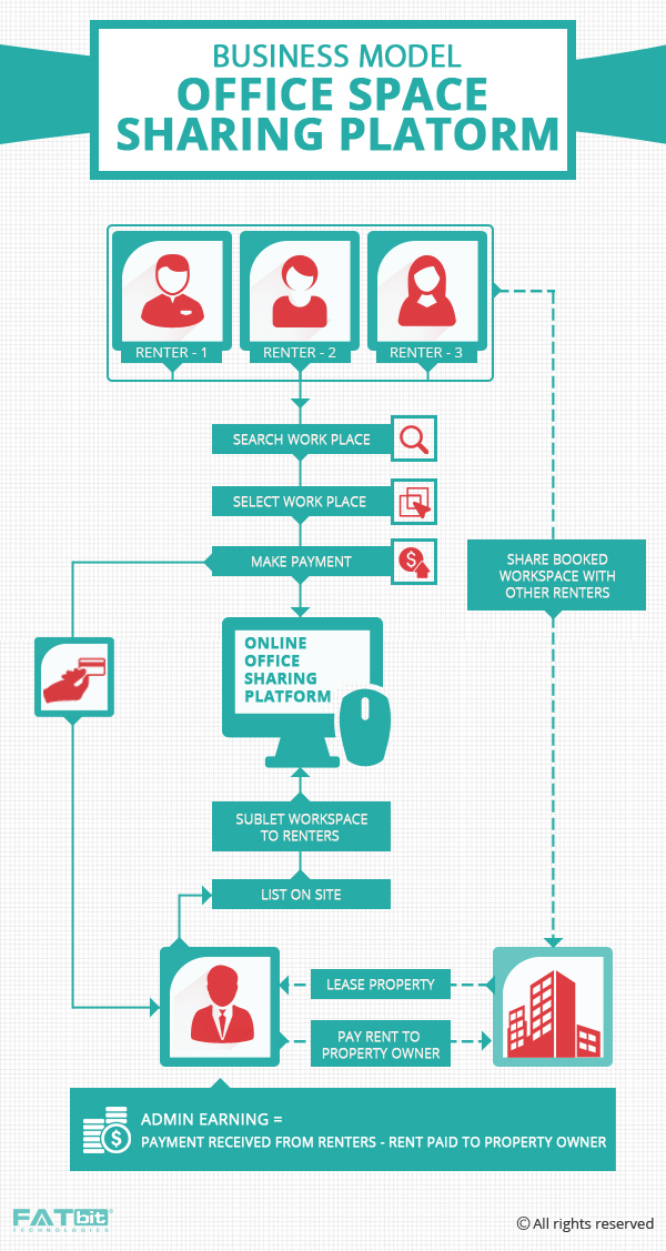
Workspace aggregators as they are commonly known design and build physical spaces that aim to bring together entrepreneurs who want to share space, office services and, potentially, ideas. Their main business is renting office space from landlords, then building it out into an incubator like space with small offices and hip common areas meant to promote interaction. It is then rented to startups and small companies on a monthly basis, and it also offers add-ons like health insurance and payment processing.
How to Make Money With Such a Platform
The platform takes out a cut-rate lease on a floor of an office building, chops it up into smaller cubicles and then charges monthly memberships to startups and small companies that want to work with each other. The platform signs long-term leases with landlords and then rents it out to its members on a monthly basis, its expenses are fixed while its revenue fluctuates with demand.
Website Overview
Websites working around such a business model essentially focuses on user-centric requirements. One of the most engaging reasons behind the popularity of such business model is that the platform has to keep user’s interest at the forefront. The same ideology has to be applied over to the design of the website. The overall website design needs to be engaging and informative. Relevant information should be made available without clutter. Let’s start with the homepage and highlight the elements that make it highly user-friendly.
Suggested Read: Strangers with Benefits: The Rise of Sharing Economy & Why Startups Are Loving It
Homepage
As soon as the user lands on the homepage, they should be greeted with a nice banner image that gives an idea what the website is all about. It is about the office and co-working spaces. Rather than going over the top with taglines and banners, you can also try to keep everything simple and subtle. The top bar can house all the vital pages like the locations, pricing and signup/login.
Memberships
As discussed earlier, most of the revenue generated on the platform is via membership plans.The same should be displayed right on the homepage giving an overview to the users for their features and pricing.
Types of users
One of the key areas where your website can stand apart from the rest is clientele segregation according to their needs. By putting a section preferably on the homepage, you make it easy for the users to find relevant spaces as per their requirement. From freelancers to startups and small businesses to large companies, you can separately list office space for everyone. FATbit analysts recommend this approach of distinguishing the clients in order to serve them better.
Also Read: Script Features Analysis to Build an Advanced Music Instrument Sharing Platform
Benefits of membership
Being a membership based platform, it is vital for you to list all the benefits in order to entice users into using your services. This is why you should have a dedicated section on the homepage which states all the benefits availed by members. This can span across various domains like:
- Workspace
- Conference rooms
- Online Members network
- Benefits and Discounts
- Weekly Events (in any)
Each and every benefit ought to be described in detail, which gives a thorough synopsis of all the features availed by the members.
Menu Bar
This section houses the important details that are required by the users. Your menu bar can include options like:
- Type of user
- Locations
- Pricing
- Signup/login
Find locations
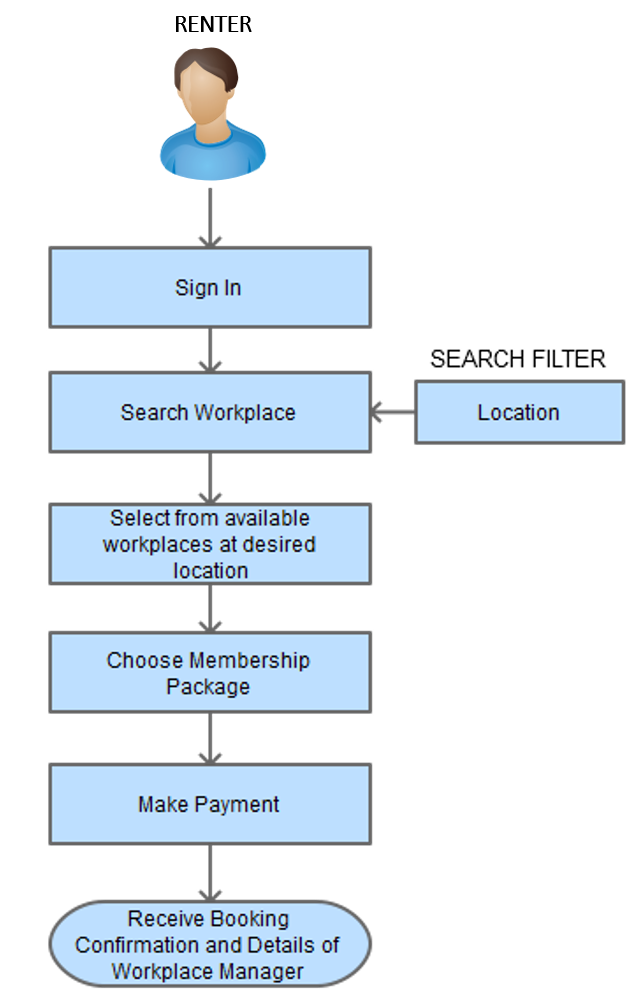
Other than the type of space, users can also find relevant spaces by browsing individual locations. FATbit analysts came up with an efficient suggestion to implement this section. The section can be divided into two panels; while the left panel displays a map view of the location with markers, the right contains lists of all co-working spaces available in that location. Users can even filter the spaces by selecting the desired amenities. Each and every co-working space ought to be nicely listed with all the essential details.
Workplace
Each and every workspace should have an intuitive webpage that showcases all the details about space. The center of attraction can bea slider banner that displays workspace images. This would provide ample idea to the user about the workspace and its amenities.
The second fold of the webpage can contain detailed information related to the workspace. This includes:
- Amenities available at the workspace
- Pricing
- Other nearby location
- What members say about
- Book a tour
Make sure you can create similar workplace pages in your Shared workspaces clone script.
Hire experienced UX designers to perfect your site design
Browse packages
Book Tour
Before signing up for a workspace, you can allow your members to book a tour of the workspace. This is a nice initiative that brings in more transparency and user engagement. The user can fill in the “Book a Tour” form present on the webpage of each workspace. They need to enter their name, email ID, preferred date and time of visit, how much space is required and optional details if any.
Pricing
As the website caters to members only, it becomes vital for you to put forth all the details about the pricing of the membership. The pricing page can feature a well-designed table layout that displays all the benefits of each membership. you can also put option on this page to directly signup for a membership.
Also Read: Takeover the Peer-to-peer Car Sharing Marketplace with These Essential Website Features
Start Membership
After selecting a particular membership users can be taken to a form which asks them to fill in their information. This form also displays aggregated order summary for better transparency. Users need to fill in their personal information like:
- Name
- Email
- Company name
- Phone number
- Password
Payment
After filling the information, users are forwarded to the payment page. Here users have to select their preferred location, making it easier for you to cater to the request. After putting in the credit card details, users can create their account and start their membership.
Help/support section
In the current age, it has become vital for a website to have a dedicated help and support section. For a novice user, getting accustomed to the website can become cumbersome. Also, there are a lot of queries in the minds of users related to renting and even website functionality. A help/ support section would take care of all such queries and increase trust level.
The future calls for more efficient ways of doing business, and co-working spaces have surely made a name for itself. There is a huge market for shared workspaces clones across the globe as the startup culture is gaining pace across developing nations as well.
By taking a good note of the script features and improvements discussed above, you can come up with an advanced website that will score high in user experience, user interface, and visual design.

For any additional feature and cost related inputs, contact our team of designers and developers.
Launch your platform for renting shared office spaces
Request the best price


Comments (2)
 virtuahub
 FATbit Chef Post author
Thanks for sharing.It’s really good information about coworking office space..
Hello,
Thank you so much for your appreciation.
Regards,
Team FATbit