Designing an effective landing page is not an easy task. Many elements need to be kept in mind while designing an effective landing page which will lead to higher sales and leads. But there are other things too that need to be figured out before starting with the landing page blueprint.
In this post, we will throw light on all the major landing-page requirements, and share best design practices along with examples. Let’s start with what precedes the landing page design.
Before landing page design
Goal determination
Do you want visitors to fill a form, sign up to your newsletter or purchase a product? The first step is to determine the goal of your landing page. Everything else will depend on it, and make sure that you design the landing page correctly.
Target industry
Industry influence design in a major way, and thus needs to be considered before starting the landing page design work. While some industries have physical and simple products, others can be digital and complex in nature. This will directly influence the page design approach.
Target Audience
The better you comprehend target audience, the smarter your landing page will come up. Gaining insights about audience demographics such as education, gender, and ease with technology will help a lot in designing a good landing page.
Now that we have listed prerequisites of creating an effective landing page, it’s time to examine how one can make amazing and effective landing pages.
Landing page design tips and best practices
Making visitors click on the ‘Buy Now’ and ‘Register Today’ buttons of a landing page requires in-depth planning and impeccable execution. Here are the tips, techniques and ideas that will help you create a super landing page:
- Sharp headline
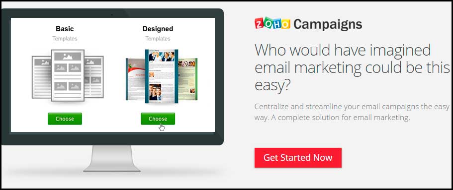
Main headline of an effective landing page assures visitors about the offer and also manages to communicate the central brand idea. It can be creative, witty or plain. Just make sure it is highly communicative.
- Uncomplicated design
It is essential for any landing page to have a neat overall design. Navigation needs to be simple and straightforward. All the required information should be provided without any unwanted popups. In short, keep it simple and don’t play tricks.
- Ad focus
Incredible landing pages are extensions of ad campaigns. Don’t send the user to generic pages to look for particular product. This will not only improve conversions but also save ad money. This tip is the top consideration of every leading landing page design firm.
- Explainer video
Use explainer videos to make complex products more understandable, and to engross the users. Explainer video needs to be engaging and high quality but make sure it doesn’t take a toll on your website’s load time. Check out Hipcamp’s anthem to see how brands are communicating through videos. Or check out these top explainer videos.

- User oriented
Don’t exhaust visitors by talking about yourself. Customers don’t care about your business goals. Show what your product or service can accomplish for them and how you can help them. This is literally the best landing page design tip anyone can give you!
- Less exit points
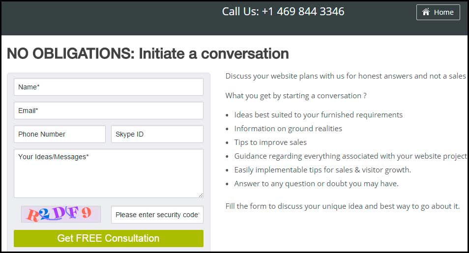
It is crucial to limit the exit points on your landing page so that visitors move to desired path. A good landing page always keeps notice of the pathways entering and leaving their page. Here is an example of the same worth referring for website landing page design.
- Length considerations
A landing page ought to offer visitors only the information that will intrigue them.Targeted landing pages with highly focused content work better. They don’t bore visitors with unimportant details, and keep it highly relevant.
- Relevant images
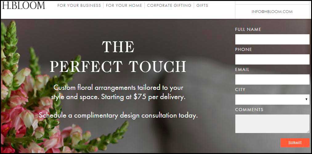
Effective images make the landing page more appealing, and provide the best user experience. Top landing page designers use high quality images to make a strong impression on behalf of their clients, and recommend doing the same.
- Quick conversion
The objective is to make it simple for users to convert. If you want them to fill a form, keep it small. Want customers to try demo of your digital product? Keep ‘Try Demo’ buttons throughout the page. Hiding the action button is bad landing page design practice.
- Right colors
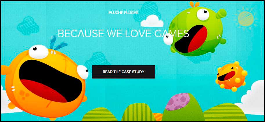
Every industry and user group responds differently to colors. Using the right color palette will give psychologically advantage to your landing page which will directly influence sales.
- Social sharing buttons
People love to share their latest purchases. Including share buttons will raise the possibility of getting social hype and mentions. Social sharing amongst real and virtual friends will lead to free promotional as well.
- Conversion tracking
Make sure you are properly set up to track and know how your pages are giving output. Tracking will save you precious money, and tell when you need to make improvements on the landing page. This is the recipe of designing and perfecting a pro landing page.
Consult experienced designers for landing page design
- Testimonials
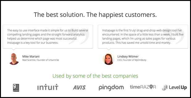
User reviews are one of the most important trust signals. If a user finds a trustworthy review, this goes a long way in building user trust. So, make space for testimonials and reviews in your landing page.
- Trust building
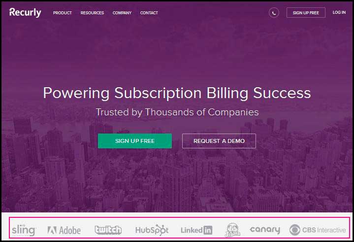
Earning user trust is very important especially if they are unaware of the brand when they are on the landing page. This can be done by adding awards, partnerships, and certifications and linking site to other brands.
- Mobile friendly
A mobile friendly site can two-fold your conversions. Make your landing page responsive so that mobile visitors get a great experience. This is one of the best landing page design practices to benefit from smartphones and tablets.
- Thank-you page
Thank-you page is an awesome way to guide the users to other related material on your site. Add a nicely designed thank you page to show your gratitude and introduce other relevant products or links.
- Testing and improvements
A/B testing permits you to improve conversion rate, and collects valuable points to discover what is missing. It can also unearth data to indicate need of change in communication or page redesign.
- Loading time
If your landing page is taking a lot of time to load, users will not wait,and move to your competitor. This will lead to high bounce rate and loss of relevant traffic. Want to design a good landing page? Pay attention to loading time from the very beginning.Period.
Landing page is the place where all your hard work will pay off if you plan it correctly. You may have a great product but if your landing page is flawed, sales and leads will not come. Implement above landing page tips, techniques and ideas to design a highly convertible landing page by. Be consistent with A/B testing to enhance the page on regular basis.
Recommended Read: Best Points to Design Landing Pages with Buyer Psychology in Mind
Need help in designing effective landing pages? FATbit analysts are here to help you with every detail.
Get a landing page that generates maximum conversions


Comments (3)
 Cado Magenge
 FATbit Chef Post author
 Kate
Kate
Great tips and tricks to designing effective landing page, i like it, its very helpful to me.
Thanks Cado for your appreciation.
Cheers
Hero images look good on a landing page. I believe the reason behind why companies avoid using hero images is the high-price of quality royalty images.