How customers perceive your business is important, after all, first impression is the last impression. And given the constant growth of technology & constant migration of offline businesses to the online world,your website has becomes your most important asset to create the first impression on your target customers.
We hardly get second chances in real life, and the virtual world is even more unforgiving. People move away without giving a single thought.
The problem is that it’s hard to figure out how to make a good first impression in the virtual world, and people tend to overdo while trying to get things right the first time. To prevent things from going awry, here’s what you need to focus on to make sure your website leaves a first impression amazing enough that people would want to come again.
Focus on a neat design
We would have said keeping a minimalistic approach is the best idea, but we would be wrong then. Every business has a different target audience. Here, we are not going to tell you what design your website should have. What you need to understand is that your website’s design should be in sync with the nature of your business and your core values. There’s no point of having an upbeat and funky website design if it is not a reflection of the personality of your business.
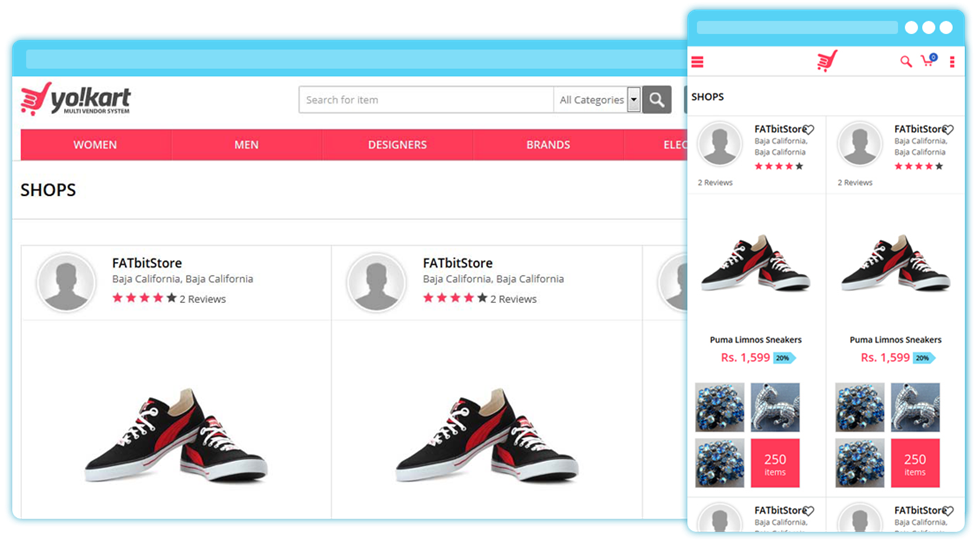
Your website should be designed to make sure people get what they want, and not solely focus on how cool the design is. That being said, bland looking websites are not a good choice either. Neat design creates a seamless flow and helps website viewers in focusing on the content.
Related Read: Frequently Ignored Web Design Practices – Adopt to Look Great & Convert More
Be more prompt in providing needed information
If you have attended some webinars, you know many speakers keep on beating around the bushes for too long and don’t come to the point. And when they do, they simply ask you to buy some book or pay for a link that has the answers, Bummer.
To make sure this doesn’t happen to your website, be prompt in giving your audience the information you promise to give them. When your target audience is able to find the desired/required information quickly and easily, they’re going to love you.For example, providing order return and/or cancellation policy proactively on the cart or checkout page is a really good practice.
Quick loading pages
Let’s put some facts into perspective first, shall we? If the page’s load time changes from 2 to 3 seconds, the difference of just one second leads to the bounce rate probability to reach a dangerous 90%. This is how important your website’s loading speed is.
The most common problem many web-based business owners face has been heir inability to strike the delicate and equally important design-functionality equilibrium.
Here’s how you can keep a tab on your website’s loading speed:
- Optimize your images and visual content to a web friendly format, easily achievable through Photoshop.
- Cache images so they load quickly.
- Invest in a good server with high technical specs.
Speed may one of the deciding factors for Google and other search engines in terms of ranking But for you, how quickly your webpages load is the most crucial factor that defines the first impression of your website.
Keep fancy words at bay
Unless you are building a dictionary based website or a seasoned writers’ discussion forum, there’s no point in showing off one’s vocabulary on a website. Your viewers want information, and they want it quick. The beauty of communication lies in its simplicity. Write your content to put your message across, not to make your website visitors run for a dictionary. And don’t be verbose.
“F”or “Z”shaped format is the best
There are two ways in which viewers go through a page, either in an F shaped flow or a Z shaped, and that’s what makes bullet points so amazing. Mention important points in this format so that they can easily find out the information they seek.
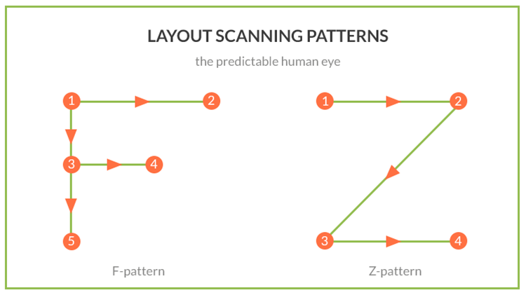 Image Source: Code Tiburon
Audio/video content is good, but don’t force it on viewers
As we know that people are able to retain more information from audio/visual content instead of textual one, embed YouTube links in your content is a good idea. But never force video content with autoplay visuals. Give them the freedom to choose when and if they want to watch a video. We came across many websites that refresh after a fixed time frame and the video we just paused started playing again. Not good.
Recommended Reading: 21 Creative Tools List for Video Storytelling & Brand Marketing
Niche specific trust signs
Depending on the nature of your web business, it is a good practice to include trust symbols in the web pages. Let’s understand this with a few examples…
- If you are running an ecommerce website, it’s a good idea to tell people you use safe payment gateways and use market specific tools to keep their information safe.
- If you are a blogger and want to affiliate with prominent blog sites, mentioning the prominent names where your blogs are shared and posted is beneficial.
- If you are a security personnel provider, your website should mention the accreditations and prominent companies that avail your service.

Deliver impeccable user experience on your website with experts’ help
Mind that CTA button
The call to action button drives your website visitors to get the needful done. What you need to make sure is that it grabs their attention while complementing the user experience. It should break the flow but not the reading consistency for the reader. And just like designing, don’t overdo it.
The CTA button triggers the instinct to perform the desired action, and thus it should be colored so that it contrasts with the overall design of the webpage. If you blend it with the design, viewers may oversee it. This is the point where you can convert your potential customers into revenue generating customers.
There are majorly three locations where you can place the CTA button:
- At the bottom: Pitching your services after educating visitors about your offerings
- Somewhere in the middle: where it can complement the most important points discussed on a page.
- Side CTA: for grabbing attention quickly
In the end, set right expectations
What your customers should expect from your company is in your hands. If you promised more than you can deliver, not only you’ll lose a customer, you may end up with a bad impression too hard to repair. In the words of Frank Martin, The Transporter, “Never make promises you can’t keep.”
And just in case you wonder how to do it right, the benefit of doubt always goes to being underestimated instead of being overestimated.
Conclusion
The world of internet is less forgiving in comparison to the real world. Fixing a wrong first impression is quite possible in the real world as you can meet your target audience in person and make amends. The speed at which things run on the internet doesn’t give this kind of luxury. Doing things right at the first time is good, but doing it right every time is going to make things work out for you.
While nobody is perfect, you can try to keep things as simple as possible, and never overwhelm your audience with a design that makes them feel as if they are going through a maze. In a nutshell, tell them who you are, what your business is all about, what they can expect from you. Keep things to the point and be quick in delivering useful information.


Comments (2)
 Rahul Parmar
 FATbit Chef Post author
This is such a nice article. Thanks for sharing,keep up the work.
You’re welcome.
Glad you liked it.
Regards
Team FATbit