Event website is not just about information sharing anymore; it sets event expectations, represent your brand, create a buzz online, generate ticket sales, and do a lot more. Thus, creating a quality event website require expert design & development efforts. If you are planning to get a website designed for a sports event, conference or musical concert, be very picky about your design and development partner.
Creating an event website just like any normal one after going through event website design inspiration portfolios would completely defeat the website goals & not at all help in ticket sales. After covering the failure of Sochi Winter Olympics event website, FATbit experts have prepared this guide for creating good event websites for global brands and organizations.
1. Single-page or full-fledged
Single page websites are more suitable for events that are local in nature, and have limited information to share with target audience. If you are organizing an art exhibition and want to share information about featuring artists, venue and timings, then, a single page website is more than suitable.
In case you are organizing something big (national or international event) and have bulk of information, history and details to share, then, a full-fledged website would be more suitable to engage audience.
An event website whether single page or multi page, requires detailed planning and expert execution
Consult FATbit’s UX design experts
2. Framework and Prioritization
Prioritization of sections on homepage is the greatest challenge of creating an event website. Considering there are various sections screaming for attention, deciding framework and overall layout can become herculean task for any designer. In case you plan to create a single page website, the challenge is even greater. Here are some points that can come handy while planning homepage design with your team of event website designers;
- Keep images of star performers and speakers above the fold.
- Explain purpose of the event above the fold
- Keep the event sponsors below the fold
- Place the important links in footer
- Place social media buttons at multiple places
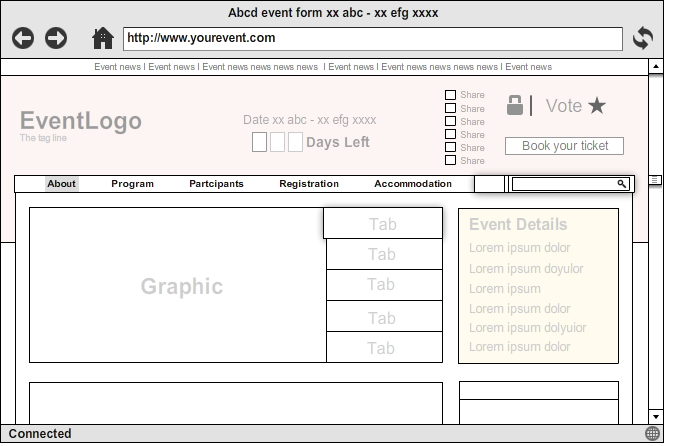
To help you create a usability focused framework for your event website, FATbit proposes this wireframe design.

3. Keep important details at the top
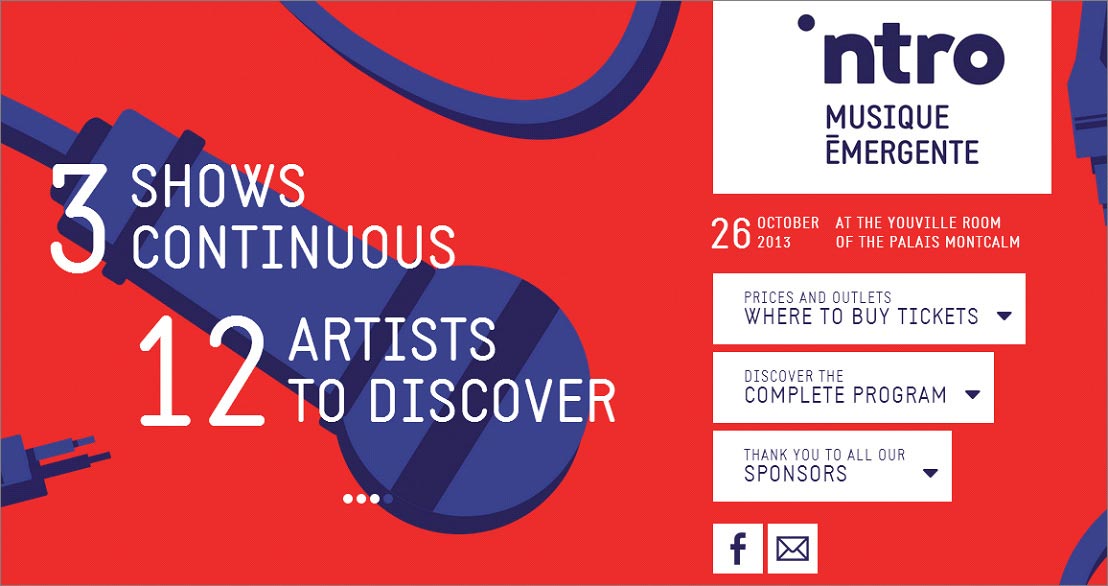
Just like any website, event based websites also have some prior goals in mind; ticket sales, registrations and communicating important event details are some of the top ones. Hence, keeping important dates, schedule, and venue details at top of the homepage makes perfect sense. Top event web designers make sure that these details stand out along with ticket purchase buttons.

4. Creating urgency
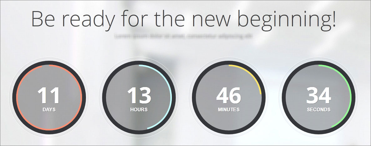
An event website that doesn’t encourage visitors to purchase tickets or make reservations cannot be passed as event website inspiration. Countdown is one of the most common design elements that create a sense of urgency amongst visitors to buy tickets, register or interact in any other way.

Top event website designers suggest unique additions to increase the urgency factor. Integrating countdown for number of pending seats is one way to do it.
Hire a team of experts who can design a good looking event website that is engaging & full of unique features
Contact team of expert designers
5. Easily sharable
Event organizers want their website to reach target audience. To accomplish this goal, no tool is more powerful than social media. Thus, experienced website designers always suggest event organizers to go for a website optimized for social sharing. Your website doubles the chances of Facebook and Twitter referrals if it is smartly integrated with social sharing buttons.
6. Element of Surprise
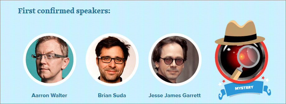
To create a buzz about your event online, include a surprise element in your website so that people have an incentive to share your event details on social media. Smashing Conference 2014 pulled off a “Surprise Speaker” stunt through their event website.

7. Live feed, polls and other features
In case your event is scattered across many days and people are going to follow it, make sure your website has the features to keep the followers updated. Live feed, opinion pools, results and various other features can be integrated during the process of event website design.
However, any website design firm cannot manage such features for you. You need an expert team of website designers and developers to carry the job perfectly.
Also Read: Innovative ways of generating more leads online
8. Make it mobile
Web has gone mobile and if you want mobile savvy users to attend your event, then, you need to be prepared with a mobile optimized website. Hire a team of event website designers that can make your regular website responsive and appealing for smartphone users as well. If you are planning to market your event through a website then make sure you either get a responsive design, one that fits all screen sizes based on the resolution or a separate mobile website to cater mobile users. Always remember designing a full fledged website for desktop is completely different from designing a mobile version. The content, navigation everything has to be re-planned in order to rank high on mobile user experience. Therefore make sure you hire the right company which has sufficient expertise in designing both desktop and mobile optimized websites.
Also Read: 10 quick tips to build a user friendly mobile website
Don’t waste your time going through multiple blog posts listing event web design inspiration. Instead, get in touch with an experienced team of designers, discuss your event, budget, and listen to their ideas.
Are you worried that you will be overcharged for your event website? Discuss your website requirements with us
Get a justified quote
