Women love nothing more than shopping but buying cosmetic products can leave even them exhausted. Men also find the task of buying grooming products tedious. If you too agree to this then the idea of a subscription-based product discovery platform is worth your time. You can launch a website that offers a personalized method for finding and shopping products, and also eliminates the need to repurchase through subscription service.
The demand of such time-saving solutions has increased in the recent years, which is why FATbit did an in-depth analysis of website features, and market competitors of subscription eCommerce. Entrepreneurs planning to launch a successful clone can read about the business and revenue model of the growing marketplace below.
Let’s start with how these websites work and make money!
Business & Revenue Model
In just a few years, you can have millions of subscribers with firm planning. Most of the websites in subscription commerce majorly have three revenue streams:
- Subscription revenue: Charging $10-$20 per month for sending a Box with product samples.
- E-commerce market: Rather than subscribing to the monthly box, users also buy cosmetic products directly by placing an order.
- Affiliate model: By charging brands some fee for introducing their products to their audience.
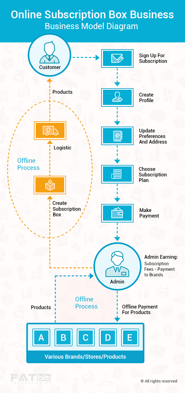
These businesses have two types of clients: brands and subscribers.
- Subscription box selling companies offer brands highly targeted exposure and detailed metrics.
- These companies also offer subscribers an opportunity to try premium products that are customized to their preference at a nominal subscription price.
Must-Have features to gain user base
- Offer Credits: These are points that can be awarded for purchasing full-size versions of samples, participating in surveys for each monthly box, and referring others to use subscription based service.
- Social Commerce: Try attracting the audience through social networks. Offer option to buy directly from platforms like Facebook and Instagram. Birchbox, a leading name in subscription box industry has a similar feature that allows users to buy directly through Instagram by leaving a comment on a photo with the hashtag #birchboxcart.
Who could be your Competitors in this business?
Since the competition is a bit high, you may need to add impressive features to grow your brand by leaps and bounds. Next section lists few of them for you.
Website Features to clone successful subscription box platform
Successful eCommerce platforms in this league give you instant access to hundreds of fashion & lifestyle based products of leading brands. As per our analysis, the main reason behind their success and popularity is their UX focused design. The front-runners in this industry have:
- Clean website design that is intuitive and easy to use.
- Simple concept with well-detailed Help guide.
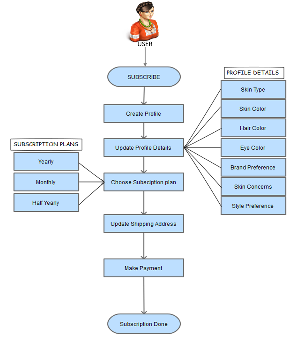
Let’s study important sections that you will have to add to your website:
1. Welcome Screen
Greet users with subscription popup as soon as they open your website. Most users feel that subscription to an eCommerce website means a bombardment of promotional emails. You should not put up with this psychological barrier. Just give a simple offer, for instance, make users get 10% off on their first purchase if they choose to join the email subscription list.
2. Homepage
The first fold of homepage must emphasis on creating user engagement. Most prominent homepage aspects are:
- Top bar with a promotional offer, search, and login.
- A Menubar with different categories of men, women, gifts and subscription.
- Homepage banner image which shows latest products.
- A special banner for discount coupons and offers.
A well-designed homepage banner is a must for any online portal. It not only introduces the visitor to the business idea but also persuades them to use your service.
PRO TIP: Talk to design UI experts to get your homepage banner right.
3. Monthly Box
Monthly subscription box is the core of this business model. That’s why most of subscription based eCommerce websites have dedicated space for monthly box section, which is usually kept in the second fold of their website. There is a separate subscription for men & women, and both can be showcased in this section.
4. Shopping space
In addition to monthly subscription box, you can give the option to shop online and make it an out-and-out shopping portal where users can buy individual products too. In the next fold of the homepage, you can display links to products listing for men and women.
5. Ideas and Inspiration
The biggest reason for the popularity of subscription based websites is that they succeed in luring customers like no one can. Users do not see these platforms as e-commerce websites but portals that solve a genuine problem. A similar approach is recommended by FATbit for developers creating clone scripts of big subscription based brands.
6. Invitations
With the advent of the Internet, most of the shopping has become virtual with no physical connection between the users and the brand. But moving beyond this limitation is not impossible. You can open brick and mortar shops and allow users to visit these shops personally to build their own box.
7. Footer
Add testimonials of users above the footer to build trust among new users. This is a nice innovative way of enticing users into using the service. A nicely designed footer in the last section on the homepage shall include:
- Social networking links
- Link to mobile app webpage
- Subscription button
- Links to content pages and other region based websites
8. Login
Give this link on the top bar of the website; there can be a login popup too. Keep the login process smooth and easy. The login popup must show a link to the signup page and redeem gift page. At this point, don’t forget to give option to login with one-click via social networking websites.
9. Signup
Sites following the traditional signup input information as follows:
- First and Last name
- Email Address
- Password with confirmation
10. Redeem Gift
Keep this section simple to allow users to gift subscriptions to friends and family effortlessly. These gifts can be easily redeemed by inputting the code or gift card. Most of the sites make it such that a user does not need to login or signup for redeeming a gift card.
11. Main menu
The approach to keep it minimal will work in your favor and make the navigation impressive. Rather than categorizing all the products into various categories, you can divide them into separate sections of men and women. The main navigation of such websites stands out in the top bar. Upon hovering over a particular category, a drop-down menu will emerge which includes Shop, Featured, and Guide. This style is effective but becomes redundant if there is a huge product catalog. FATbit analysts recommend taking this into account while developing a clone.
12. Shop by Brands
As discussed earlier, revenue of these subscription eCommerce websites mostly come from brands as it acts as a platform to connect both ends. This is why the subscription box portals also allow users to shop products by brands. This makes it easy for brand conscious users to buy relevant products. Users can access the brands alphabetically and gender specifically.
13. Search
Although the overall business model of these websites is based on monthly subscription boxes, there is also a dedicated e-commerce platform where users can find and shop relevant products. To make it effective, the search functionality must have auto-complete feature and be created with concepts of UX in mind. It is placed ideally on the top bar keeping in mind its usability. Users have three options to streamline search:
The results are categorized separately in products and brands. To build a successful subscription based eCommerce platform like beautybox5, wantable, Birchbox.com, etc. your website must have a prominent search bar with similar features.
14. Product Listing
Keep your search and product listing minimal. Most important elements of this listing are following:
- Product image
- Name of the product
- Rating
- Price
Make sure that users can only adjust the results based on price and gender.
15. Product Page
It has been seen time and again that the product page is one of the most vital sections of any e-commerce platform. If you keep it minimal, then the user does not find it engaging, but if you clutter the page with information, it hinders the user experience. This is where you need to tread the fine line between the two. Try to design the products exquisitely with all the relevant information. In the left section you can include a visual overview of the product, and in the right include price and other description. Don’t forget to add a feature that helps users can also add the item to favorites to be viewed later.
The second fold of the product page caters to recommendations in order to increase productivity. This is a useful approach adopted by most ecommerce players. The first section you can include recommended items based on the current product while the second section can have other items from the brand. Aspiring clone scripts must incorporate these features for enhanced productivity.
16. Reviews
After undergoing the business model of various ecommerce platforms, FATbit Analysts have found that novice customers buy their first product based on testimonials. So adding dedicated reviews section at the bottom of each product page makes complete sense. It should be complemented with following features:
- Filter reviews from users based on skin type, skin tone, and age.
- Total number of reviews
- Average product rating
- Users can also mark a review as helpful or not based on the information.
17. Gifts
Your subscription eCommerce clone must allow users to gift products to friends and family. Most of the brands have designed the gift page section neatly with regard to user engagement. Add a nice banner image that tempts users into subscribing a gift for someone close. Additionally you can have users who subscribe based on individual gender and price.
18. Feedback popup
While going through the website, our analysts found that there is a random feedback pop-up on many websites. Make sure that the placement of the feedback popup is user-friendly and does not hinder the ongoing process. Users should be given the option to either close the feedback or click on continue to answer few questions.
19. Subscription
The feature of adding a subscription to the shopping cart is the backbone of subscription eCommerce. Users should have the option to go for a monthly subscription or yearly based on their preference. The overall page has been nicely designed by leading brands with well-placed taglines and CTAs. few websites have put various offers across its websites at relevant places, which makes the subscription more luring.
Users can also peek inside the subscription box to get an idea about the products they will get. This is like a notifying feature as the subscriptions are customized based on the preference of the user.
20. Loyalty points
Customer loyalty is the biggest asset for any company, which is why introducing a Rewards program is purposeful. For every purchase, referral and survey, users get some points. Major characteristics of this section are as follows:
- Users can redeem points for money.
- Every $1 spent results in 1 reward point.
- Users have to redeem their points within a year before they expire.
You can also add a nifty option available for users, where they can add email notifications for any balance changes.
21. Account settings
This section mostly covers all aspects of the user profile, including subscriptions, account information, reward points, and favorites. Here users can also update their profile in order to get customized subscription products.
22. Favorites
Many ecommerce websites have started to incorporate ‘favorite’ button on their products. This wishlist acts as a bookmark, making it easier for users to view products at a later stage. However, we found that this section can be improved further in order to enhance productivity. More on this has been discussed later in the improvements section.
23. Referral Program
Other than reward programs, you can add another referral program as we saw on many websites. It will be a section where users can earn points by referring your website to their friends and family. For every friend that joins you, and makes the first subscription, users can get 50 points. Make sure users can select contacts from their Gmail address book add emails address individually or even create a referral link to share on social networking websites.
You might have a hard time competing in the market If your clone script misses above listed features. That said, there is scope of improvement in present website design and features. Read on to discover improvement areas suggested by our UX experts
Areas of Improvements
1. Search
As discussed earlier, the search feature on most of the websites is minimal and there are no additional filters available for users to streamline the search. More importantly, the placement of the search box in top navigation bar doesn’t seem right from UX point of view. Most e-commerce platforms put major emphasis on the search for product discovery, which is why it should be ideal placed.
2. Minimal design
Our analysts found that the overall design approach these subscription box portals is minimal. Although their core business model revolves around subscriptions, they also have a standalone e-commerce marketplace. There are various sections like favorites where UX focus disappears. A successful eCommerce clone must make the overall design engaging in order to enhance conversions and engagement.
3. Account settings
Although most e-commerce players do not put much emphasis on the user setting page, the options must be well laid in order to ensure proper navigation. The account settings page is usually divided into different categories which make it a bit confusing. Rather than cluttering it into categories, we suggest you divide the options into different tabs so that it is easy for users to find a relevant option.
4. Sign-up/Login
One-click registration/login via social networks is the norm of ecommerce industry. This is essential to minimize the steps required by users to login or signup on the platform. You can improve on this by ensuring that your eCommerce clone script offers social login feature.
Growth potential of subscription based ecommerce clones
The concept of product subscription may have been around for some years now but the industry is still in nascent stage due to low user awareness. This is one reason why there has been a huge demand for clone scripts of Birchbox, Stitchfix and the likes.

If you plan to start a website like we discussed above, then, you must incorporate these advanced features at all events. Without addressing these features, you will find it difficult to capture initial user base, forget stealing users of competitors/established-brands. Get in touch with our team of designers and developers to start subscription based online shopping website.


Comments (1)
 Jennifer S Reed
Very Nice. Valuable information. Thanks for sharing the feedback. Your review on subscription boxes can help a lot to new customers.