Imagine you’re organizing a party and want to hire a band or a caterer. Maybe you also want a comedian to liven things up. Finding all of them can prove to be time-consuming. The ideal solution in this technological era for such a problem is a website dedicated to search and hire performers. It offers an easy way to book entertainment and event service providers for any type of event. Moreover, using such a service, event planners and hosts can search bands, performers, musicians, and more for events and parties of all types and sizes.
Online booking platforms like GigSalad, GigStart, and Gigmaster have already come to the forefront. FATbit analysts did an in-depth analysis of this business model as well as key website features for entrepreneurs who want to launch a similar and advanced performance gigs marketplace. Before we move on, let’s take a look at its business model and how it makes money, to better understand its market dynamics.
Business Model of Gigs Booking Platform
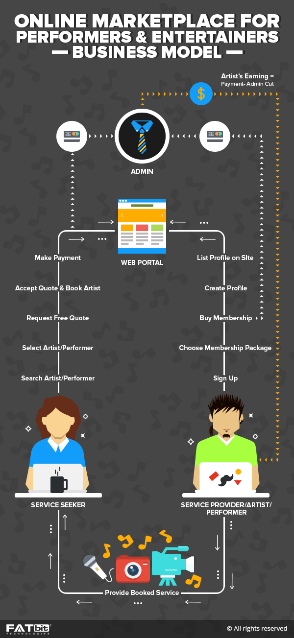
The main aim of such platforms is to connect event planners with performers and party vendors. Just type in the category you’re interested in and you would see a list of all the entertainers as well as service providers in your locality. You can also view their photos, watch their videos, check out their reviews, and select your favorites. Getting a Free Quote is like a walk through the park and once you receive a quote you are happy with, simply enter your payment and that’s it… you’re done!

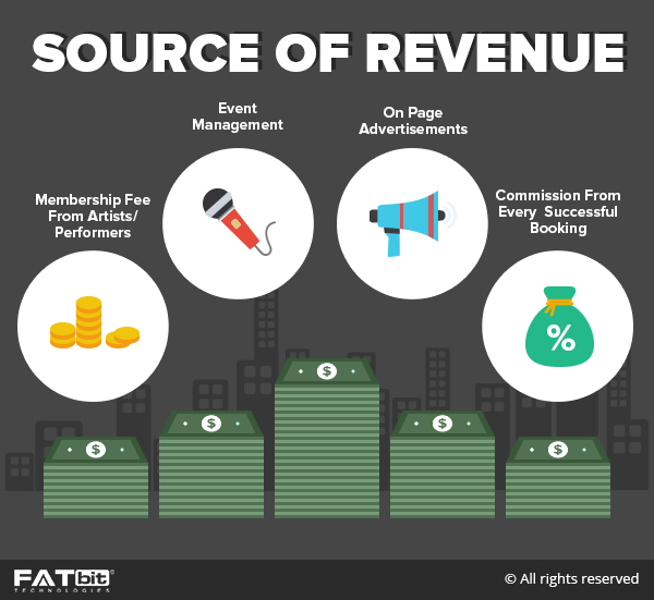
How do gigs booking websites make money?
Getting registered as artist or performer is totally free. However, the platform can have membership plans which give additional features to the users. In addition to it, the platform also charges a service fee, from the event planners who hire a service provider.

Main Competitors Based on this Business Model
Website Overview
When it comes to website design, you cannot have a lackluster attitude. A website high on functionality and low of user experience would not perform optimally as far as revenues are concerned. All the concepts of UX need to be perfectly implemented. Let’s take a look at each of these features and unique website aspects closely, starting from the homepage.
Homepage
It is generally said that the first impression is the last impression. The same holds true for the website design. You might have a killer website features, but if you are unable to entice users in using your service, then all the hard work is for nothing. When it comes to the homepage design of your website, you ought to focus immensely on rich media and graphics. As soon as the users land on the homepage, they should be greeted with a banner image that makes it obvious what the website is all about. A search bar over the header will be a nice addition as it highlights its importance. The top bar can house links to Login, Signup as well as other important sections.
Why Choose Us Section
The second fold of the website should focus on leveraging the benefits of GigSalad in order to entice users into using the service. It can highlight three simple steps:
- Browse and compare
- Book securely
- Enjoy Event
You can also display some of the prominent brands that use your service. This is vital to gain trust among the user base. Additionally, this section can also include testimonials from these brands, which portray the feasibility of your platform as an efficient peer-to-peer event marketplace.
Signup Options
As this is a peer-to-peer marketplace, there have to be two options given to users when it comes to creating an account. Users can either sign up as:
- Performer, artist, event service provider
- Host planning an event
During the analysis, experts at FATbit came up with a unique idea, where your website does not create an account straight away for the hosts. They have to first create a quote after which their account is created. In this way, they first request a quote which will lead to better recommendations.
Artists Signup
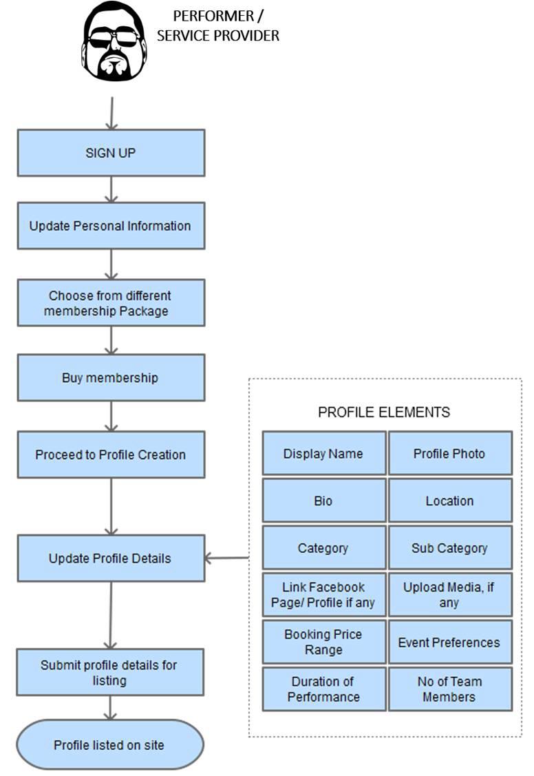
When artists click on the link to create an account, they have to go through a process of filling in all the details about themselves.
- The first stage would include introducing yourself.
- The second step involves selecting the desired category of the service provided.
- After selecting the service category, the artists have to select their service location. Users can either input a zip code or the city name.
- After adding the location, users have to add a small description about themselves or their service. This summary is necessary to explain to the hosts why they should book you for their event.
- The final step in creating an account involves adding contact details so that event planners can directly contact them.
Select membership type
After providing all the account details, users are given the option to continue with the free tier and upgrade to premium membership with paid plans. You can also offer a limited time trial of paid membership. A comparison graph that displays all the features of each plan will help the users in making an informed decision.
Account confirmation
Before users get access to their account, they have to verify their email. This is a vital step to check spam accounts. Most e-commerce platforms incorporate this approach and is recommended to maintain a viable community. FATbit analysts recommend that same in the event professionals marketplace system.
Dashboard
The dashboard is the central hub where users can get all the information related to their account. This includes:
- Add more images and videos to enhance visibility
- Take a look at their profile to have a better understanding of how the client would perceive them.
- In addition to these details, you can also offer different analytics like Booking Stats, Reviews, and Visitor Stats. This information helps users manage the account more efficiently.
Messaging
Messaging is the core aspect of every peer-to-peer network. It allows users to connect with each other more efficiently thereby diminishing the gap. Its main aim is to connect people and it does that with ease. Users can even search through stacks of messages making it easier for them to find relevant information. You can also have a real-time chat feature incorporated on your platform for better communication.
Leads
This business model is all about providing artists a platform for capturing leads from event planners as well as hosts. In this section, users can view their upcoming leads, new leads, and past leads. These are basically the inquiries made by the hosts.
Booked Gigs
After the artists books any gig, it can be viewed in the booking section. This can be subdivided further into different sections like – Newest, Upcoming, Past, and payments. Additionally, users can also search within the stacked gigs to find relevant information.
Contact Lead
Once a user clicks on a particular lead, they can be taken to the lead page which showcases all the details about the event as well as the requirements of the host. Users can also contact the user by sending a response to the lead. All they have to do is fill a pre-made template which includes all the information about the user. Moreover, if need be, users can edit the template to add more information.
Reviews
There is no denying that user reviews have become one of the most vital aspects for any e-commerce website. It is the de-facto reason which helps users make an informed decision. Studies have shown that most users check reviews before making a purchase or hiring someone for service. This is why most websites have started incorporating review system on their website. On your website, users can manage all the reviews and even request one from the host. FATbit recommends this approach while design an Event professional marketplace clone.
Account
This section contains all the information related to the account of the user. Users can even have a snapshot of the account which shows what features are available in the current account type. Other options include:
- Manage Membership
- Payment Info
- Contact Info
- Login Info
- Notifications
- Upgrade
Help
For all the novice users, Help section is vital as it offers all the solutions to their queries. The help section of your website can divide into three different sections. Users can either go through the FAQs, email support or call on a given number directly.
Search
Now that we covered all the aspects of artists, let’s take a look at the hosts’ point of view. The search functionality, as already discussed, needs to be rock solid and its placement on the homepage makes it easy for the hosts to find relevant artists. Other vital features include auto-complete that triggers results as the users start top type in a query. A vital point to keep in mind is that the results must be segregated into categories and direct user search.
Search Results
When hosts enter a search phrase, they should be taken to the result page which displays results. All the results can be displayed in a grid-like an arrangement, with the option to view them in the list. Users can also streamline these by advanced filters to streamline the search further.
Artists’ Category
In addition to search, hosts can even browse the database of service providers via categories. Hosts can select a category which best defines the type of service provider they are looking for. The categories need to be well defined and the platform also ought to give out recommendations under “You may also like” best suited to that category. In addition to it, hosts can also see the featured artists in that particular category.
Location of the artists
After selecting a particular category, hosts have to select their desired location in order to view relevant results. Selecting the location only shows the artists that are near to the user location or who serve in that location.
Artist’s Profile
The profile page of artists is one of the most vital components for starting a conversation. You have to put a lot of focus in designing this website to ensure that users get all the relevant information. It should contain a top banner with display picture, name, rating and ‘mark as favorite’ button. The next section can show location, service area, charges, website, and contact information. Hosts can also get a free quote by clicking on the respective button. Other suggested sections on this page include:
- Why choose the artist
- Gallery
- Videos
- Reviews
- Booking Info
- Services offered

Artist Booking
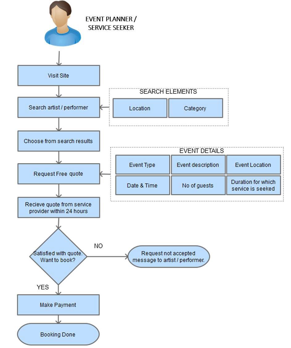
The overall process of booking an artist needs to seamless and straightforward. Rather than drafting the whole request, you can have a predefined template in place, which makes the whole process a breeze. The first step can include selecting quotation. The next step involves providing information about the event itself, making it easy for the artists and services providers to offer their services. This form should include information like:
- Type of event
- Expected number of guests
- Event City
- Event state/province
- Flexibility of the event
- Date and time of the event
- Time duration of the services required

The final step in getting a free service quote requires adding contact information and other event details. The predefined form approach compresses the time required to fill the form. FATbit analysts recommend a similar approach in your online event professional marketplace.

Overall this business model has huge potential and has incorporated all the necessary features to create an identity in this niche market. For a new startup, the features along with the improvements mentioned above are vital.
Also Read: Top Nine Asset-Light Business Models to Consider For Your E-commerce Startup
The combination of both will surely lead to an advanced peer-to-peer marketplace. If you have any additional requirements, you can surely consult our experienced designers as well as developers for starting your own event based portal with VivoGigs.
Best Software to Create a Website for Performers and Event Planners
VivoGigs

