The traditional concept of business as the established and dedicated place where all work-related activities take place has changed with the advent of technology. Nowadays, people are always on the move and they don’t always work from the same place. The place keeps changing with people’s movement and their work is always accessible on laptops, smartphones, tablets or any other mobile devices.
The Rise of Online Workspaces
This transformative shift in the way people work has given rise to the concept of Co-Working Spaces. These spaces accommodate workers from different companies, providing them instant access to common infrastructure, like equipment, utilities, receptionist and in some cases refreshments and parcel acceptance services. As per Statista, the number of people using co-working spaces worldwide is estimated to grow up to 2.26 million in 2020, which is 128 times higher than 21,000 people in 2010.
Online Marketplaces like LiquidSpace, Pivotdesk and Sharedesk help people look up coworking spaces around them. They provide enhanced search options, imagery and simple filtering to make the search easier.
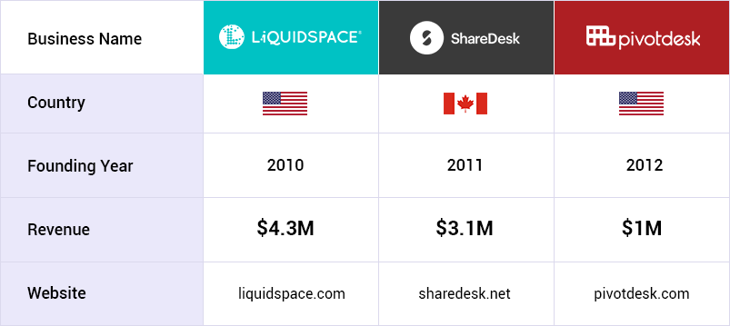
By providing relevant tools to market, manage and monetize excess office space, a website based on similar business model can help:
- Startups and small businesses find flexible and affordable room to grow.
- Growing businesses attain profit from their dynamic space.
- Build an economic development in downtown locations.
FATbit researchers, therefore, did an in-depth analysis of the sustainable growth of this business model to help entrepreneurs build such a website. Before we look into website features that make it unique, let’s quickly go through this business model.
Business Model of Workspace Searches Marketplace
A website based on this business model is focused on growing the supply of on-demand work space, and introducing new types of spaces to its marketplace. From hotels meeting rooms to conference centers, legal deposition rooms, and corporate training facilities, it offers easy access to on-demand renting for office spaces and private offices.
Users on the marketplace can view the listed workplaces in a specified location. Based on their requirements users can place a rental request for a workplace of their liking. Once a request is placed, the workplace owner has to approve it for further processing. As soon as the request is accepted, the money(adjusted after commission charges) is transferred to the owner’s account. To safeguard against any damages/loss, a safety deposit is kept in the admin’s account, which is refunded after the safe use of the workplace at the end of the rental term.
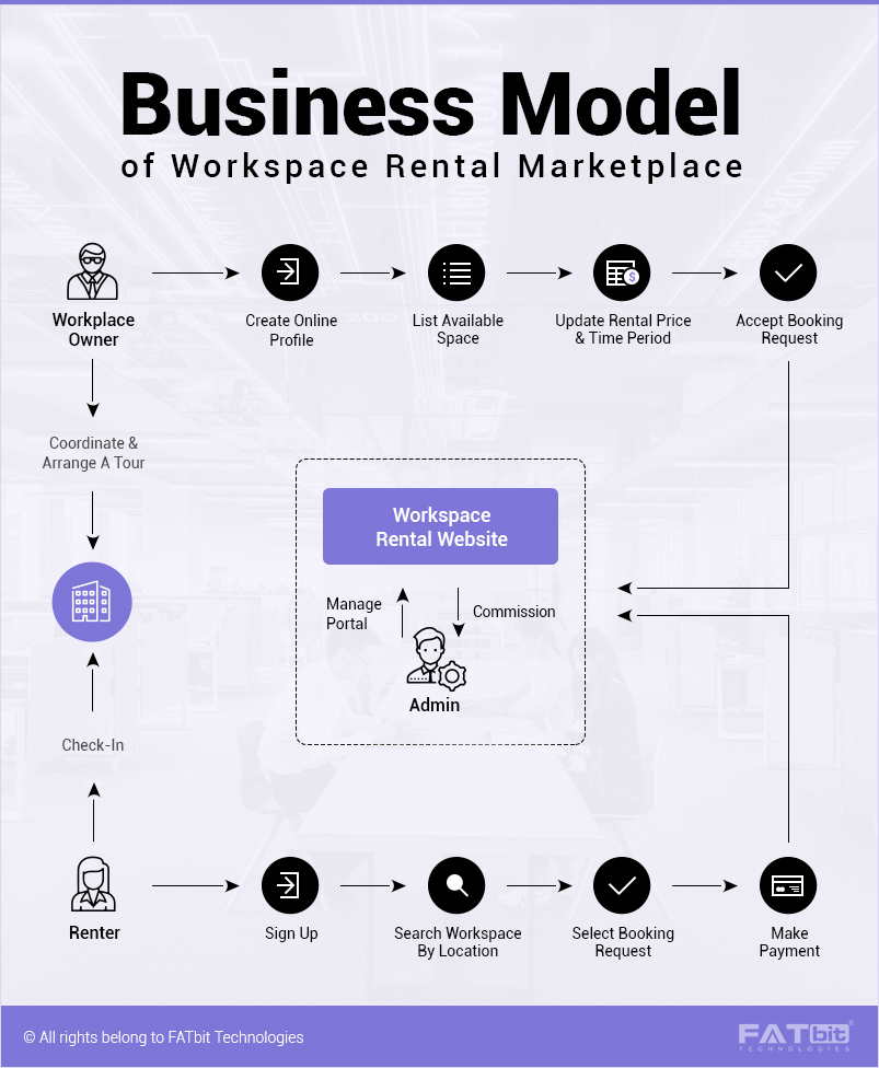
How to make money with such a platform
The platform does not charge its users to list their space on the platform. It only charges a commission fee when space is booked. In order to ensure repetitive booking by the consumer, the website can decrease the amount of commission as well. For example, for the first booking, if you are charging 30% of Transaction revenue net to the venue, it can decrease to 20% for the next transaction. For the third and the subsequent time, the charge can be fixated at 10% of the transaction value. You can also have premium membership plans for workspace owners to feature their listing on the website.
Website Overview
In the current market dynamics, most e-commerce websites tend to portray their niche in order to gain user’s interest as soon as they land on the homepage. This is why this website focuses heavily on the design and UX of the front page. The overall design of your website ought to be highly immersive. As soon as the user lands on the homepage, they should get a clear idea what the website is all about. Let’s take a look at each and every feature of the website in detail.
Homepage
The homepage of your website should have a unique identity, with a large banner image, tagline and a search bar in the prominent location. The top bar should consists of links like Sign In, Join, Find Spaces, Share Spaces and Help. In addition to the consumers who are looking for the workspace, you should also make it easy for the business to list their spaces. Working on a peer-to-peer marketplace, the website should offer a unique platform for businesses to stay productive and share their spaces.
Venue Categories
The second fold of the website can house all the venue categories making it easier for the end user to find relevant space. It is interesting to note that the overall design of the homepage should be consistent across all the sections be it categories, or any other feature. FATbit analysts recommend this design strategy which developing a Workspace rental website.
Workspace Types
In addition to the venue categories, you can also make it easy for the users to find workspaces based on their requirements. From collaborations to board friendly meetings, you can display all the prominent requirements on the homepage. This is beneficial for users as it removes the hassle of going through several steps to find the location for a specific purpose.
Help Chat
As most peer-to-peer platforms work on different business models, it sometimes gets difficult for novice users to get accustomed to the overall functionality. This is where Help Chat functionality comes to the rescue. We recommend a nice Help Chat button placed at the bottom right corner of each web page. Rather than traditional chats where you just send in your query and get a response later, you should provide an actual real time Help Chat feature with customer service executives.
Signup
Enticing users to register is a challenge for most peer-to-peer marketplaces. This is where the sign-up process of your website ought to be pitch perfect and user-friendly. Whenever a user clicks on the sign-up/ register link, a popup can be displayed showing the sign-up screen. The sign-up form should be highly minimal, just requiring name, email and password. In addition to it, you can also let users sign up with one-click social login.
Dashboard
As soon as the users log in to their account, they should be taken to the dashboard which showcases all the recent activity of the users. You can also let them search and book a space right from the dashboard. The dashboard ought to be highly appealing with all the relevant information present to the users.
Also Read: Top Features to Build Storage and Parking Space Marketplace
Manage Venues
The website must make it easy for users to manage all their venues under a single section. By clicking on the venues, users should have the option to edit their availability and other information like a change of pricing, timing or images etc.
Reservations
Using this section users can access all the reservations made by them. This comes in handy when you have many upcoming or past reservations and don’t want the hassle of going through each and every listing.
Favorites
This section can house all the workplaces that have been marked as favorite by the user. Each and every listing can be displayed in the grid form making it easy for the user to identify the venue.
Reviews
Being a peer-to-peer platform, you can incorporate a review mechanism, under which users can review booked workspaces. This helps other users to make an informed decision. More importantly, only those users who have used the services of a workspace can review it, which gives the review authenticity.
Pro tip – Get a workspace rental platform that comes with smart review management system
Settings
Under this section, users can access all the settings of their account. Users can change their personal information, account password and alter payment method seamlessly using this tool.
Connections
Peer-to-peer networks can only be successful if the community is connected. This is why you must have a dedicated messaging service on your platform, to manage all the connections. Using this tool, users can also manage their followers and follow other venues. Business can even add members to a group in order to provide exclusive services to the repeat customers.
Search
Other than browsing through the categories, the only option available to the users for finding the relevant workspace is the search. As discussed earlier, the placement of search bar on the homepage at a prominent location makes its importance clear. From autocomplete keywords to dynamic filters, each and every aspect of the search has to be taken care of. Some other search features include:
- Search based on hourly/ monthly booking options
- When is it required?
- Search type
- Capacity
- Price
- Additional amenities
The search results can be segregated into two sections. While the left section can show a map view of the area with all the locations, the right section can show a grid-like pattern for the locations along with price, description, and reviews. Users can also add any location to the favorites by clicking on the heart shaped button. FATbit researchers feel that such search functionality will surely add to the user experience for the Workspace rental marketplace. So, pick the solution accordingly.
Workspace Listing
The workspace listing page should have all the vital information placed seamlessly in a single page without cluttering or degrading the user experience. The top section should display the images of the workspace in a nice interactive slider. The other sections below the slider can be showcased as follows:
- Ratings
- Workplace description
- Amenities provided at the workplace
- Real time availability
- Map view
- Reviews
- Mark as favorite
- Book workplace
Reservation
You can also allow your users to reserve a venue right from the website. The overall Reservation process should be efficient and easy. By clicking on the book venue button, a popup can show the reservation form. It can include:
- Date
- Time
- Number of people
- Reservation title
- Amenities required
After filling these options, the user can be taken to the payment form where they have to make the said payment.
On-Demand Meeting Space
your website can also have additional features for businesses as well as users, which make it a one stop gateway for renting short term workspaces. One of these features can be On-demand Meeting Space. Using this feature, users can bring their company’s micro meetings into focus. The only difference between this service and traditional booking is that this is essential for users who want to micromanage their meetings and book spaces in real time without the hassle of going through all the reservation process.
Request a Workspace Tour
Although businesses do put up detailed information about the venue as well as workspaces, still it is not the same as visiting the place yourself. This is why you can also allow users to request a demo of the workspace before making a reservation. However, this feature is dependent upon the business owner to allow tours of the venue before booking. Users need to fill in a simple form in order to request a demo. The information in the form includes:
- Name
- Email
- Phone Number
- Name of the company
- Booking date
- Preferred Tour date
- Additional information
Add Your Space
Under this section, businesses can easily list their workspaces on the platform to share with other companies or individuals. The overall process involves three different steps from adding venue to adding workspace to the venue. Let’s take a look at the overall process in detail.
Enter Venue Address
The first and the foremost step into listing your workspace includes entering the venue address. Users can add the full address of the venue and the platform automatically finds and places the pin on the map. The other information related to the venue is generated automatically, but the users can themselves change the details also.
After filling the venue address, businesses need to add contact details, making it easy for users to contact them. This includes name, email, phone number and website.
Add Venue Details
The second step involves adding details of the venue including:
- Name
- Description
- Time zone
- Hours of operation
- Images
By dividing the venue details into two separate section, you can ensure that the users don’t feel the overall process to be lengthy and cumbersome.
Add Workspaces to Venue
The final step in this process includes adding workspaces to the venue. In it vital to note that users can even skip this step and only list their venue on the website. The information required includes:
- Name of the workspace
- Description
- Images
- Type of workspace
- Reservation method (Hourly/monthly)
- Capacity
After adding the information users can either continue with confirmation and add payments information or add another workspace. FATbit believes this approach is highly efficient and user friendly. We recommend a similar feature for any Workspace listing website.
Key Areas to keep in Mind
Although we have covered each and every aspect of website feature, but still there are some areas which can reduce the user experience of the website. You need to take cognizance of these issues to ensure that your website offers exquisite user engagement.
Make sure that it is easy to relate between venues and workspaces: While you can keep user experience at the top when it comes to the website functionality, users might have difficulty in getting accustomed to your platform if they cannot differentiate between venues and workspaces. Although the difference between the two is obvious, you should offer ample disparity between the two. When searching for a workplace, the results should not display venues which only have a single workplace. This creates confusion into the minds of the users.
Multiple layers of cities and venues when browsing: Other than search, browsing is the only option for workspace discovery. Make sure that you do not make overall process highly cumbersome by adding different layers of cities and venues. A common example is that first a user has to go through a list of cities and then venues in order to reach a relevant workspace. In order to make the overall process highly efficient, we recommend a filter based functionality using which users can streamline the results straight away without going through multiple pages.
Competitive Commission: Even after taking care of all the above-mentioned points, one area where your platform can lag behind is the commission charges. Make sure that you do not charge more than the competitors. We recommend analyzing the market and keeping the pricing adequate in order to entice users into using your service.
The scope for peer-to-peer marketplaces like LiquidSpace, Pivotdesk and Sharedesk is huge and can turn out to be a great alternative to workspace renting. In case you’re already planning to build an online workspace rental marketplace, then do check out Yo!Rent – a white label solution to build an online rental marketplace. It’s highly scalable and offers plenty of room for customization. Furthermore, Yo!Rent provides industry-grade security, and encompasses all the key features like in build analytics, multiple revenue generation channels, smart review management and excellent tech support that allow you to successfully launch and manage an online workplace website.
Build a workspace rental marketplace at the right price
Get cost idea


Comments (2)
 AlonsoMup
 FATbit Chef Post author
Много полезной информации о ремонте
Рад что вам понравилось!