Subscription ecommerce is the raging online business option currently, especially the ones based on women fashion. Companies parcelling every month a package of hand-picked items picked by their personal stylists is a common trend and shoppers love it like anything. They pay for what they like and send back the rest within few days. Interestingly not all of these subscription based apparel websites are running successfully. FATbit analysed few of successful and failed names of eCommerce industry that act as online stylists and came up with a list of website features that may help future entrepreneurs in building a better platform of online shopping.
Working like any other subscription based eCommerce website targeting women may not work in this regard as you need to adopt an algorithmic approach towards fashion to make it a unique venture. Let’s dwell what the growing subscription based eCommerce business is all about; have a look at its revenue model and essential website features:
Business Model

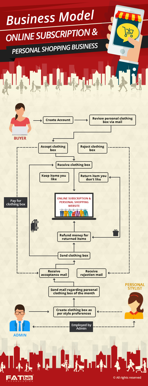
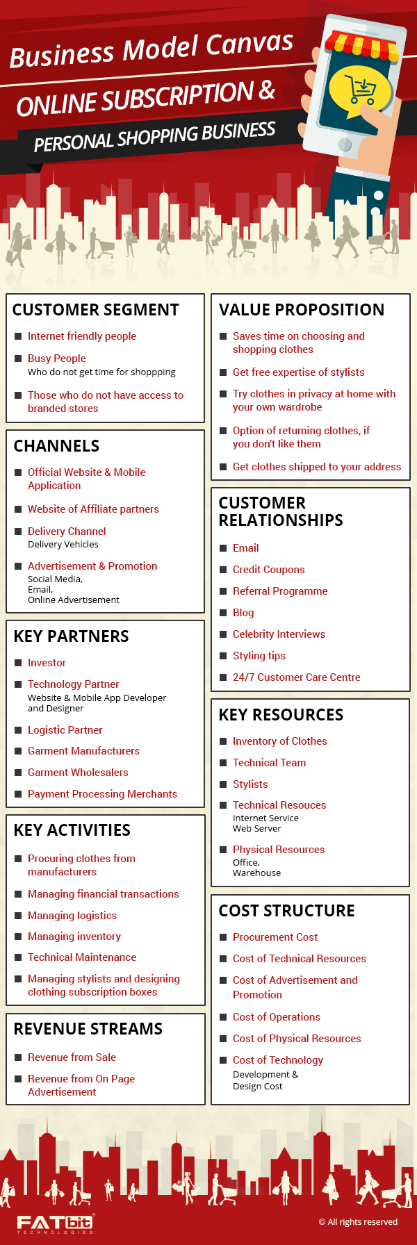
Delivering clothes & accessories (that you think will suit and be liked by subscribed users) at the doorstep of customers is the core of subscription business model. The stylists select clothes, bags, accessories and send a fixed number of items every month at a cost as low as $10-$20, which is charged toward the fee of personal stylist. Customers can redeem this fee as cost of shipment when they choose to buy any of items. They receive this package on recurring basis i.e. monthly and get some discount if all things are shopped. Following are few websites that make subscription-box service desirable for shoppers:
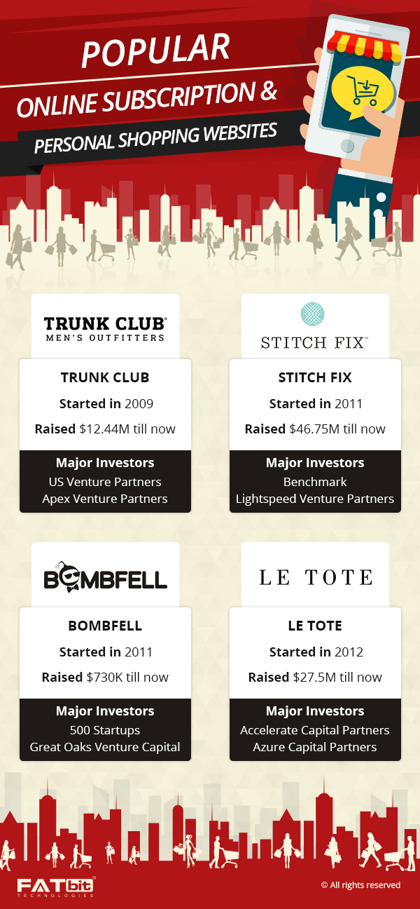
- Bombfell
- Stitchfix
- Stylit

Let’s find out more about the website features that can turn online shopping into addiction if you serve the customers right:
How should be the Design?
Whether you go for an impressive parallax scrolling, or soothing color scheme, which is apparently trending in web design world, inspiring top fold balanced with information architecture is a must to bring off a persuasive shopping platform. Try to have a user interface that can reflect the business idea i.e. women styling. Keep above the fold area simple and focus on ‘Learn More’ section. You can take visitors to further categories (under the fold) directly, using this link.
Here is a broader view of important features that a clone of subscription based website targeting women fashion must have:
Get Started
Add a questionnaire that can inquire likes and dislikes of the users. Add the link (get started) of this questionnaire in top fold as well as a smaller version of question sheet in the footer. Clicking through this option must take the user to a long style inventory that has questions about preferences of females (target customers).
A questionnaire targeting female users should ask things that can interrogate one’s style choices like following questions do:
- Which jeans type you prefer?
- Are you curvy on your bottom half?
- Are your ears pierced?
Style survey could be your best feature if implemented cleverly. It can help you determine the dressing needs of a woman. Try to engage users like a personal interview does and fetch information regarding their style preferences. The best part is that women don’t mind filling lengthy forms as it helps them explore their personality.
How it Works
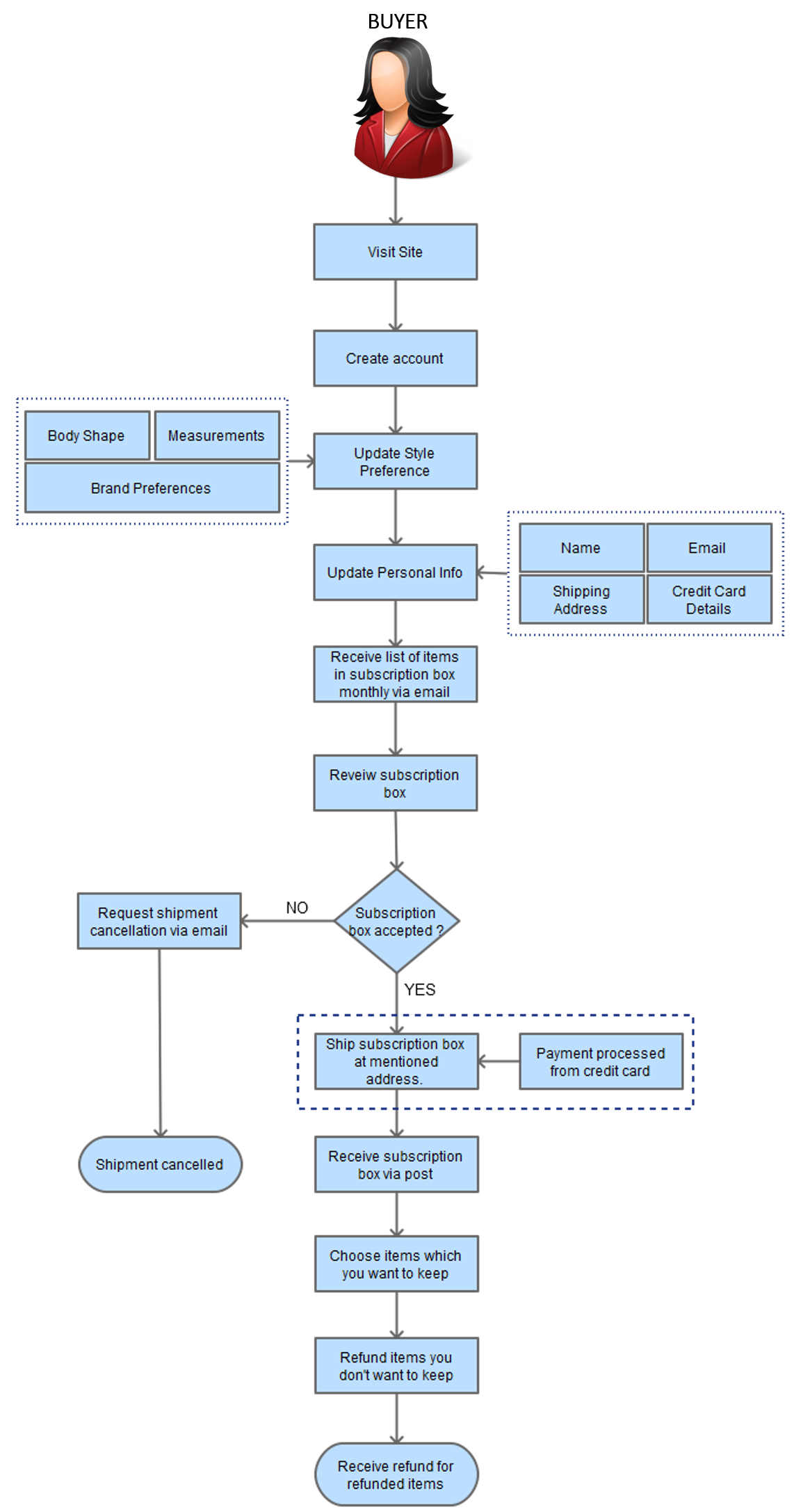
New visitors need something to understand what the website is exactly all about. This is where How It Works comes in. It informs visitors about the personal style quiz, which is more of an interactive style-sheet that helps personal stylists define customer’s style profile. It involves three steps:
- Take up the style quiz
- Get five personalized, handpicked pieces delivered to door
- Keep what you want and sent back the rest

FAQ
The FAQ section guides users regarding style profile, scheduling, billing, returns etc. On top of this page, add a ‘search bar’ and ‘contact us’ buttons to make the search for specific answer easier. Add complementing images to answer all questions explicitly. You can add commonly read articles below the list of frequently asked questions.
Blog
Blog is an asset to any website, whether it’s a subscription based fashion retailer like Stitchfix, Stylit or ecommerce giant like Amazon. Blog is the distinct feature of a website. It should score high on user engagement as well as guide readers through various queries that they usually have before or after shopping.
Work on details of each section if you want to outdo established ecommerce brands based on subscription model. Utilize your blog by offering useful information; engage visitors by assisting them through the whole process of styling and outfit delivery. Also show top posts, FB likes and latest tweets; you can use side panes to add social data. Add categories that point to style preferences, like:
- Styled outfits
- Get a stylist
- Get your best fix
FAT tip – Optimizing a blog can leads and improve search engine rankings marvellously.
Add Reviews Section
Reviews are the priced possession of an eCommerce brand. Design a dedicated space for adding customer reviews to our website. You can also add pictures of the customers along with feedbacks to bring an element of credibility to this section.
Plan Unique Website Features for your Online Store
Contact Us
Offer Gift Card
Add gift cards section to offer redeemable gift codes and make customized gifts possible . Implement this feature to enable sending a gift to someone else. You can let a user send a gift code in mail or print the code. Offering option to add personal message to these gifts could be inviting; you can customize this feature as per your offering.
Footer
Keep the footer simple and tasteful and try to match it with whole layout. If you ever build a clone or buy script to launch website to sell women outfits, remember to make it chic but not at the cost of simplicity. It will help you offer the required user experience and build a performance rich website.
Sign Up
Sign-up area plays crucial role in customer acquisition, so try to make uncomplicated design to state your purpose clearly. It will fetch maximum information without taking much time of visitors. Not just the name and email id, try to collect other details like size and source of visitors too. For registered members you can add a ‘sign in’ option distinctively below ‘Get Started’ button.
Make conversion funnel improvements in your online store to sell more
Learn More
My account area
You can’t think of making a successful subscription based fashion selling website without offering access to users to track orders, check credits and shopping history. The ‘my account’ section can be sued for this purpose provided you meet the user expectations. Add following details to it:
- Shipping address
- Billing & personal details
- Password change
- Email
Referrals
Referral points bring new traffic to an ecommerce store. Make this space inviting by properly arranging social media links and offering clean design, just try to make the referral process simple. Add ‘how it works’ to inform visitors about earning credits.
Support
You can use a pop-up to connect users with customer support. Allow visitors to leave their queries along with email address and name in the box.
Affiliate program
The affiliate program is added by eCommerce brands to offer cash payouts, private discounts and invites to events. Don’t forget to include details like language, currency and country in this section. Now that we are done with most important website features, let’s get started with few recommendations suggested by our eCommerce experts:
Ghostly sign up option
Fix the Sign Up option besides Sign-In in your subscription based website so that it’s easy for first time visitors that come to join the site on reference.
Appropriately sized homepage
If you compare StitchFix with Trunk Club, the top names of eCommerce you will find that Trunk Club has displayed all three steps of ‘how it works’ in one fold of homepage. On the other hand, the former stretches it to thrice the size. You should not repeat such blunders.
Say NO to Lengthy form
The style profile, which apparently is the USP of this subscription ecommerce website should not be too long to fill. Not all users may like to answer all questions there and may switch immediately. Few questions can be reserved to ask in further communication.
Add Stylist pages
Asos, a British fashion and beauty online store is the perfect example of how you can raise the bar of such website. It is one of the must-have clone script features for a fashion e-store like this as users would like to know about their stylists before registering for the subscription box.
Add live chat
Don’t leave a user confused when he/she needs help. Give appropriate options to help a user access help center, support or contact sections to get in touch with team.
Go ahead, if you look forward to invest in a subscription based eCommerce website that targets women or men fashion. But, to set a new retail trend along the lines of leading brands, choose a clone script that can aptly highlight the distinct features of a mail-order service of curated style packages. Personalized shopping experience and matchless style inventory are the two major highlights that can make you the winner in this industry. Don’t miss them but try to add few more features, which are present in its competitors’ store.
The best thing about an ecommerce subscription platform is that it needs low capital and incurs low overhead. If you want to launch a similar retail clothing business and earn well from online subscription model, take help of ecommerce development experts. Send your queries to FATbit to get assistance of our team.

Enquire about cost of Stitchfix clone
Ask Experts
