Website is the face of our online business and we put hours and hours of hard work to design and develop it. But for our visitors its just a matter of few seconds, to be precise less than 5 seconds to decide if your website is worth their time or not. A website gets just 2-3 seconds to impress visitors and grow interest in them. And in these few seconds you need to grab attention, convey your message and make them want to stay and check your website in detail. Pretty difficult! Right? That is why so many clients come up to us with this question that ‘How to make people spend more time on my website?’ and ‘Why people do not stay on my website for more than 5 seconds’ so to answer them all we have created a quick guide that you can follow to make your web pages more appealing and to ensure that you are not losing your potential clients.
Through the length of this article we have tried to answer
the following queries:
– How to make people spend more time on my landing page?
– Why most people are leaving my website in first 5 seconds?
– Best practices to ensure your website visitors stay & convert
1. Optimize the loading speed of your web pages
If your webpage takes more than 4 seconds to load be sure that you have lost a considerable amount of potential clients.
Research proves that people abandon pages that take time to load and on an average online buyer expects a web page to load in 2 seconds or less.
Also Read: Quick tips to help you reduce the loading time of your website
To make people stay on your website it’s important to first quickly load your web page to ensure your visitors don’t quit before seeing your website even once.

2. Make a Great First Impression
As it is always said that ‘First impression is the last impression ‘. This phrase holds true in case of online businesses. Very rare there is a chance that a website that looks awful does a good business, that’s pure luck and nothing else.
To pass the 5 second test, it’s important to have that first impression right.
Also Read: Actionable tips to make your website sell more
We suggest that make your website visually attractive using color combinations, images and design that syncs with your overall website. The deal is to capture people’s attention without confusing them! Don’t be scared to experiment with your design till the time it is impressive, memorable, and unique.
Make use of eye-catching visual aids which make people want to stay and check your website.
3. Plan an Expressive, Meaningful and Concise above the Fold Area
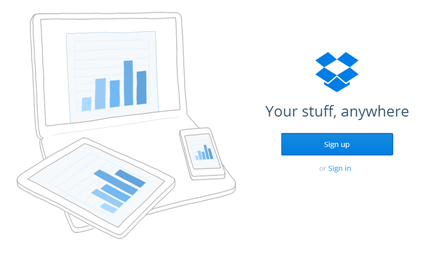
According to research done by Nielsen Norman Group, Website users spend 80% of their time looking at the information above the page fold. This clearly indicates that website visitors are more likely to spend major part of their time reading the information provided in the first fold itself.
Make sure you include your USP, what you offer and how it will benefit your potential clients in a language which is easy to decipher and digest.
Visitors have a short attention span and considering reading and scrolling extra activities there are chances they stick to only what is visible in the first instance so make sure you include everything that is important to make visitors stay on your website in the first fold only.
Want to know why you are losing sales?
Get a FREE website analysis report
4. Highlight What You Offer through Crisp Headlines
Website visitors will not put in so much effort to read through all the paragraphs to find out what you have to offer, they expect to see that right when they arrive.
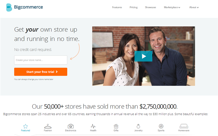
Having a short crisp and informative headline is a must to make your audience realize that they are on the right page. Your headline must effectively communicate what’s in it for the visitors and what is the benefit that they are going to derive. Don’t rely on your gut feeling while choosing headlines for your website; test the headlines using A/B testing and use whichever gives you the best result.
Research proves that 79% of the people just skim through the page while only 16% read in detail.
Make sure your headlines are simple, concise and informational.
5. Offer Clean and Intuitive Navigation
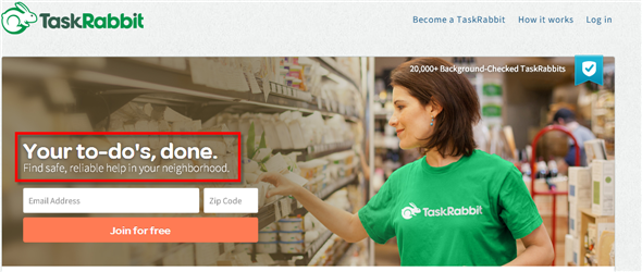
One thing that your visitors expect the moment they land on your web page is to have easy and clear navigation options.
Your top navigation bar must have all the important links that might be of interest to your visitors like other related services, contact us option, home etc.
Your website’s navigation must be intuitive and easy to use.
The language used for each tab must be easily comprehensible because if the navigation is baffling and your audience is not able to locate what they were looking for then certainly it will lead to rejection.
6. Avoid Using Too Much Text: Use Videos, Graphics Instead
If your web page has a lot of content in the form of paragraphs, and long texts without any breaks than be ready to face a high bounce rate.
Simple reason is that visitors aren’t willing to read so much of content to understand what you offer. To make them stay on your website it’s important to highlight all the information explicitly that they want to see.
Also Read: 101 Tips to make your website more engaging
With so many websites offering the same products/services and with people always being in a hurry it’s vital to keep what you write precise and focused.
Make use of images/graphics to communicate your message visually. Optimize your content to reduce length and make scanning of your page easier.
Uploading an ‘Explainer Video’ is another great example of making your web page visually attractive and informative without adding to the length of your content. Videos can be used to showcase your core functionalities, company overview etc. but again be careful and do a thorough research before hiring a company to make an explainer video for you. Remember it requires a lot of expertise to convey maximum information in as few words as possible!
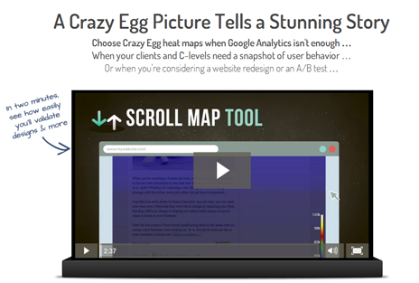
We create websites which rank high on creativity & usability.
View our Portfolio
7. Include Elements That Add to Your Website’s Credibility
Website credibility plays a crucial role when it comes to creating an everlasting first impression. If your visitors find it hard to trust your intentions then they won’t even spend a second before quitting your website. Research proves that visitors are constantly concerned about the safety features of a website, whether its virus attack, payment security or risking fraud. To make certain that your visitors find your website trustworthy you must add reviews, testimonials, security badges, privacy trust seals and a detailed privacy policy as well.
Also Read: 25 tips to Optimize your conversion path to make visitors stay longer
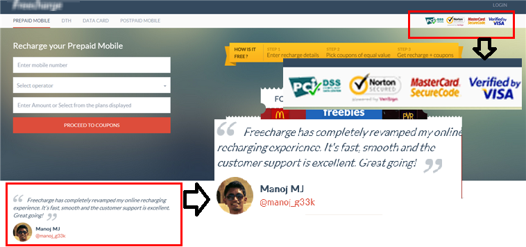
8. Use Graphics that Support Copy: Avoid Using Cheap Stock Images
Eight out of ten people quickly take a glimpse of the images/headings to understand what the company offers, and only two of ten read the content in detail.
To pass the 5 second test the graphics or images that you use on your web page must communicate and support your content.
Instead of using common stock images make sure you use relevant, high quality, unique photos that actually represent who you are and what you offer.
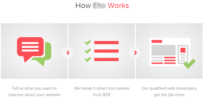
9. Optimize Your Website To Cater To Users Coming Via Mobile & Tablets
Research has proven that Mobile Searches have gone up by as high as 500% in the last 2 years and it is expected to grow even further. So mobile devices and tablets are one such area which you can’t afford to ignore. Just getting a responsive design won’t solve the problem here, it is critical to optimize your web page to deliver the ideal user experience on all devices.
Also Read: Build a User friendly Mobile Website: Expert Tips
Test your mobile and tablet version to check how the headlines, images appear and what is the appropriate font to be used etc.
A desktop version is completely different from a mobile/tablet version so its important to test in order to ensure it ranks high on usability and passes the 5 second test with ease.
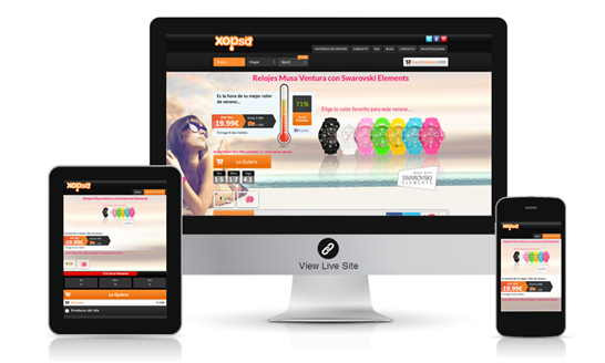
Maximize your conversions with a UX optimized responsive website
View Details
10. Give your visitors a clear path to follow: Plan your CTA’s well
Another very important point to make your website visitors stay for more than 5 seconds on your web page is to ensure that you constantly give them a clear line of action.
If they know what they have to do next without any hassle there are chances that they will take that action.
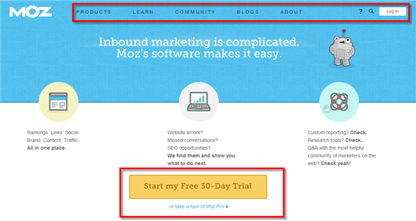
Your call to actions must be easy to understand, should prompt for an action and most importantly they must look clickable.
Also Read: How to create the best call to actions to generate more leads?
Give a clear path to follow because you don’t want your visitors to think too much when they arrive at your site and nor do you want them to keep looking for what they have to do next. So well planned CTA’s at regular intervals which motivate users to take action is the key to pass the 5 second test!

11. Keep All the Sources of Traffic Consistent with Your Web Page
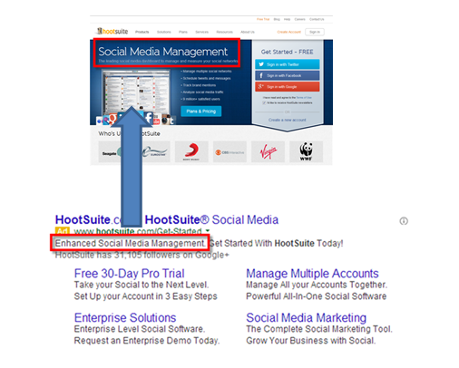
Your website might get traffic from a variety of sources, so it’s important that you maintain consistency. This means you have to ensure that a visitor who lands on your web page by clicking a ‘Pay per Click’ Ad, search results, banner Ad or from any social mediums gets what he is expecting.
Your promotion must be in line with what you are offering. If there is a disconnect between what your Ad and landing page convey then that will immediately lead to visitors exiting your web page without any further action.
Always confirm that your website is ranking for the right keywords, Ads match your landing page copy & social media shares and mentions are relevant to guarantee that your users find what the description specified.
12. Avoid Any Kind Of Distraction on Your Web Page
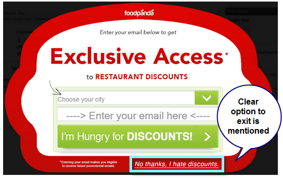
The biggest turn off for any visitor when he lands on a web page would be an auto sound – automatic music that plays in the background. Make sure you aren’t still following this age old trend because if you believe us that’s the major cause of your visitors immediately leaving your website. On the other hand some might consider pop ups as a distraction too. But in reality if used effectively they can be the biggest source of conversions.
Also Read: Read how Website Pop ups can help you get more conversions
Make sure you do not bombard your visitors with pop ups as soon as they arrive or with pop ups that stick and do not go away till the time the desired action is taken.
Avoid using a lot of animation or flashy graphics to showcase your creativity; they will only act as a continuous source of interruption.
We tried to cover all the best practices that brought great results for our clients with you. Let us know if you have more tips to increase your website’s user engagement. In case you have any doubt or want to have a friendly conversation with our web experts then feel free to fill in this form to contact us. We will be happy to help you!
Hire an expert who knows how to optimize your website to generate more leads.
Ask for a FREE Consultation


Comments (2)
 Ankit Arora
 FATbit Chef Post author
Thanks for this stuff, I was in problem that visitors were not staying my website for long, hope your information might be helpful.
You are welcome Ankit.
Do share with us, the positive change you witnessed after making these changes.
In case, you need any help, FATbit is always there 🙂
Have a great day.
Cheers!