Thinking of pop-ups on a website reminds us of the distasteful ads that come up and spoil user experience. Some people have even called pop-ups a medium of online interruption marketing. Here is a statistic that will make you less hateful of unsolicited graphics:
Over 70% of your website traffic never revisits.
In such a scenario, what is your plan to bring visitors back or start interaction? ‘Effective’ pop-ups are the FREE medium to do that. Before you jump to conclusions, let’s get the facts straight; we are not talking about the ones that freeze the website as soon as you land and force you to either register or leave; there can’t be a better example than Zulily.
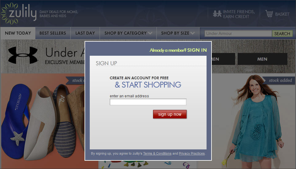
We are talking about the soft block overlays that help generate leads, distribute freebies and garner future sales without irritating visitors. Before moving ahead, let’s first answer the question occupying your mind;
How can a pop-up make people revisit your website or buy more?
Effective persuasive pop-up can increase the count of repeat visitors and also build the ground for purchases in immediate future by;
- Asking people to share contact details to stay in touch
- Addressing doubts about product/service on offer
- Introducing them to a great offer on the product they are viewing
Hire designers and developers for adding custom features to your website at small cost
Consult FATbit experts
How to use pop ups effectively?
Now that we are convinced (at least partially) that pop-ups are useful, let’s see how they can be designed to be more engaging, appealing and effective:
1. Timing is everything
A pop-up too soon is nothing but disruption. Give the user at least a minute to browse the website. Let them scan few pages or at least complete reading an entire blog post before displaying pop-up. However, one timed to appear too late might not get enough impressions. Ask your website popup designers and programmers to configure the pop up’s timing appropriately.
Website pop-up of Wider Funnel appears when visitor is browsing ‘client case study’ page. Such a guest is expected to have gone through the service, and is also mature enough to look for references.

2. Use effective copy
What you write on your pop-up will have a major impact on its effectiveness. What you want from your visitor and how you communicate it are two different things. Some will not fill up a pop-up form laced with sales pitch. Here is an example;
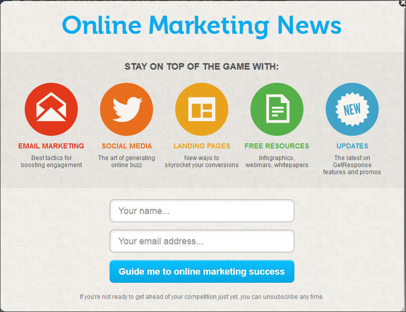
Actual Motive: To make visitor sign up to push promotional content on regular basis
Motive communicated: Online marketing assistance with free tips and guides.
So when you plan the copy of your pop-up, here are some things you need to keep in mind:
- Keep a positive tone
- Talk about benefits of sharing user information
- Space limitations are present. So, say more in few words.
- Ask for least amount of personal information
- Give social proof like testimonials, satisfied clients or number of current subscribers
- Plan an effective call to action
Also Read: Top Tips, Tricks & Cheat Codes to increase online sales
Do you have ample website traffic but suffer from low sales?
Consult conversion experts
3. Clear option of exit
The purpose of a pop-up should not be to trap a visitor and force them to opt in. After coming face-to-face with the interactive graphic, visitor should be able to easily figure out how to close it. Once the user has declined opting-in, he should not be bombarded with it again and again.
Give the visitor CLOSE option with:
- A distinct cancel option
- A link that takes them back to where they were
- A click outside the pop-up window
- Active main navigation
You can opt for a more creative approach to minimize the probability of someone closing the pop up without paying attention. Some marketers have replaced the ‘close’ button with an interesting link (like the one used byFoodPanda in below graphic)
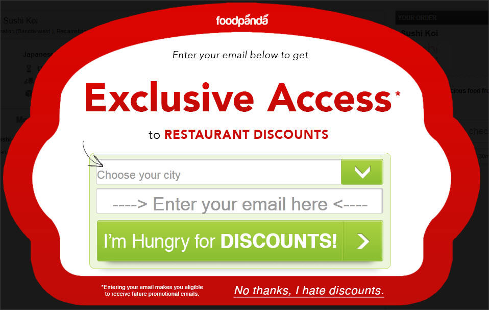
The copy of the link has been planned in such a way that a first time visitor will be forced to read before closing the pop up and still not get irritated.
We however advice you not to go overboard; don’t write something very negative in the copy. Try a pinch of humor.
4. Calculated Approach to Interruption marketing
If you believe visitor registration is very important for your business goals, then, you need to think of effective ways of making a visitor opt-in. This is best done with a little bribe. Give an incentive in exchange for opt-in through pop-up.
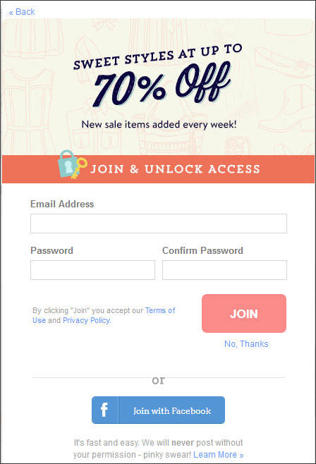
ModCloth has done something very similar & interesting on its apparel online store. It only allows registered users to view products on discount. This way, a user can easily browse their entire website but to access products on sale, they need to register through the pop-up. Had ModCloth placed this pop up on homepage, it would have been most irritating for visitors. Fortunately, they knew better.
5. Make relevant pop-ups
Optimize your pop-ups for maximum relevance. Using the same pop-up on all pages won’t really make sense. Pop-up’s copy should depend on the location of the website visitor in conversion funnel. If you feel that a visitor is there to buy a product, you can use a small polite pop-up at the bottom right corner to inform about an ongoing discount.
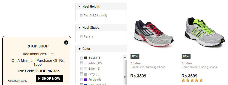
If you are selling a complex product or service online, you can make a live chat pop-up gradually appear from a corner after the visitor has spent ample time reading and browsing. Such pop-ups are highly relevant and never seen as a disturbance by visitors.
Also Read: User Experience Design and Optimization: What-Why-How

If you wish to continue the debate over the use of Pop Ups in a website, feel free to use the comments section.
There is no single formula for higher sales and traffic. Thus, we recommend clients and followers to keep experimenting to gain new insights and make website improvements.
In case you think your website is performing as per your expectations, fill this form to request FREE reports to identify website improvement areas.
Consult FATbit for website design and feature upgrades
Initiate a conversation


Comments (1)
 Alexandra
Thank you for the article! Pop-ups can be smart and useful, that is true. But you also need to know how to make them not irrelevant. With smart help of services like rightconversions.com. You can fully use all the advantages that pop-ups can give you.