The biggest apprehension when you start a venture is not of earning profits but to earn a name. To establish your business through traditional mediums, you may take years, while a website can do this for you more readily.
There are many startups, which began with a small business site and tested the market feasibility first. After seeing the orders coming their way, they went for customized solution to improve their User Experience and conversion. It saves one from unseen losses and ensures results.
Startups Which Started Really Small
Read below about startups, who started with blogs and turned it into bigger platform after testing the target audience. It will give you a fair idea about how to start a small business online.
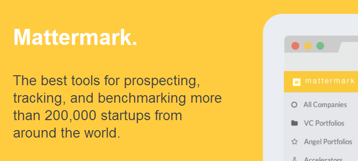
Mattermark

Danielle Morrill did her first post, ‘The Y Combinator Startup Index’ in which she put across the success evaluation of YC startups. It got great response of target audience and she kept publishing such posts for next 10 weeks. One fine day, she declared “In case it wasn’t obvious, this is our startup and these posts are our MVP” and this is how Mattermark was launched.
A simple business idea can become a success with the right balance of hardwork and efficient marketing
Contact digital marketing experts
Groupon

Very few might know thatGroupon too was initiated as a blog. A WordPress blog was repackaged to launch Groupon. The blog posts were used to announce offers, discounts and various Chicago deals. Very soon, the team realized that their target audience is responding to deals and people are paying for coupons. This was it, when the business got expanded beyond a blog and a complete infrastructure was developed for it.
Also Read: If you also wish to start a Groupon like Daily Deals Business, here is a startup guide.
App.net
Dalton’s blog post regarding Twitter’s restriction on API got instant acclaim with 80,000 views in less than three weeks. Many businesses had been affected by that Twitter’s announcement and thus an alternative, which offered open API was expected to be welcomed. The reactions, shares and feedbacks over Dalton’s post stamped the fact that market was ready for it. By that time, App.net was already on the verge of re-launch and his post grossed so many supporters, who were leaving comments for a product even before it was released. The team utilized those comments to launch a better product and App.net secured $803,000 from 18,000 customers within two months of Dalton’s post.
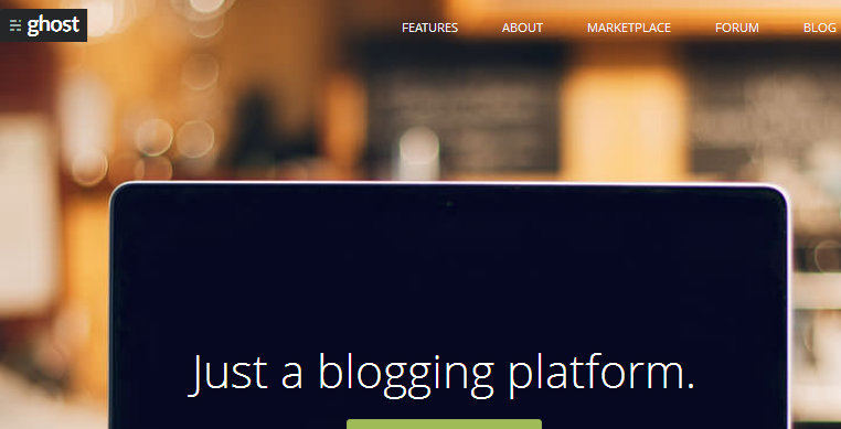
Ghost

John O’Nolan made a page which described the ideal blogging solution. He mentioned in his post how self-hosted solutions had grown beyond viability. Its blogging campaign garnered huge attention and Ghost was launched as a blogging platform, as an easy to use alternative for bloggers. O’Nolan received around 91,000 views right after he published the page. While ghost is still growing, the site receives 200,000 public views monthly.
You can also begin with a small platform to validate your idea first.
It will help you create a following that can further be transformed into regular customers. Once you have succeeded in creating a name and got the way to reach your target traffic, it would be the time to buckle up your website for a bigger fight. Acquiring highest conversion rate must be your next target, for which you may need to offer a customized experience to your visitors.
How to make your website better to increase conversions?
A business website is expected to offer an experience that user remembers and feel comforted with. Here are five commandments that small businesses should stick to, in order to grow online.
1. Customer’s Memory is Short
The matter of question is why and how a customer would remember you when you hardly remember what you had in the breakfast yesterday. Similarly, staying in visitors’ memory is tough as nails because there are so many links that a user opens, shuts and goes through in one single day.
- Cling to customer’s Memory through a business page that is visually, spatially and operationally impactful.
- Don’t feed them with too much information. This is the blunder that many e business sites commit while developing their online business.
- All that a user needs to view on your home page is your logo for business and a precise text informing about the products or services you are selling.
- Remember the first user experience is worth a millions because one good thing that would get registered in his mind will lead to bringing him back again. It can be anything, the view of your site, the comfort of ordering, the selection you offer or the simplicity of design.
At times nothing goes wrong but nothing goes right too. Making that one right move is all about creating individuality of your business.
Do not believe in following the rat race or feeding them with same spoon. Know your target customers and present your best in best possible manner.
Want to know what clicks and connects with your online buyer! Talk to an Expert with enough Experience
Contact FATbit
2. Your Site Mirrors Your Business
The first thing your customers will look at is your business website; hence, it would not be an understatement to call it a mirror to your business. Everything that you put on your webpage from, text, images to special features is of utmost value to user response. Even the colors that attract your customers matter more than the list you offer to read because he may not opt to open any link if the first look of your site is not inviting enough to prompt his next step.
- Converting traffic into visitors and visitor into buyers is an action evoking process that goes step by step. Beginning from the domain name to creating a shopping cart, there is a scientific approach that a commercial website follows.
- Looking for domain names that catch attention, are easily memorable to stay on the tip of tongue, easily relate to your business and speak for your unique business policy is the first yardstick to create the best business website.
- Don’t place yourself on web for users to just know that you are there, place instead to let them know that you are there to be relied on.
Also Read: 101 good ways to increase online sales
3. Landing Pages are More than Important
What disappoints an online visitor is the time that your landing pages take to open. Another frustrating thing can be a stack of menus inside menu, which obviously shuns the interest of a visitor for once and all. Devising navigation strategies is the best way to deal with such occurrences.
- Honestly, there is not one single path to define your website navigation because there is not one way which can be termed right to woo a visitor. Even if it exists in some manner, then too using it completely as others may not be of your use, because it will restrain your individuality.
- Design your navigation such that it makes you look different among your competitors. For instance, instead of menus piling on screen, you can make use of drop down menus, which are more desirable by customers visiting for a purchase.
- Using the same tools and techniques in different manner to establish you among the best business websites is what you must opt for.
- Apart from navigation, it’s the loading speed of a page that matters. A landing page should neither take more, nor less time while loading, as pages that load too quickly are not trusted by Google and those, which taking more time may disinterest visitors.
Helpful Tool: Check your website’s loading speed with Page Speed Insights
4. Differentiate Between Customers
Distinguish your customers regionally and locally to get business online. While designing a small company website, it is important to take in account the area proximity.
A website no matter how beautiful done or navigated, is a sheer waste if it does not get relevant traffic and remains unknown, un-clicked in the search engines.
Hence to design business website for strong local presence, it is a must to include keywords, which are not just industry specific but indicate region, city or zip code too. This is the rule that applies to every small enterprise whether you want to sell burgers online or make your medical appointments available there.
Another important case for small business enterprises is of those who seek expansion of business through re-designing a site. The moment of Re-designing a business website is rare and does not come off and on. It’s a brand identity that needs to be fixed for the good of a business but whenever you feel like refurbishing your site.
Also Read: Case study of what FATbit did to re-design an online store to make it Spain’s biggest ecommerce success story!
5. Past Clicks Make Your Future Clientele
Tracking old behavioral patterns is an advantage that comes across only while giving a new look to your business website. It is hugely important to track the old site’s patterns as to see which feature your customers responded the most or through which source you were getting new customers to your site.
Ericson did the same thing to track which areas of its old web site were getting more clicks and which were getting lesser, with software named Web Trax. Re-casting their site gave them more purchase orders from customers, as they got a better idea of their products than earlier.
Helpful Tool: There are tools like Google Analytics, CrazyEgg and ClickTale, which allows testing web pages for clicks and user browsing behavior. Know more about them here.
The study of sources which can connect your business to target customers is the first step of starting a web business. Basically, it is an estimation that stocks out of the technical minds, which are good at playing with business web design tools.
Establish -> Grow -> Expand
If you are a startup, looking forward to grow online, then focusing on improving the user experience of your website should be your next step. Remove the errors that stop you from reaching the top and hamper your business growth.
Need any professional advice for your website? We have been helping online businesses since 9+ years
Talk to FATbit’s consultants
