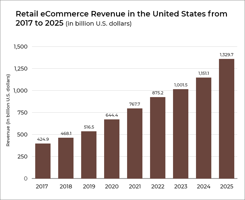
The pandemic has changed consumer behavior undeniably in both big and small ways and retailers are adapting to it. According to stats, year after year the earnings of eCommerce seem to climb higher and this year, eCommerce retailers in the U.S are projected to garner $875 billion, something which was not expected until recently. And, with the global economy still reeling from the effects of COVID-19, the demand for eCommerce is only expected to move upwards.

Source: Statista
While eCommerce will continue to be an integral part of retail strategy, future success will ultimately depend on the creation of a cohesive customer experience. As per a doctoral thesis, it has been found that a single design element, if used effectively, can increase the purchase intention by up to 10% (a substantial amount in online retail).
Covered in this blog are various aspects of eCommerce design that create and provide a compelling customer experience, thereby, increasing perceived trustworthiness and sales.
Table of Contents
Knowing the Customers – Understanding their Psychology
It is often said that decisions are made through logic. But that is far from the truth. Even what we believe as logical decisions are arguably based on emotions. This even applies when making purchases online, where emotions act as a key component in how decisions are made. Understanding what influences purchasing decisions is an important skill.
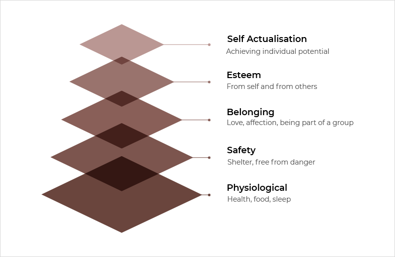
While designing an eCommerce website (or an app), psychology can be used as a powerful sales tool as the consumers are placed at the center. The most well-known representation of human psychology is Maslow’s hierarchy of needs. The diagram below shows various motivators (emotional) that drive decision-making and gradually lead to an increase in sales.

Maslow Hierarchy of Needs can be used as a powerful tool for product placement
Persuading users to desire a product can be done by making it more appealing, but that is only half the journey traveled; compelling them to buy is equally important and psychology can help there too as you can segment your customers on the basis of personas.
Creating User Personas to Drive Conversions
eCommerce user personas are a meaningful way to segment your customers and gain better insights into their perspectives, behaviors, goals, and what motivates them to shop. The data gathered through personas can help in determining how the unique preferences of buyers can be catered to – this might mean designing or redesigning an eCommerce website.
It is also important to consider age, gender, socioeconomic and cultural background, as well as personality traits (early adopters or risk-averse). Understanding shoppers’ emotional triggers can also influence them to shop. Triggers can be categorized as:
- Internal Triggers- Include aspirations, status, insecurities, fear, stressors
- External Triggers- Obstacles, life changes, other people’s expectations
- Seasonal Triggers- Change of seasons, holidays, birthdays, interest or profession related events
For example, a person who is starting their professional career might need a wardrobe upgrade to feel more confident. Here, buyer personas can help marketing professionals with eCommerce website designing so that users respond to them. In this scenario, the products can be displayed under categories, and as a consequence, the better customers are understood, the better customer experience can be provided.
Creating an eCommerce Experience – The Four Dimensions
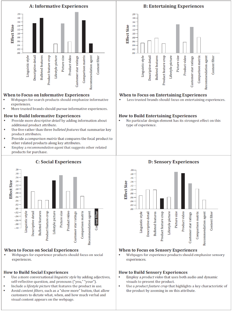
While designing an eCommerce website (or an app), the prudentially elegant intangible products need to be “tangibilized.” This is known as crafting an online customer experience and should be done so that satisfaction post-purchase is quite the same as in trial or promise. Research confirms, for the creation of the most effective, online experiences, its four dimensions must be considered. These are:
- Informative: This is a cognitive dimension that helps the visitor with decision-making.
- Entertaining: This is an affective dimension that captures the aspect of pleasure offered by the webpage.
- Social: This dimension refers to the warmth, feeling of human contact, sociability and has nothing to do with social media.
- Sensory: This dimension mimics the sensations a product provokes in the offline world and is also known as sensory dimension.
But, the relevance of each dimension is subject to a specific product and brand, i.e. instances between less or most trustworthy brands. And, surprisingly, all these dimensions don’t influence the purchase intentions equally. Entertainment has the strongest effect and is directly associated with consumer intentions, followed by information, social and sensory aspects.

Creating Effective Online Customer Experiences. Source: IntoTheMinds
Note: Although customers buy on the basis of emotions, the purchase is always justified through logic. And, eCommerce experience is more than providing information. It is about creating a page that resonates with the customers.
Two Critical eCommerce Website Design Factors
With hundreds of millions of products on display, the competition within eCommerce industry becomes fierce. Here, the key to boosting sales is orchestrating content on the site’s page to create customer experiences. This can be done through:
- Building Trustworthiness
- Product Evaluation
Building Trustworthiness
In a cookie- cutter environment, making a product sell out narrows down to building knowledge around the eCommerce-specific user interface and user experience design, i.e. a company can be unknown to a user, but the interface should appear familiar. As a buyer explores an eCommerce website, graphic design and usability will make the first impression and will also lead to the re-assessment of ‘trust value’.
Trust, defined as a firm belief in the ability or strength of something, is superior to faith and inferior to confidence. Acting as a mechanism that facilitates decision-making, trust mentally reduces complexity under uncertainty. For business relationships, it is a highly valuable element as it fosters risk-taking in transactions.
For example, when buyers examine the eCommerce site cognitively, such as while entering a transaction, they should be confident that there is more to gain than to lose.
Thus, the user experience of an eCommerce app should be designed to induce a positive effect where the main concept of UX is trust.
Types of Trust
- Initial Trust: A prospective customer assesses the information of a product and a merchant on the basis of third-party information.
- Experience Based Trust: This is based on the direct experiences of a customer, where the initial transaction is followed by the evaluation of the outcome.
Lastly, relationship management which refers to order handling and inquiries may also affect one’s level of trust.
Product Evaluation
As per a study, people judge reality on the basis of appearances. It doesn’t matter if a buyer is sophisticated in technology or is naive. What matters is that up to some extent eCommerce sales depend on impressions, i.e. the viability of the product will be determined not only by considering who the vendor is but also by its representation as both are inextricably linked.
For example, a customer is looking to buy a watch. As it is to be sold online, the buyer needs to make a decision without touching or trying it. And, only on the basis of assumption, the prospective buyer will translate appearance into confidence. So the watch has to look right, conveying an impression of modernity and reliability. Various methods like 360-degree viewing, product video, and avatars (for certain products) can be used.
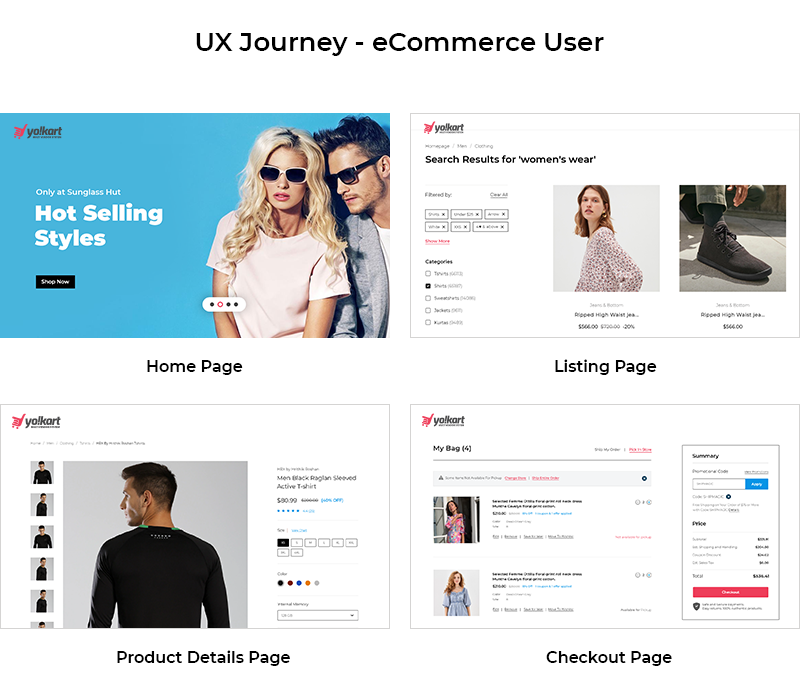
eCommerce User Experience Journey
Determining user experience by offering usability and visual pleasure will undoubtedly go a long way. Since industries are designed around people, eCommerce sites invariably have a similar sequence of pages to funnel shoppers through to the check-out process. This includes – homepage, category page, product page, and checkout page.
The information on each page – content, layout, navigation, helps shoppers find what they are looking for while also steering them closer to purchase. Considering this, all of these pages should be carefully designed. Discussed below is the way forward with the designing of the four pages, starting with the homepage.

Uncluttered Homepage Design
For shoppers, a homepage is the first impression. They should be able to ascertain the primary value proposition quickly. This can be done through crisp copywriting and photos illustrating the benefits of the products. If shoppers are required to read a lot or have to stick around longer and search for an explainer video to understand the product value, then the value wasn’t apparent instantly. Study highlights that visual clarity can impact a person’s decision by one-third to stay or leave an eCommerce store’s homepage. Sometimes buyers are looking for shoes, dresses, gym equipment, or accessories like jewelry, online. If a website doesn’t have a clean design and the homepage is cluttered, then it will be eye-draining for the buyers as they will have to stick around longer and search. Eventually, this will lead to a higher bounce rate. So as a UX principle, the homepage of any eCommerce site should be clean.
Easy to Navigate Category Pages
A category page (or product listing page) is an eCommerce store’s important asset. It is where the products are displayed. Having an easy-to-navigate category page helps with the user experience and through heightened usability the traffic and conversions increase. The structure like grid and the category names too have a crucial role in SEO ranking.
To better understand user needs and have easy to navigate category pages, the following UX practices should be kept in mind:
- Use common terminology so that consumers can relate.
- For parent categories, use contextually relevant images that are large and have high quality.
- Have optimized filters so that the eCommerce site is browsable through faceted navigation.
- Have descriptive (3-4 lines) subheadings for category landing page design.
- 79% of users only scan the page, so the eCommerce product listing page design should create a visual hierarchy, highlighting the most important elements.
Compelling Product Pages
In the space of eCommerce, product pages are ubiquitous. Often, the product page is where users make their minds about whether they want to purchase the product. The quality of the page, its visual elements, navigation, content, and more become the centerpiece of a user’s eCommerce experience. While consumers bypass the homepage, it is the job of the product page to convince browsers to add products to the cart. This can be done via psychological triggers – trust being the most crucial factor. Hence, it is important for a product page to both fully explain the product and the brand. Other areas of focus:
- The product page should be consistent with your brand.
- The loyalty and confidence of the customer should be boosted.
- Customers should be inspired to promote the brand.
- It should grab the attention of consumers immediately and the add to cart button should be easily distinguishable.
Simple Checkout Pages

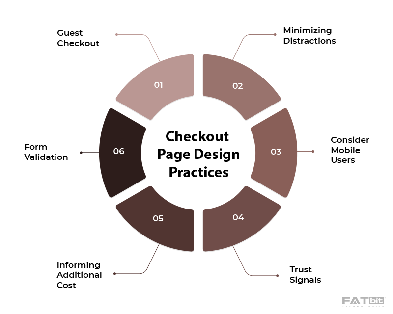
A checkout page is where a customer is converted into a visitor. It is also where a customer adds their details, chooses a shipment and payment method, and completes the order. So the checkout page design should facilitate a smooth transition for users with different personas. Types of checkout pages:
- One-page Checkout
- Multi-page Checkout
One-page Checkout
One-page checkout is quite popular as the checkout process is accelerated through it, adding to the customer convenience. The design of this kind of checkout page improves the user experience as buyers don’t have to wait for several pages to load. But it can be challenging too as larger amounts of data is to be collected. Here, it is important to design the page in a way that the shopper is not overwhelmed by the information they need to enter.
Multiple-page Checkout
As the name suggests a multiple-page checkout has multiple pages that might seem less user-friendly. But this type of checkout has the biggest advantage of collecting data seamlessly. Even if the shopper abandons the checkout process at a later stage, the data entered earlier has still been captured. This kind of form is also cleaner and simpler because the fields are divided between several pages. Other points to be considered are:
- Minimal form design that guides through each stage of the checkout process.
- Allow guest checkout.
- Minimize promotions.
- Allow users to customize their orders.
- Using heat mapping and A/B testing, are great ways to test and improve the checkout process.
Other Attributes to Enhance User Experience
1. Accepting Multiple Forms of Payment
In the world of eCommerce, convenience and security are the primary concerns of shoppers’ which can also be the prime reasons for cart abandonment. Fortunately, there are several payment options backed by trusted companies like Apple and Amazon that can alleviate security concerns and expedite the checkout process.
2. Boosting Trust with Security Badges and Support
The shoppers can be given confidence by displaying security badges and third-party integrations. Verified rankings and reviews can also be placed at checkout. Support features like chatbots, links to FAQs, return policies, customer support lines, and more too can be incorporated. Here, it is important to note that while shoppers may not use resources at checkout, knowing they exist, brings them peace of mind.
3. Providing a Clear Order Summary
Giving shoppers concise order summaries during checkout is mandatory. It allows them to view product details with quantities, shipping and billing information, breakdown of fees, and more. If the eCommerce site is charging a specific amount or is providing free shipping, buyers would like to know. If the information is not provided or is provided later when the credit card details are being input then the chances of cart abandonment will be high especially if the tax charged or the shipping rates are higher. The users need not be shocked, so it is wise to have them informed at every stage of feedback. It would also be smart to elegantly display product pictures, making sure attributes match with the customers’ selections, i.e. color, size, and more.
Ready to Customize your eCommerce Website?
Conclusion
For ages, shopping has been tactile. Angles, edges, weight, fit and feel, all these things matter! In the absence of presence, familiarity through design and display size are crucial. A comfortable paradigm consisting of spacious screens, straightforward navigation, images that are truer to life should be delivered through the design of an eCommerce website. And, regardless of how consumer behavior continues to change, retailers should focus on developing stronger relationships with their online customers. For it is only via trust and by looking for details that are hidden beneath fine prints and caveats that businesses will be able to maximize sales.
If as an entrepreneur, you are looking to revamp your eCommerce website design, contact FATbit Technologies. Their expertise in the field of eCommerce design and development can help in creating user experiences that resonate with customers and can help businesses’ to catch a wave of profitable growth.
Frequently Asked Questions
Q1. What is an eCommerce design?
Ans. An eCommerce design has several aspects like brand, copywriting, UI, visuals, and more. The eCommerce UX must work in tandem highlighting the value of the product while also motivating shoppers to make purchases. For eCommerce website designing, one must plan, conceptualize, and effectively display the products.
Q2. Why is eCommerce website design important?
Ans. The design of an eCommerce website is an important factor as it can improve customer experience by building trust. This can potentially lead to more sales.
Q3. How can an eCommerce website improve user experience?
Ans. eCommerce websites can improve user experience by having a responsive web design so that the eCommerce website experience is consistent while using any platform such as a tablet, mobile, or desktop. The eCommerce website UX can also be improved by optimizing the webpages, using product images to build trust, and having intuitive navigation so that buyers are swiftly taken to the checkout page.
Q4. What makes a good eCommerce experience?
Ans. A good eCommerce experience consists of having a few similar attributes, i.e. compelling copywriting, illustrative visuals, intuitive layouts, and pages that clearly display the value of the product. The end goal is to provide a seamless shopping experience to buyers while they make a purchase.

