Website owners spend a lot of time, money, brain and sweat for bringing traffic to their websites, but most of them don’t track how many of these visitors leave immediately after landing on their website i.e. (Bounce Rate) and very few keep a track of the number of visitors exiting the landing page after browsing the other pages of their website i.e. (Exit Rate).
This post will give you a better picture of:
– What is exit rate and bounce rate?
– What is the difference between the two?
– Analytics that can be used to track them.
– Some quick tips to reduce the exit rate and bounce rate of your website.
What is bounce rate?
When a visitor lands on your web page and exits immediately or after some time without visiting any other page, it is called a bounce.
Bounce Rate = Bounces / Entrances
Bounce from Page A:
Lands on Page A → Leaves Website
Expert Tip – Optimize landing pages and top entry pages. Take care of the first impression and keyword optimization
What is exit rate?
Every page on your website has an exit rate. It is based on the number of visitors that leave your website through that particular page. This is irrespective of the number of pages they have browsed on your website before reaching that page.
Exit Rate = Exits / Page Views
Exit from Page A:
Lands on Page A → Leaves Website
Lands on Page B → Page C → Page A → Leaves Website
Lands on Page A → Page B → Again Page A → Leaves Website
Expert Tip – Optimize your process pages. Focus on the flow.
Are they different from each other?
Exits include bounce as well as internal-traffic exit. So, it goes one step ahead and also tells you that there are other leakages in your website.
Nobody landing on your website should ‘bounce’ just after viewing a single page. So, your site will always have an average bounce rate which you should continuously try to reduce.
Someone who visits your website “will exit” at some point of time. So your overall exits sum up to be 100%. Lowering the exit rate for one page will increase it for the other. It will always be compensated some place or the other.
If you do not have the time to manage critical details about your website’s traffic and performance
Hire a Google Analytics expert
Also Read: 12 Effective Ways to Reduce the Bounce Rate of a Blog
Does bounce rate and exit rate directly affect search engine ranking?
Your website or webpages are bound to have exits, unless you have no visitors at all. If a person visits your webpage (home page or any other internal page), browses quickly, finds the content totally irrelevant, feels lost and returns to the search results within 10 seconds, then,it is an “actual bounce” and is counted as one in Google Analytics and is considered bad for SERPs also.
Another person organically lands on the same web page, finds what he is looking for, spends around 15 minutes reading the information provided on the web page and exits. This is counted as a bounce by Google Analytics but not bad for SERPs.
For search engines, what is more important is the visitor’s “dwell time” – the actual time spent on a web page by visitor. Search engines will not just depend on the numbers measured by Google Analytics.
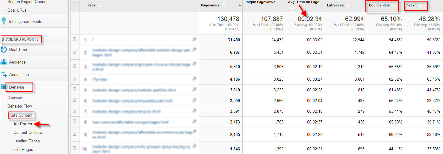 CLICK TO ENLARGE ( Open in new tab)
This is why your Google Analytics account also gives you information about the time spent by the visitor on the web page.
When is bounce rate or exit rate irrelevant? Should I always go by the numbers?
After installing Google Analytics, most website owners either do not know how to use it or get alarmed by the big numbers & data. Our advice is that you give the website some time to perform and have reasonable expectations from the individual web pages. Being a little conservative would be better.
Your product might be such, maybe complex or a little expensive, that the visitor cannot decide to buy immediately. All your visitors will not be impulse buyers. Give them time to decide. If they like your website, they would probably come back. You need to understand the nature of your product and the psyche of your visitors.
- Keep Calm because your site might be bookmarked:
When a visitor is still in the research mode, they will broadly scan your webpages and finally exit. This does not mean that the last page where they left your website is under-performing. They might bookmark your website and come back later. Some visitors might add a product to the cart and finish the payment process a day later. This is also not something you need to worry about.
- Act logical at default-Exit Points:
Some pages of your website are the logical exit points. For instance, the checkout confirmation page/thank you page or email subscription page. If a visitor reaches these pages, they will leave the website.You can of course try to persuade the visitor to shop further but all will not do so. A high exit rate for such pages is desirable.
- More the dwell time, lesser are the worries:
If a visitor comes to an informative page like a user manual or a blog post, stays there for a long time, reads carefully, in some cases prints the data and leaves, this is also not a reason to worry. The page has served its purpose well. As discussed earlier, if the dwell time is appropriate, the exit rate does not matter.
- There can be other Contact options too:
Some of your visitors might refrain from filling up your RFQ form. They instead decide to call you back or mail you on the email address mentioned on the same RFQ page and exit. All this will still be counted in Google Analytics.
So, the bottom line is that you should not always go by the numbers.
The numbers are there to tell you if something is strikingly wrong. You need to analyze the nature of the page, behavior of your visitors and use your fair judgment. Do not always go by the overall figures.
When is high exit rate bad? When should I panic?
There are some pages of a website on which a visitor can never land directly from an external source. This could be your conversion form or the checkout pages of an ecommerce website. If these pages have a high exit rate, there are some things you need to think:
- Are the shipping charges too high?
- Is the ‘submit’ button too hard to find?
- Is the purchase form too long or confusing?
If the visitor exits from the initial pages of a multiple page newsletter, it means your content is not engaging enough or maybe too long.
Some of your landing pages might have a very high bounce rate. That can be a major issue because the traffic for that page might be generated through paid advertisements.
All these are red flags that need to be taken care of when you analyze the exit rates of your web pages.
Understanding the visitor psychology from numbers needs detailed analysis and expertise
Talk to conversion optimizers now
How do I handle high exit and bounce rate?
1. Landing page Optimization
Your landing page is the greatest impression & conversion maker. This entry page will decide if the visitor will browse any further. If these pages have a high bounce rate, finding answers to following questions can greatly help:
- Am I delivering on what external links have promised?
- Is the organic search optimized for the right keywords?
- Is it targeting the right traffic?
Make sure that your advertising is reaching your target audience and not generating irrelevant traffic. Create dedicated landing pages for all your ads to convert greater number of visitors.
A landing page should answer all the needs of the visitor that you tried to question through the advertisement. If your ad and the landing page are not in sync, the probability of an immediate bounce is very high.
The best people to tell you about what is wrong with your website are either industry experts or your visitors. So, it is best that you take actionable feedback from both of them
usabilla.com
fatbit.com

2. Easy navigation
The navigation though your website should be easy and intuitive. You can experiment as much as you want with the look and feel of the website but the navigation should be conventional so that even the first time visitors do not face any difficult while browsing.
3. Appropriate use of call to action
The webpage should be designed in such a way that call-to-action elements are clearly visible, and properly guide the visitor to the next step of the conversion process. They should remove all apprehensions from visitor’s minds and clearly state where the ‘click’ will take them.
 You can see if your call to action button is getting noticed and getting clicks through heat maps generated by some online tools. These tools will track the movement of a visitor’s mouse, giving you a fair idea about what is going wrong.
Some of these tools are:
clicktale.com
crazyegg.com
inspectlet.com
Also Read: Get better insights on tools like clicktale, crazy egg and google analytics
4. Provide relevant information before the “add to cart” option
- Be transparent about your shipping charges and other additional costs so that there are no last minute surprises.
- Inform the visitor about your areas of delivery.
- Give details about availability of special services like ‘Express Delivery’ and ‘Cash on Delivery’ service in the visitor’s area and related charges.
- Provide enough reviews from past visitors to prompt conversion.
We know it is not easy to generate traffic. Convert casual visits into sales.
Talk to conversion experts
5. Detailed analysis of abandoned carts
Keep a check on the number of abandoned carts and see if there is any trend. Maybe the cart is abandoned at the stage where shipping charges are added. This is a clear indicator that your visitors were not comfortable with the charges and left. Try to retarget the visitors who left midway through ads or an email reminding them about their planned purchase and about limited period offer (if any).
You can track step by step performance of your “add to cart” option through Google Analytics.
6. Optimize the checkout process
The checkout process, especially for an ecommerce website, should be very quick and with minimum steps.
- Allow login through social media websites. This way the visitor does not have to input their personal details again and remember a new password
- Provide multiple shipping and payment options
- There should be an option to change the order even on the checkout pages
- The checkout pages should display the image of the product being purchased
- Remove all other navigation from the checkout pages
- Do not try to up-sell or cross-sell through these pages.
Also Read: Infographic: 7 proven ways to improve conversion and visitor engagement.
7. Optimize your conversion forms
Here is a quick guide from FATbit to help you with conversion form improvements.
8. Well structured home page
Your homepage is the gateway to almost all internal web pages. It might also serve as the landing page for a lot of marketing endeavors. It can make or break your brand image. The layout, content, architecture and navigation of the homepage should be engaging, and prompt the visitor to visit the internal pages.
Click to see a perfect home page example.
9. Research of site search terms
Sometimes, the site search results page has a very high exit rate. See the list of search terms used by your visitors and the results they were shown. If people are searching for unrelated things, it means you are probably promoting your website for the wrong keywords through search engines and paid ads. If the results were unrelated, you need to check what is causing the issue.
Check this guide from Google for better understanding.
10. Pages with quality content targeting the right keywords
The content of an informative page should be unique and engaging with a lot of visual elements so that the reader stays on the page for longer time. The content should be rich with relevant phrases & keywords so that visitor is immediately reassured. Your every page should be doorway to other pages so that you can delay the exit of a visitor.
11. Proper use of acknowledgement page
If your website is only for lead generation, then, you cannot do much to reduce the exit rate of your acknowledgement page (that appears after filling the conversion form). You can prompt the visitor to read about other services or share on social media platforms.
- Try to cross sell related products
- Ask them to fill a survey about their experience and suggestions for improvement
- Ask them to leave a testimonial
- Give them a discount on their next purchase. This will give them an incentive to shop again with you
- Ask them to refer you to their friends through email or social media platform
12. Open external link in new tab
If you have used an external link as anchor for your page content, make sure it opens in a new tab. This way, a visitor will never be forced to leave your page immediately, resulting in a low exit rate.
Also Read: 101 actionable points which you must check to reduce high bounce and exit rate.
Key Takeaways:
There are two types of pages: pathway pages and information pages. A pathway page should prompt a visitor to scan, choose and move ahead. An information page is where they need to stay, read carefully. Instead of worrying about the overall bounce rate and exit rate, try to see the nature of the page. A visitor spending too much time on a pathway page means he is unable to get the required information. If he stays too long on an information page, it means he is confused and not engaged.
By focusing on the above mentioned points and correctly reading the Analytics findings, you can drastically improve conversion chances, improve visitor engagement and of course manage exit & bounce rate smartly.
Though we made every effort to cover all the important points, please get in touch with FATbit team if we missed anything.
Our conversion experts will be glad to assist you with your queries & doubts.
Consult our team now


 You can see if your call to action button is getting noticed and getting clicks through heat maps generated by some online tools. These tools will track the movement of a visitor’s mouse, giving you a fair idea about what is going wrong.



Comments (3)
 Drew Johnson
 SSCSWORLD
 FATbit Chef Post author
I personally often get confused between exit rate and bounce rate which has been clearly differentiated in the post. Two points in the article which made me rethink when I analyze my anlytics reports are:
1)Trying to reduce the exit rate of one page will ultimately increase that of another. So you should not always go by the numbers.
2) Proper use of acknowledgement page to reduce its exit rate.
The team has done a wonderful job in gathering these valuable points. Thanks a tonne. Bookmarked and shared the post.
Bounce rate is the percentage of people who landed on a page and immediately left. Bounces are always one page sessions.High bounce rates are often bad, but it’s really a matter of context. Some queries may inherently generate high bounce rates. Exit rate is the percentage of people who left your site from that page. Exits may have viewed more than one page in a session. That means they may not have landed on that page, but simply found their way to it through site navigation.
Hi,
Thanks for sharing this good piece of information on bounce rate and exit rate.
FATbit Chef