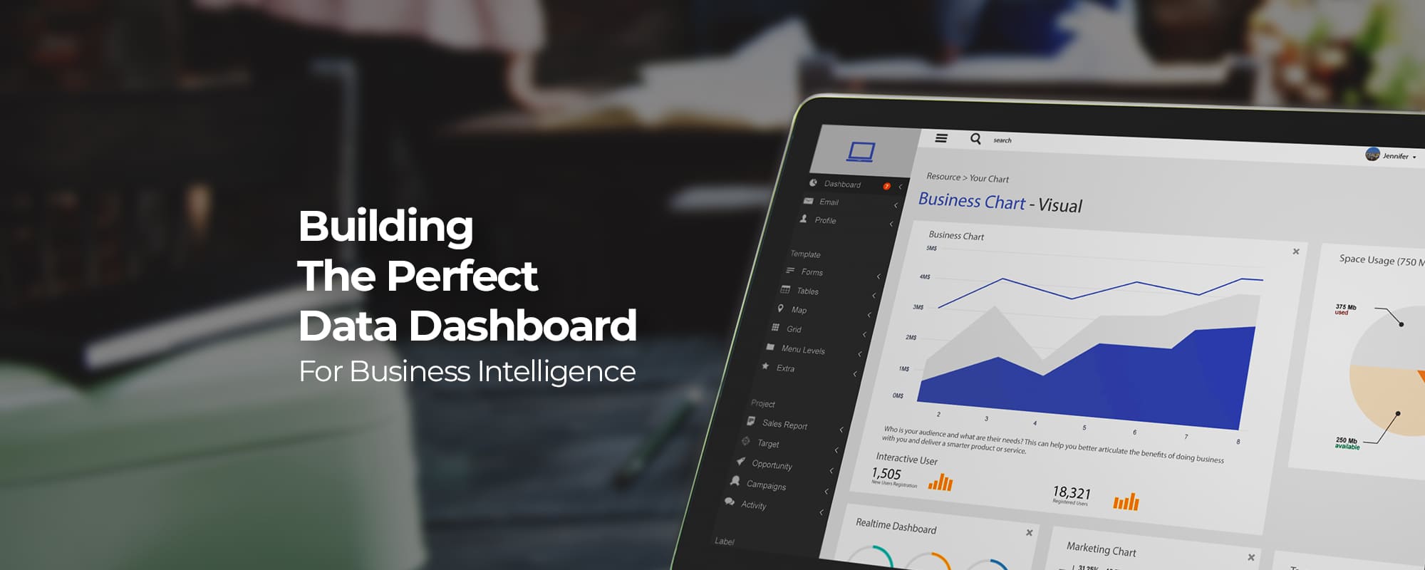
Is the recent boost in sales indicative of growing customer trust? Has the recent ad campaign got the expected results? These are the kind of questions over which marketers rack their brains in an attempt to understand business trends and how they may affect them. They often look at data to connect the dots. But data is only helpful when it’s organized and presented in a way that’s easy to visualize and hence the rising demand for informative dashboards.
Define The Purpose of Your Dashboard
Dashboards are great asset to understand the overall performance of a business and pick up on early signs of potential issues. But not all dashboards are created equal. Many dashboards are ineffective simply because they are built on no clear requirements. At the very least, before building a dashboard, one has to get the answers to the following two basic questions:
- Who will use the dashboard?
- What kind of decisions will be made based on the data provided through the dashboard?
If you’re unable to answer these two questions, it’s important you probe for more clarity. Only once the objective of the dashboard is clear in your mind, should you proceed with its development.
Types of Dashboards
There are 4 types of data dashboards for business intelligence (BI) and their selection comes down to the overall goals of your analytics and data monitoring practices.
1. Strategic Dashboard
The strategic dashboard is used to monitor the long-term business strategy through key performance indicators. Its chief aim is to bring departmental performance in alignment with the overall business strategy. They are complex to create and are mainly used by senior-level management.
Strategic dashboards rely a great deal on past performances. A strategic dashboard offers a bird’s eye view of the revenue and the customer overview for the current and last period. The findings from a strategic dashboard can inform the management of the current state of business, its growth rate and how stats stack up against the long-term business goals.
2. Operational Dashboard
Operational dashboards are meant for monitoring and managing the operations within a shorter time-frame. Their administration usually rests with the junior level managers. Since these dashboards are based on real-time data, their main focus is on creating alerts about business exceptions. Operational dashboards facilitate the smooth workflow of departments and help them stay ahead of problems.
It gives crucial operational information for KPIs such as Total Impressions, Total Clicks, Total Acquisitions and Cost Per Acquisition and the total amount spent. This is very useful as any deviation from the desired course can alert the marketing department to adjust its operational activities.
3. Analytical Dashboard
As the name suggests analytical dashboard is meant for analysts to collect vast amounts of data and use that to support executives. Analytical dashboards’ effectiveness is derived from their use of historical data-usage.
Analysts study this data to find out trends and create predictions and targets, which can form part of a business intelligence strategy. The analytical dashboard can be seen as an intersection between the strategic and operational dashboards.
4. Tactical Dashboard
Tactical dashboards are used to trace the performance with the company’s goal and objectives. They help middle-level managers in the decision-making process and see how the market reacts to the company’s actions. The level of detail in tactical dashboards falls between the operational and strategic dashboards.
With a tactical dashboard, it’s vital to use proper technology to support its various functionalities. This will enable drawing deeper insights from analyzed data, identify the problems, find out their root cause and make sound decisions to improve the current scenario.
In the IT project management dashboard, one gets a complete overview of the project. All the different activities and their progress status is easily understood. Moreover, there’s a separate section for risks and the average time consumed in different tasks. Once the project is finished, a comprehensive IT report can be created to evaluate results, and enhance the efficiency of future projects.
Key Performance Indicators (KPIs) & Their Selection:
KPIs are at the core of any dashboard as it’s these metrics that display a visual representation of the insights drawn from different business processes. Once you’ve identified your target audience and established your ultimate business goal, you’ll be able to select effective and value enhancing key performance indicators for your dashboard.
Measure your KPIs against the following 6 points to validate their selection:
- Aligned – Ensure that the KPIs align with the objectives and strategic goals of your organization.
- Attainable – Whatever indicator you choose to measure should have data that’s easy to obtain.
- Acute – They should bring everyone on the same page and going in the same direction.
- Accurate – The data used for performance indicators should be reliable and accurate.
- Actionable – Each indicator should offer key insights into the business that is actionable.
- Alive – Since the business never stops, so shouldn’t your KPIs. Keep evolving them.
KPIs generally fall into the following five categories:
- Sales – E.g. average order size, gross profit, conversion rate, new customer order vs returning customer orders, shopping cart abandonment rate.
- Marketing – E.g. site traffic, new visitors vs. returning visitors, bounce rate, average session duration, traffic source, newsletter subscribers.
- Customer Service – E.g. customer satisfaction (CSAT) score, hit rate, net promoter score (NPS), first response time, average resolution time, active issues.
- Manufacturing – E.g. cycle time, overall equipment effectiveness (OEE), overall labor effectiveness (OLE), yield, number of non-compliance events or incidents.
- Project Management – E.g. hours worked, budget, return on investment (ROI), cost variance, cost performance index (CPI).
Good Design Accentuates The Details of a Dashboard
The User interface (UI) and User experience (UX) of a dashboard are as much important as its overall functionality. Following are the six best practices for designing appealing dashboards.
1. Know Your Audience and What They Expect From Dashboard
Who is your audience? That’s the first question you need to answer. Create user personas and look to know their behavior and preferences in detail. Once you’re done with that, you’ll know what your audience expects from a dashboard. Focus on no more than 5 key takeaways that your audience will want to see. Then by applying the F and Z reading pattern, structure your page accordingly.
2. Great Dashboards Lead With Key Data
There’s something about dashboards that throw big numbers up front and clean out the clutter. In a way, they communicate confidence and decisiveness. The style of the dashboard should be right up with any modern and clean design. Presentation of this type in dashboards gives instantaneous access to the most important data and saves the end user’s time.
3. Use Information Architecture To Create Stunning Design
When designing the dashboard it’s good practice to refer to the principles of information architecture and hierarchy. They help you decide which card to display and in what position. The F and Z patterns reflect how a user’s eye scans a page. The same logic needs to be applied in structuring and ordering of elements on your dashboard. Start with the key takeaways and let your dashboard flow from there.
4. Different Views Make For a Clean Design
Dashboards that offer many views while keeping the main view as simple as possible are most desirable. The user should be able to easily filter data by date, access information about payments, and so much more while maintaining a simple and elegant look. Presenting all that information on a single screen would create a total mess.
5. Consistent Design and Color Theme
While data might be the most sought after thing on a dashboard, that doesn’t mean it can’t look appealing from the word go. In an ideal dashboard, the web designer manifests a great combination of pleasing colors with light and proportionate amount of data. The outcome is a visible, easy to navigate dashboard with an elegant look.
Gather insights with a custom dashboard to fuel your business growth.
Conclusion
The effectiveness of a data dashboard lies in offering balance in all things. It should be appealing but visually light, edgy but straightforward, and most of all it should be tailored to help you achieve your business goals and serve your audience.


