Be it ecommerce marketplaces or brick and mortar stores, engagement matters. While offline stores try techniques like strategic product placement, ecommerce marketplaces need to work on homepage design elements to engage a visitor.
According to Vendasta, 85% of visitors will leave a website due to poor design. If the homepage design is not engaging enough, visitors will go to another website.
If you are planning to start an ecommerce marketplace, the homepage design is one of the important things you should consider first. To guide you along the way, we would like to share few examples and recommendations.
Without further ado, check these homepage examples of marketplaces that were launched recently and are doing well in their domain.
Artisan Born – Customized Furniture Website
 (View Full Page)
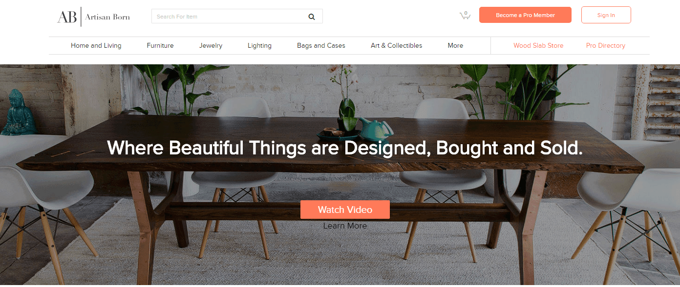
Artisan born sells customized furniture. This website does everything a furniture marketplace aims to accomplish, like inspire visitors to: check the new designs, find professionals for custom requirement, and buy furniture. A simple website with powerful content, Artisan Born offers a wide variety of handcrafted furniture to choose from.
Strengths
- Simple Navigation – Every category has a drop down menu for the type of furniture the visitor is looking for. The website should help visitors by providing sticky navigation.
- Personalized Search – Potential buyers may not be certain of what to buy and like to search around for products. They have added a section of recommended products that engages with personalized recommendations.
- Images on the Website – The product image and the banner image is high definition which helps engage potential buy
FATbit Recommends
Most potential buyers visit the website not knowing what they want exactly. Provide them with options on the homepage itself to improve engagement and conversion rate.
Wiser Community – Service Marketplace Website
 (View Full Page)
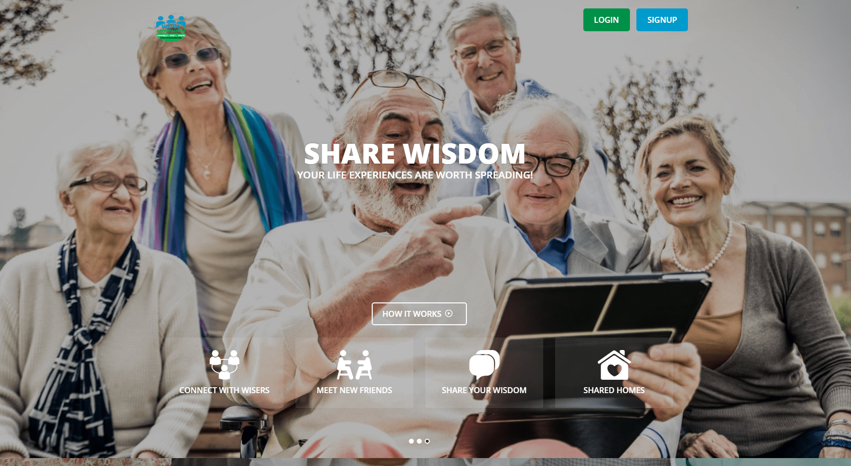
Wiser community is an online platform for senior citizens in India. This website offers them multiple options, such as:
- Find an elder-friendly accommodation
- Meet other elders online
- Assistance/care service
Strengths
- Relevant Linking – The links on the first fold are placed appropriately for clear understanding of services. All the services have a link which takes the website visitors to the service page.
- Clear Understanding – The “How it works” section, helps one to understand the process. When a visitor clicks on it, an informative video starts playing.
- Glimpse of “Latest Activities” – A dedicated section on the homepage which shows people who recently became members, upcoming event/meetups, recently shared home, latest blog and article.
FATbit Recommends
Use images on the homepage that the target audience can relate to. The website should consider the age group of the target audience and use bold text and subtle colors for improved conversion.
Furniture Spot – Customized Furniture Website
 (View Full Page)
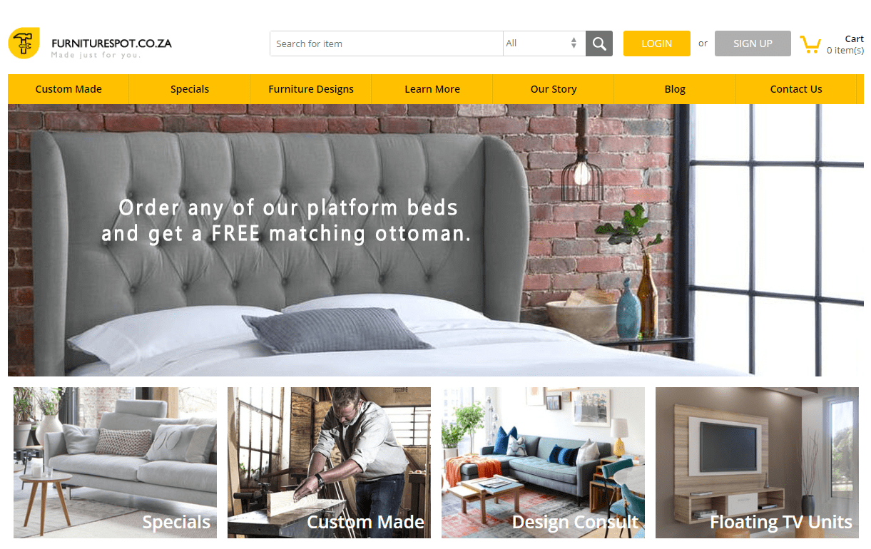
Furniture Spot is a custom-made furniture marketplace. This website aims to provide talented furniture designers a place to showcase their talent.
Strengths
- Design Aspect – The website has a simple and clean look with a minimalistic design. The homepage is designed in grid style, making the user experience highly intuitive.
- First fold of the Website – The carousel banner slider showcase their own amazing furniture design. The images are high definition which improves engagement.
- Search Feature – Filtered search allows a potential buyer check the category he/she wants to search in. This helps a potential buyer to narrow down the search results.
FATbit Recommends
Entrepreneurs willing to start this kind of website should include important links on the navigation bar. Furthermore, there should be relevant touch points such as live chat option on homepage to address queries of the visitors.
FootLoos – Travel Activity Website
 (View Full Page)
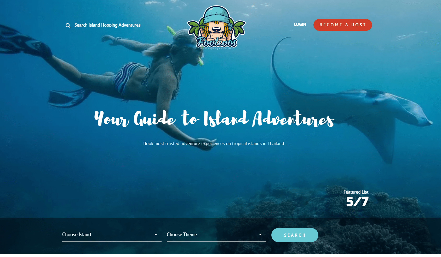
Created by FATbit one of leading eCommerce development companies, FootLoos is a travel website from a group of passionate local islanders who came together to share their enthusiasm for active, healthy and sociable paradise living as well as love for nature.
Strengths
- Banner of the Website – The appealing banner image hints at adventure that awaits a visitor.
- Search Feature – The search bar is prominently placed to help website visitors search specific activities.
- Testimonial Section – A testimonial section telling “What travellers Are Saying” develops a sense of trust among the visitor.
- Subscription Section on the Homepage – This section has numbers pertaining to the number of hosts, travellers and activities performed. This section encourages the website visitor to sign up and avail lucrative rewards.
Have Doubts about Conversion-Friendly Website Design?
FATbit Recommends
People who visit such travel activity booking website come with a vague idea of tourist destinations and adventure activities. Add travel activities on the homepage itself to improve the experience of website visitors.
UNI – Diamond Marketplace Website
 (View Full Page)
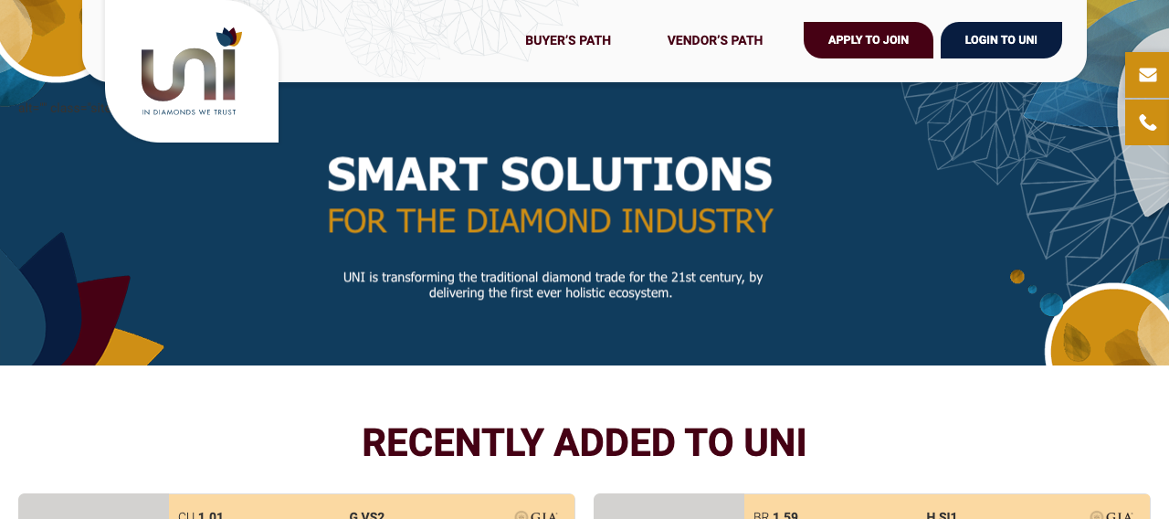
UNI is a diamond marketplace that enables diamond buyers and vendors to digitally search, compare, value, bid, and buy diamonds. It is completely a transparent network that allows vendors and buyers to verify all the required information and market data.
Strengths
- 360º Vision View – The website has this appealing functionality offering a complete 360º look of the diamond for a live-like experience while buying.
- Navigation of the Recently Added – The recently added diamonds to UNI is prominently displayed at the home page which makes it quite easy to have a quick look at the latest added inventory.
FATbit Recommends
For a more elite look of the website, a few more design elements should be added on the homepage. Prices of the recently added should be displayed to the guest users also without signing in.
Conclusion
To build an intuitive and user-friendly homepage for your online business, you’ll have to stand on one foot, touch your nose and rub your belly. Just kidding! But yes, it requires similar balance to create the best homepage for your business. The above-mentioned examples and recommendations will give you a clearer idea on how to design the homepage of your marketplace. At FATbit, we have a team of creative designers who know the importance of a well-designed and optimized homepage and can offer the best value web design packages. We follow the best design practices and methods to create intuitive designs for your websites resulting in a high rate of conversion.



Comments (1)
 Huzaifa Ali
Hi, i read this article, it is very informative.Thanks for sharing this information, very helpful for me.