Why do we go to the same restaurant, same grocery store, and same barber shop time & again? Because of the good experience we get there.
And that good experience isn’t just about the fancy interior or nice ambience, but also about the quality of service/product you get there and how swiftly you get it.
The same is applicable to businesses that operate in the virtual world. Which ecommerce store, blog or online cab service a user chooses over others depends on the user experience (UX) of an online platform (website or app).
Most online business owners take UX design seriously. But the problem is that they interpret ‘providing good user experience’ as ‘coming up with something radically different from what rest of the industry offers’. Though offering something different (if useful) won’t hurt, but basically, good user experience is about providing users what they want in the simplest way possible.
On a more technical side, the user experience of a website or app depends on four key factors – its visual design, navigation, speed, and meeting user’s expectations (or problem resolution).
With these key UX pillars in focus, this post will guide you how to design a good user experience for your business website or app to engage customers better and convert more.
Visual Design
Visual design is often confused with the visual appeal of a system. It’s true that aesthetically pleasing things leave a lasting impression on mind (which is important from the branding point of view); however,
Visual design isn’t just about the prettiness of your web page layout.
Visual design is more about smart use of visual elements (images, typography, colours, white space, etc.) to build a visual hierarchy – meaning, organizing information in the right manner on a web page, highlighting actionable components; thus, helping users achieve the intended goal effortlessly.
In other words, it is communicating with users without words.
Here is a quick example from our website Fatbit.com. See how we have used different visual elements to make it easier for visitors to consume information and guide them to perform certain actions.
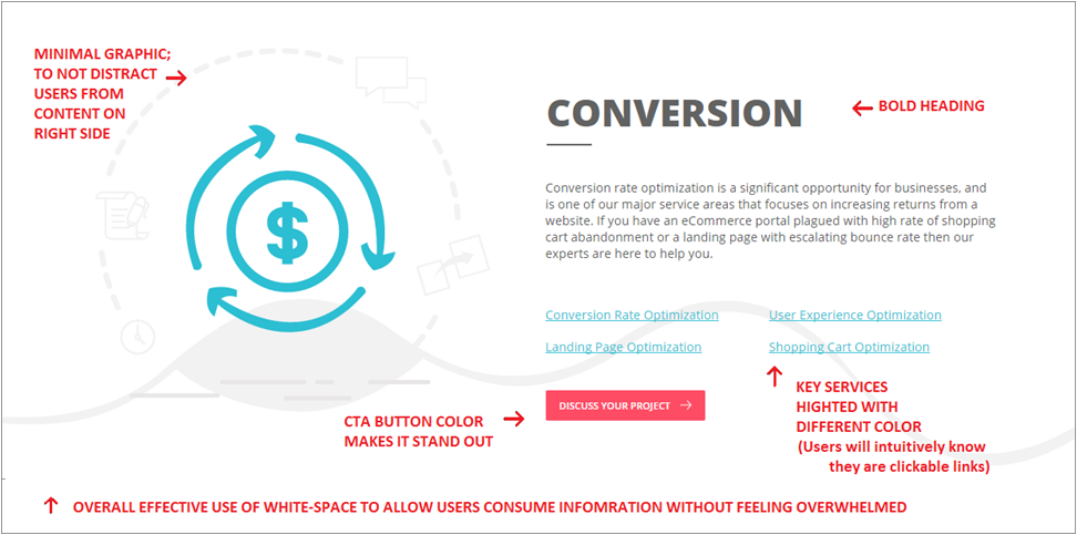
Another important thing to keep in mind about visual design is its consistency. Visual design creates a thought pattern in users’ mind, which helps them connect & interact with a website/app easily. So, it is wise to use visual elements in the same manner across your online platform to make it easier to use.
Navigation
Site navigation plays a crucial role in engaging & converting customers; yet, this key UX factor is overlooked or often mis-implemented.
For instance, if you have seen those fancy websites that win design awards, you would know navigating them is often a bit of challenge. These experimental navigations (known as Mystery Meat Navigation) might make perfect sense for designers, but for users, they are usually a hard nut to crack.
Experiments can make your website and app look cool. But as a business, you should put users first, cool later.
The simple formula to keep your site navigation user-friendly is to create well-defined information architecture (defining categories, sub categories, etc.) and implement it by following the navigation design standards.
For small business website design, these standards mean – setting up primary (top navigation bar) & secondary navigation (footer), putting elements that interest users most in primary navigation, and boring elements like Policies, Terms, FAQs, etc. in secondary navigation.
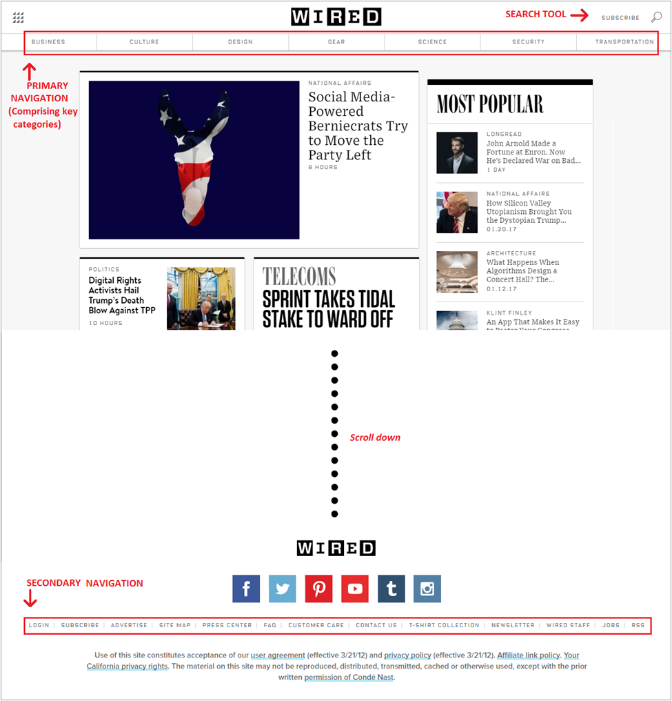
For mobile sites/app, it is usually a hamburger menu*, consisting of primary navigation elements and some other actionable options.
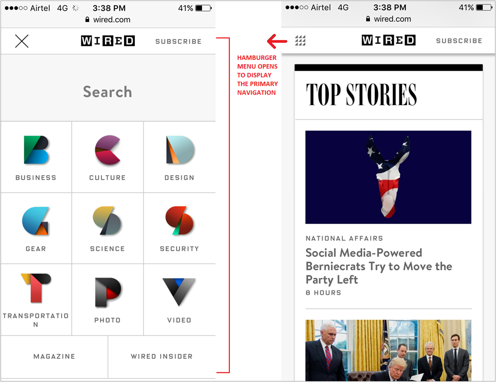
*Hamburger menus for desktop websites are also becoming common these days. So it is okay to implement hamburger menu if it goes along better with the entire look & feel of your website.
Apart from that, some other key things in regard to site navigation include:
- Keep primary navigation elements between 5-7, otherwise it would be difficult for users to memorize & comprehend your site’s navigation
- Use breadcrumbs on inner pages so that users know exactly where they are on the website
- Label tabs/links appropriately, so that at any point it doesn’t seem misleading to users
Speed
By default, users are impatient. If your website doesn’t load in 2-3 seconds, about 40% visitors will abandon it, and will go – of course to a competitor of yours. If you have a really good product/service to offer, it would be off-putting that your prospects aren’t consuming it just because you are too slow to guide them.
Take World of Swiss airlines’ website for example. Visually the site will fascinate you and no doubt they offer excellent premium services. But when you visit their website, it takes like half a minute to load even at good internet speed, which ultimately will put you off. (I have used the same example in my post on web designing tips, which you might want to check out.)
There are a bunch of techniques you can follow to make your website load faster. For starters, cache the elements that are same on every page (logo, footer, any images, etc.). For a WordPress website, plugins like WP Super Cache or W3 Total Cache are great, as they also compress file size, making page loading even swifter.
Other than that, optimizing images on your website is an obvious one. Do a Google search for image compression tools, and you will easily find a bunch of handy ones.
For more advanced techniques, I would recommend you to go through this gem of a post on improving page speed: How to Improve Page Speed: Tips & Online Tools from Pro Developers
(make sure you do read it)
In case of a mobile website/app, removing graphics & other web elements, which you think are not necessary for mobile users, will definitely remove some unwanted weight from it and make it load faster.
Meeting User’s Expectations
Let’s say your website has the right visual design, perfect navigation, and it loads at a lightning speed. But how good would be users’ experience if they don’t find what they came looking for on your website?
“A website that does not add value by fulfilling user’s needs will not be able to provide a meaningful user experience.” – FATbit Tech
To provide that meaningful user experience, you need to understand your target customers better, define buyer journey more clearly, find solutions for their problems, and put up the valuable information (and useful actionable options) where & when users might need them.
In a nutshell, it is about setting right expectations & then meeting them.
If you run a blog, share information that is of some use to your readers; if you operate an ecommerce store, be transparent about your policies & make sure users are able to see them easily; and so on.
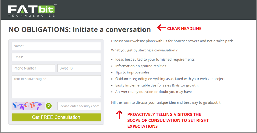
As an example, if you visit the consultation page of our website, you will see clear messages next to the form telling users what to expect.
Conclusion
As new web designing trends will surface & customers’ demands will increase, there will always be need of refinements in the UX design of your website. But if you stick to the above-mentioned UX fundamentals, enhancements will come easy and will be sound; making it easier for your target audience to find value in your offers and ultimately helping you get the results you want.
Need Experts to Enhance Your Website’s User Experience?


Comments (2)
 arshiya fouzia
 FATbit Chef Post author
It is amazing and wonderful to visit your site.Thanks for sharing this information,this is useful to me…
Hello Arshiya,
We are delighted to know that. Stay tuned for more insights.
Regards,
Team FATbit