Okay, so you are a good writer, can weave words to produce something interesting, and your posts are packed with all the useful information related to the given topic.
But, is the structure of your blog and elements present in it helping readers to go through your posts smoothly?
Here are the best practices to improve the UX of your blog to allow readers to go through your posts easily; therefore, to improve its engagement rate and get more social shares.
Blog homepage – Provide a helpful signage
Most of the time readers land on your post following its link shared over the web. But a few readers arrive on it only after first coming to your website or blog homepage. It is crucial that you don’t overlook this factor, and work on improving the homepage of your blog.
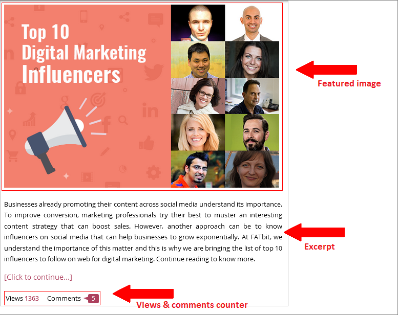
The blog homepage must have an intuitive layout & navigation, and should be designed in such a manner that effortlessly directs visitors to the post page. Few techniques that most successful blogger practice to engage visitors on their blog include:
- A featured image depicting the topic of the post in a clear & concise manner, and is also visually appealing
- Counter for number of views & comments to highlight the engagement on the post
- Create a unique excerpt summarizing your post to engage visitors so that they can have a better idea what the post is about
Although the above-mentioned practices are widely accepted in the blogger community, it is okay to come up with something new, but only if you are sure that it has a chance to work.
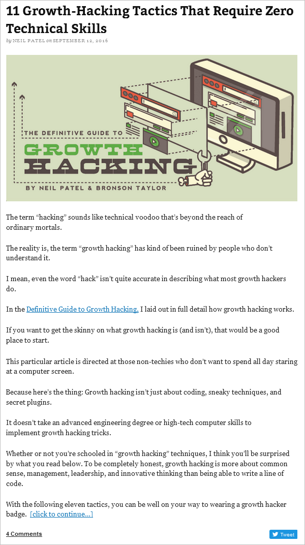
For example, marketing blog QuickSprout’s homepage displays post in a slightly different way. They use the introductory part of the post as the excerpt so that users get engaged with the post even before reaching the post page.
Separate and sticky top navigation
Plan a separate navigation bar for your blog to make visitors feel that they are on an entirely different section of your page. A dedicated navigation bar will also allow users to navigate through your blog easily, therefore, improve its engagement rate.
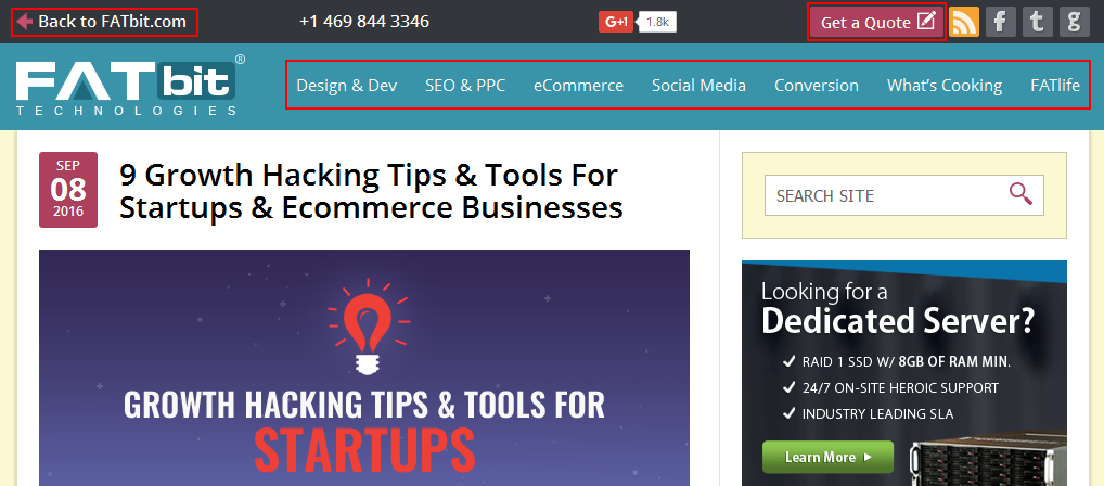
If your blog has many categories, put on the most popular ones on the navigation bar. Make a provision to keep the navigation bar always on the top as users scroll down the page. In technical language, make it a sticky navigation bar.
Additionally, also place a link back to the main website on your blog so that visitors don’t need to manually enter the URL to visit back your website.
Smaller visual span – Make it easy for eyes
Keep the view span of your blog somewhere between 650-750px to minimize the eye movement.
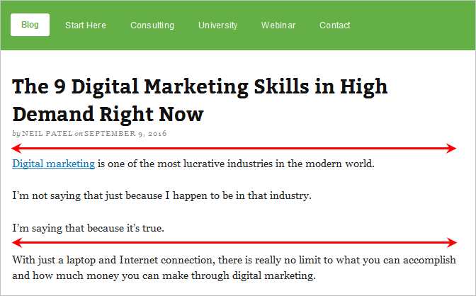
Don’t break the neck of your readers by making them move from one end to another to read every line on your blog. Keep the post span between the aforementioned limits, so that readers can read lines with the minimal eyeball movement. This, in long terms, will also improve your blog’s average stay time per visitor.
Keep paragraphs short and crisp
It takes a lot of effort to read big paragraphs even if they are very informative. Long paragraphs give readers a feeling that the post is a never-ending read; therefore, it becomes probable that they might lose interest somewhere in the middle of the post.
Ideally, a paragraph should consist of only 3 to 4 lines. Anything longer than this would require a lot of concentration from the readers’ end.
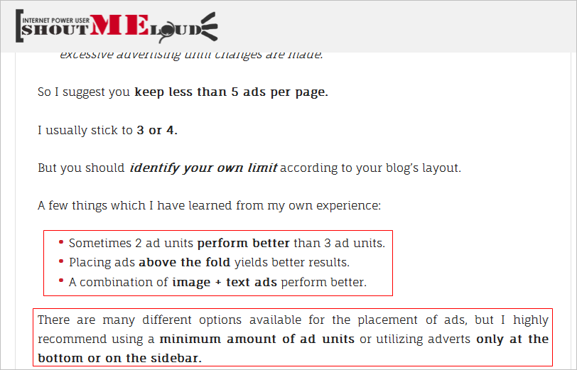
Don’t force readers to try too hard just to read your post. Keep paragraphs short, give readers pit stops to visualize things, and allow them to connect well with the post content.
Quick tip: Using bullet points to explain the process, benefits, features, etc. can do wonders.
Improve user experience of the visitors on your website
Always go black-on-white
When it comes to the background color of your post, never-ever do any experiments. It should be white, always white. And the font color should be black (or a darker shade of gray) as it appears very clear on the white background, therefore, improve the readability of your blog.
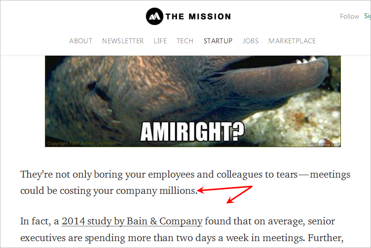
Also, avoid using fancy fonts or too small font size for that matter, as it can adversely affect readability.
Don’t date a post
If you write posts on tips and how-to topics to educate your readers, then in most cases, that piece of content is meant to be evergreen. Adding date to it will make your post look outdated even if you update your posts on regular basis.
Two ways out of the date thing:
1. Do not allow the date to show with the post and in the URL.
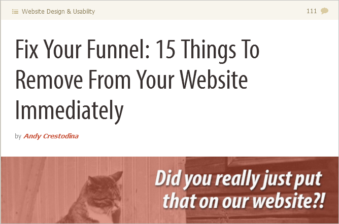
2. Or if you think adding a date is important, try not to highlight it much. And if you regularly update your blog, keep a counter that automatically updates the date to the last time you updated its content.

This will tell readers that you regularly update your posts, therefore, chances are good that readers will come time & again to your blog.
Spread it with social sharing icons
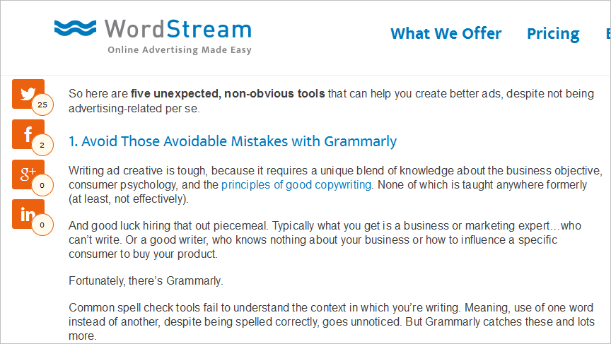
A good post deserves to be spread across different social networks. And to make sure that it happens, you need to place social media sharing icons with your post.
Choose social media networks, where you want your post to be shared, wisely, and according to your audience.
Social media sharing icons should always remain visible to readers, so that your post can be shared whenever a reader feels like.
Tell your programmer that icons should stick to a place when scrolling down; also make sure that it doesn’t obstruct the post content view.

Let’s sprinkle some icing sugar on the cake:
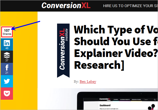
1. Make a provision to show the total number of shares for the post like ConversionXL do. This will act as a social proof for the readers.
2. Make sure when someone tweets your post, your Twitter handle is displayed along with it. This will help you to easily track re-tweets and will also ensure that you get credit for your work.
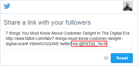
Discuss this with your programmers and suggest that changes are required in settings of the plugin used for social sharing.
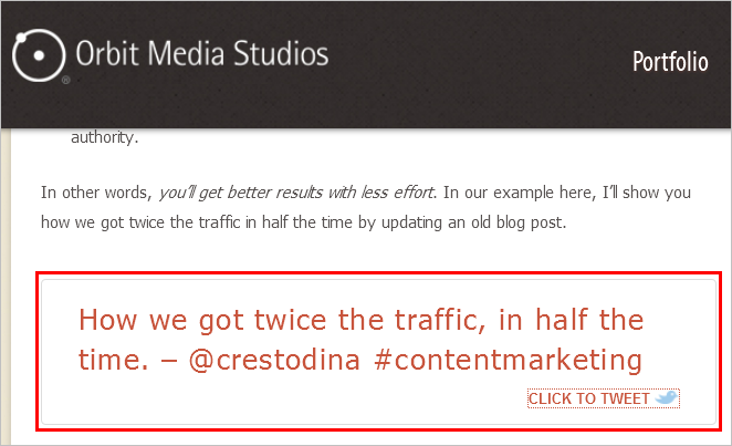
3. Let readers tweet a quote or a line from your post.
Also Read: How Much Do You Focus on User Experience Design While Building a Website?
Don’t let the interest die
To keep the post engaging throughout its length, you should always maintain the balance between text and visual content. If you are giving tips, explaining a topic, giving your thoughts on a strategy, then it is possible that the post may go up to 1800-2000 words.
Keeping readers engaged on a long post requires including of following types of visual content:
- Screenshots
- Vines
- Memes
- Gifs
- Infographics
- Videos
- Quotes
- Tweets
- Stats
- Graphs
Do not try to add all of the above mentioned visuals in your post as it may affect the loading speed of your page. Here are a couple of tips in this regard:
- Always add optimized images and other visuals without compromising on quality.
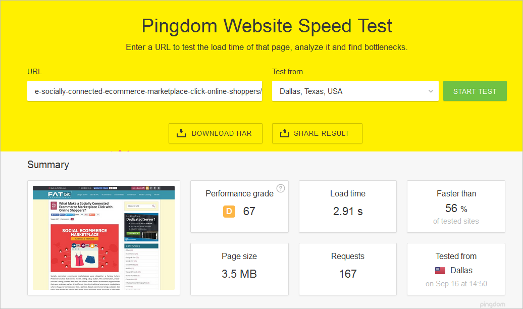
- Always measure your page load speed using this tool.
Attract more audience with high user experience website design
Add estimated reading time
Your headline triggers the interest of your readers. Telling them right away the estimated reading time of your post can improve its engagement factor considerably.
Adding estimated reading time also improves the bounce rate. Always keep in mind that your readers’ time is important, therefore, make it a habit to always add time at the top of your post. Also, remember that adding estimated reading time only makes sense when it is for text only, not for post with lots of visual content.
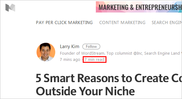 Note: Add estimated reading time only if you think your post will take about 6-8 minutes to read. If the post will take more than that, mentioning time may have the opposite impact and discourage readers to read your post in the first place.
Insert CTAs smartly
Ask yourself: ‘Why do I have a blog?’
Answer might be: ‘To educate people.’
But that’s not true all the times. When you have a company blog, besides educating people, you also need to generate leads and convert them into clients.
Therefore, it is also important to allow readers to learn about your services & products. To make it happen, practice following:
- Do internal linking in your posts
- Insert CTA-AB (Call-to-action –Action button) i.e. a statement that recognizes the pain-point or need of readers, plus the action button that takes visitors to a service/product/contact page.
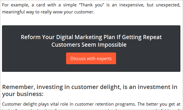
Some CTA tips and etiquettes:
- Do not over stuff your post with CTAs and internal links
- Make sure you are adding relevant CTAs to the post and placing them at appropriate places
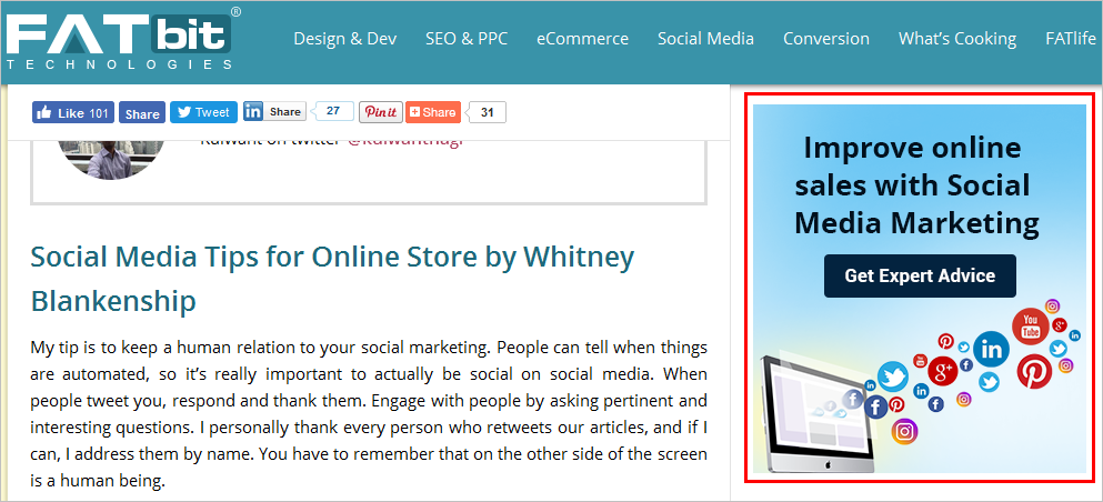
- Utilize your side panel and add a sticky graphical CTA which always remains visible to readers
- Add an exclusive CTA with benefits, social proofs, and offers at the end of the post

Don’t leave reader on a dead end
You did an extensive research and came up with an informative article; but don’t do the mistake of neglecting the end, otherwise, all your effort to engage readers may go in vain.
Deploy the following tactics towards the end:
Add a conclusion
A great article starts with a great title and ends with a great conclusion. No matter how engaging your entire article is, if you fail to add a conclusion in the end, it would be a purposeless piece of content; and your readers will go away without doing any further activity on your blog.
The conclusion should be short and a sum-up of all the main points of the post. Not only will it improve the engagement rate of your blog but will also motivate readers to take further actions.
Ask a question
Ending conclusion with a question is also a great way to motivate readers to take part in commenting.
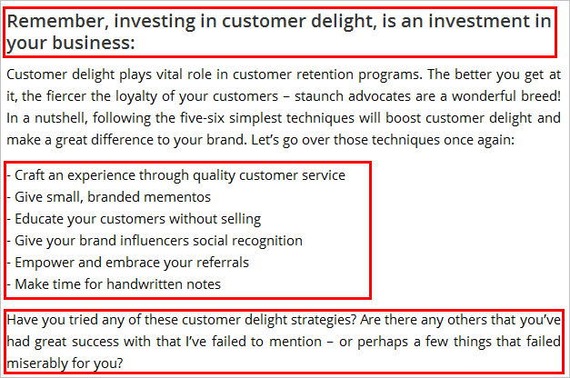
Your post ends here…
Let’s talk about some more engagement tactics which are not the part of your post but play a great role in engaging readers.
Comments section
Now it’s time for the readers to ask their questions or answer the questions asked (by author) at the end of the post.
After going through a post, readers may have some queries which they want to ask. So, it is reader’s turn first. Comment form should appear on the top of the comments section.
On few blogs, comment submission form comes after all the comments. On a blog which receives hundreds of comments, such a practice is discouraging for readers, as they will have to scroll down a lot just to find the comment form.
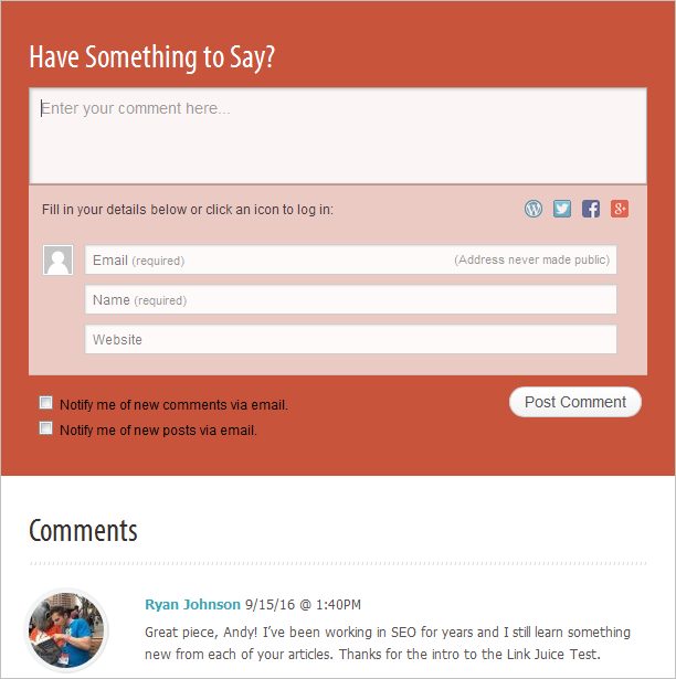
Additionally, try to respond to all the comments from your readers. This will enable you to build a relationship with your readers, as well as encourage readers to comment on your future posts.
Send readers to other posts
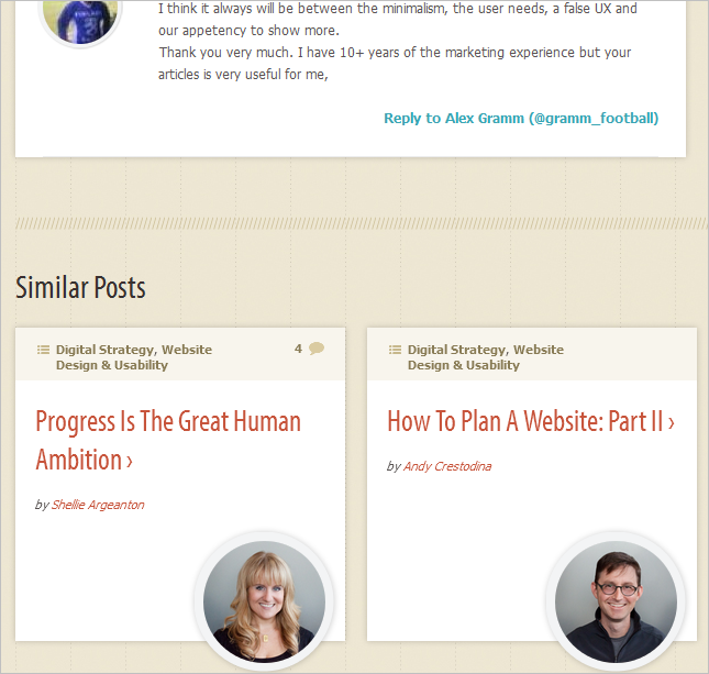
Your readers are hungry for information, so feed them with more content. Here are few techniques you can try out:
- Highlight related posts (or previous & next post) below the comment section
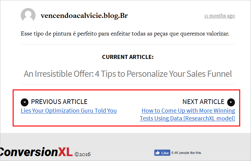
- Place quick links for recent/trending/ popular posts in the right panel of the blog
- Highlight relevant categories and tags in the right panel to allow users to find related content easily
Conclusion – Provide better experience to improve engagement and trustworthiness
If you succeed to provide a better user experience and engage readers on your blog, you will automatically succeed in improving your brand value. And an improved brand value will help you achieve overall business success.
Let’s go through above-mentioned practices for improving the UX and engagement on your blog once again:
- Improve blog homepage to drive readers to post page
- Plan a separate and sticky top navigation for your blog
- Keep smaller visual span on post page
- Keep paragraphs short and crisp
- Always go for black font on white background
- Avoid placing date with a post (or place them smartly)
- Place sticky social media sharing icons
- Add visual content to keep interest alive
- Add estimated reading time (Not for blogs with extra-long posts)
- Insert call-to-actions to keep readers to allow readers to take further steps
- Don’t leave readers on a dead end
Are there any other ways to improve the UX and engagement on a blog? Please suggest in the comments.
Want to Build a Website with High User Experience?


 Note: Add estimated reading time only if you think your post will take about 6-8 minutes to read. If the post will take more than that, mentioning time may have the opposite impact and discourage readers to read your post in the first place.


Comments (8)
 mokshika
 FATbit Chef
 Archana Gupta
 FATbit Chef
 Prologic
 FATbit Chef
 peopleux
 Chuck Fulkerson
hey
amazing content and it was very helpful and very well explained.
I am really impressed by the quality you have delivered through this blog.
great work! keep writing. It was of great help!
Thanks for the appreciation.
Keep visiting us.
Cheers!
Team FATbit.
Hi Jasbir,
I’m very thankful for the effort put on by you. You discussed nicely to improve user experience. Will definitely add these inputs in my blog. Keep posting such types of articles.
Hello Archana,
Thanks for the appreciation!
Best Regards,
Team FATbit
Thanks for sharing the valuable information with all of us… This could be so useful for all who find the new designs and or startup of UX and UI designing career.
Hello,
Thanks for the appreciation. Keep visiting for more insights.
Regards,
Team FATbit
Clean and clutter-free designs are today’s most important elements to provide a satisfying user experience.
I read about gamification in one of your other blogs. I found the concept really interesting and think we can apply it on blog pages to improve engagement and user experience too.