Last Updated: October 12, 2023
Why should hiring a service professional always be an ordeal for service seeker? The reach of the internet and local marketplace for professional services is the ideal answer to all your queries related to finding professionals.
The job that used to be delivered through recruitment consultancies and agents earlier is aligned online now. Websites like Zaask, Thumbtack, Angie’s list are the top names helping connect service seekers with service professionals. The sheer popularity of such websites has generated such great enthusiasm among entrepreneurs that FATbit had to take up this business model and acquaint the readers about pros, cons, risk, and other factors associated with it.
Our team did an analysis for such websites to get an in-depth view of their business model, how they make money and key website features that would help any entrepreneur in launching a successful and popular on-demand service marketplace. Before going through the website features, let us look at the business model for a better idea of market dynamics.
How an On-demand Service Marketplace Works? – Business Model
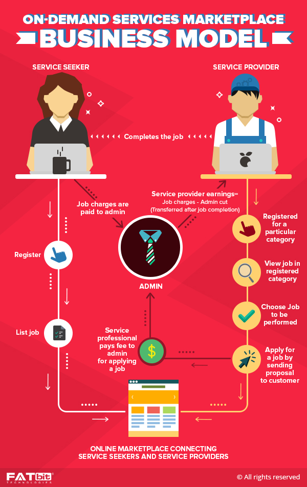
The main aim of these marketplaces is connecting service seekers with providers.
- The service seeker, register and lists their job on the platform.
- The service professionals, on the other hand, register in a particular service category and access all the listed jobs. They then apply for a particular job by sending the seeker a proposal.
- The service seeker analyses all the responses and chooses the person having relevant experience as per their requirement on marketplace for professional services.
Start your On-Demand Marketplace for Services with a Ready-Made Solution
How do such online service marketplace websites make money?
An on-demand service marketplace can generate money via different revenue models:
- A nominal membership fee can be charged by the platform.
- The service professional has to pay a fixed charge to apply for a particular job. This fee can vary depending upon the job.
- The platform can also charge the service seeker a commission on completion of every task.
- Implementing ad-based monetization can provide an advantage to the platform in generating additional revenues.
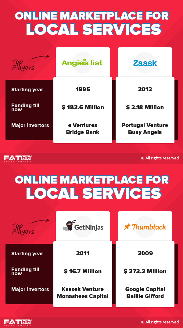
Leading Market Players
- Zaask
- Angie’s List
- Get Ninjas
- Thumbtack
How to Build Professional Service Marketplace
- Code Yourself
- Hiring developers
- Readymade B2B eCommerce platforms
Going with readymade B2B ecommerce solutions like Yo!Gigs is a wise decision to save time and cost.
How it work for Service Seekers?
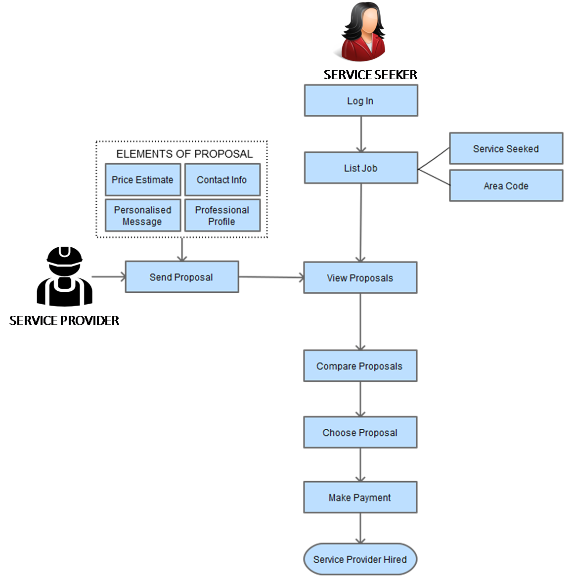
The business model of an on-demand marketplace for services aims to connect two entities: service seeker and service provider. When it comes to service seeker, the overall process goes through the following timeline:
- Service seeker creates account
- Job is listed on the platform and service is sought
- After receiving proposals from service professionals, service seeker analyses all of them
- Subsequently comparing the proposals, service seeker chooses a proposal, makes payment and hires a service provider.
Process flow diagram for hiring a service provider for a service
 CLICK TO ENLARGE (Open in new tab)
How it works for service provider
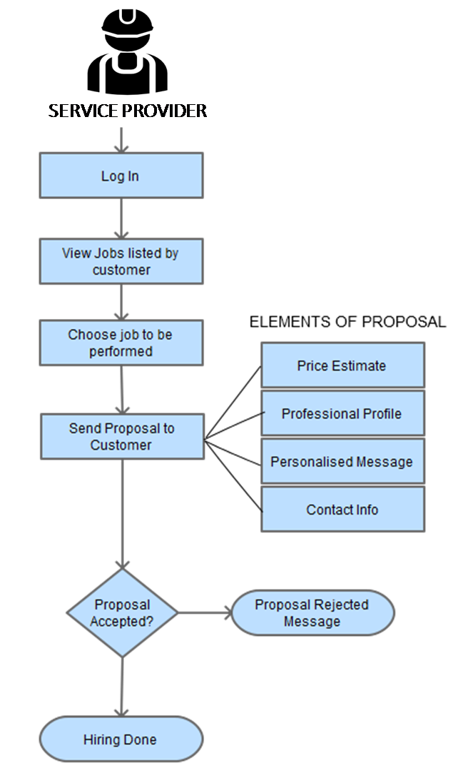
The overall on-demand service marketplace website for professionals works in the following timeline for a service provider:
- Service providers create an account and logs in it.
- They view the jobs listed by the service seekers.
- The desired job is then chosen and a proposal is sent
- After their proposal is accepted, they start working on the job
Website Overview
What makes websites like Zaask, Thumbtack and Angie’s list stand out is their focus on user engagement. While analyzing several websites like them we came to the conclusion that a service marketplace website must be easy to use and navigate. Let us go through all of such necessary features in detail.
Homepage
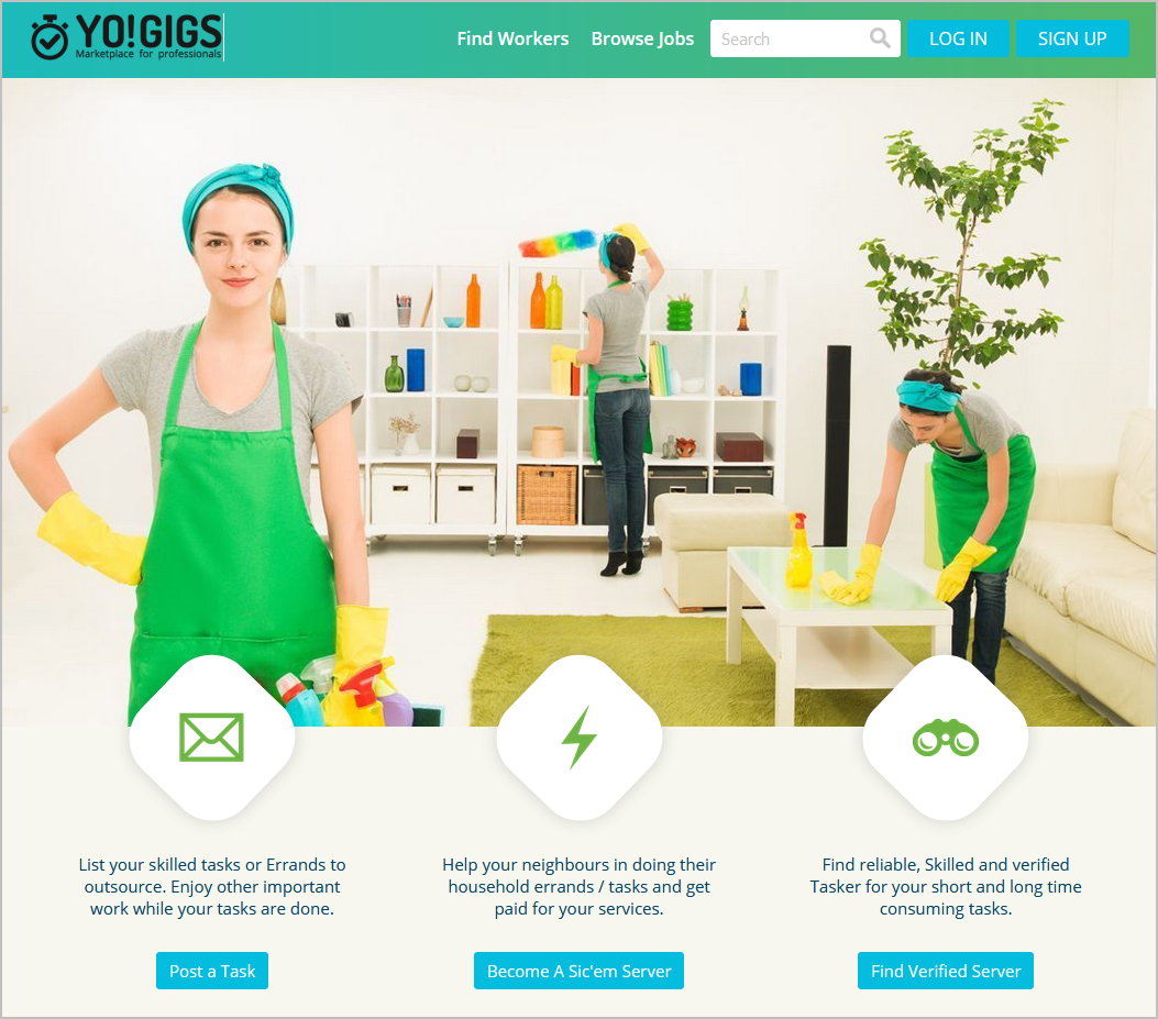
When you open a homepage of a website for the first time, it takes around eight seconds to either close the window or browse further. This is why it is always advised to focus immensely on your homepage design. While some tend to go all out, by putting every bit of information right on the homepage, others keep their design language to a bare minimum. FATbit analysts are of the view that the latter approach is more beneficial than the former. Some other suggestions to make homepage more intuitive include:
- A large banner image displaying different service professionals
- Name of the website along with a tagline that optimally highlights what the website is all about.
How It Works Section
As more and more complex and unique business models come into existence, it becomes difficult for consumers to get accustomed to them. This is why a online services marketplace must have a dedicated “how it works” section in place, making it easy for the consumers as well as service professionals to understand how the platform works.
NOTE: Such a section would also eliminate most if not all the doubts of users.
Want an Instant Way to Create a Local Service Marketplace?
Featured Professionals
One of the innovative ways with which online services marketplace can enhance the reach of their professionals as well as add another revenue model is featuring premium professionals right on the homepage. FATbit analysts recommend using tabbed design elements, which would allow you to feature professionals based on popular categories, making it more relevant.
Enticing CTAs
Enticing visitors to convert into customers is a nifty trick that only a few marketplaces manage to accomplish. There are several best practices, which not only enhance conversion rate but also help in increasing sales. CTAs (Call to action) are a prominent way used to boost conversion. FATbit analysts highly recommend you to follow this approach if you want to build a service professional marketplace anytime soon.
Well-defined Categories
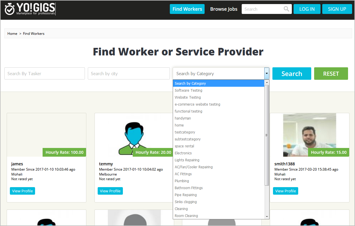
A service professional marketplace caters to a wide array of categories ranging from carpenter to technician. To make it easy for the service seekers to browse service professionals based on respective categories, the platform must have well-segregated categories. Another essential benefit of having such categories is that service seekers can easily post their jobs into a particular category, allowing for easy discovery. FATbit analysts recommend incorporating small thumbnails along with the categories so that the users can easily identify them.
Reviews/testimonials
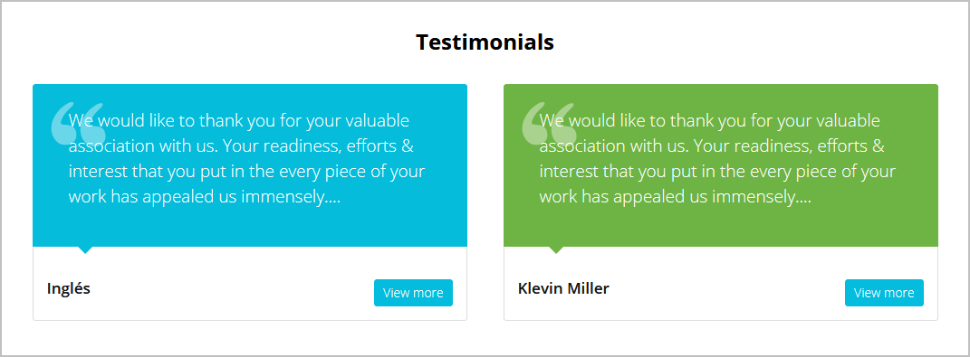
Reviews/testimonials are integral part of any ecommerce marketplace. It is not only useful in helping consumers make a decision, but also, garners trust of users for the platform. Proper placement of reviews is necessary for optimal impact.
Footer
Most of the ecommerce platforms do not pay any heed to the footer, terming it as unfruitful. However, the fact remains that with proper designing of footer, a platform can optimize its navigation. We recommend you to incorporate city selector within the footer, making it easy for the service seekers to find professionals only in their vicinity. Other recommendations include content-based pages as well as social networking profile links.
Assurance & Guarantee
The biggest hindrance in front of ecommerce platforms these days is the trust deficit, which they have to diminish. Most of the first time users do not hop over to a particular platform without putting in considerable thought. One way to jump over that hurdle is to offer review and testimonials, but that too helps to a certain extent. The other way of garnering the trust of the users is to offer assurances and guarantees. As far as users are concerned, you should also perform a background check of each tasker for security reasons. Highlighting the same on your website will give you ample credence.
User Types

There are two types of users on such marketplaces:
- People offering services aka service professionals
- People looking to hire people for tasks aka service seekers
The process of signing up is different for both types of users. Let us go through the same in detail.
Login/Registration Process

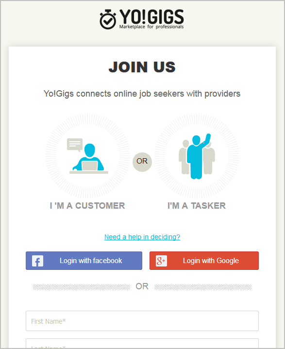
Service marketplace is a broad industry catering to service seekers as well as service professionals. When it comes to local service marketplaces, they are based on a peer-to-peer platform catering to both service providers as well as service seekers. This is why it needs to have multiple signup options in place. This means that a separate account is required for professionals and seekers.
Post a Requirement
After going through many service professional marketplaces, we came up with several ideas which would help in building an advanced website. You ought to put a lot of focus on UX, which would show your user centric approach. The requirement section asks users to post their requirements. Users need to input their name, email, contact number, category and location to get requests for their requirement. In this step, users have to share some information about their prerequisites, after which service professionals send their proposals. The proposal includes:
- Type of task
- How big is the task?
- Description about the task
- Task Location
- Timeframe when the user wants the professional
- Days and timings of availability
- Additional details if any
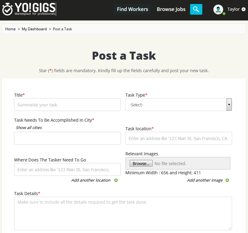
NOTE: In order to address the privacy aspect of the users, the website ought to take the consent of the users to share their contact details with the professionals. Other than that there can also be a communication mechanism built right into the platform for better interaction. More on this has been discussed later in the post.
My Requirements
After a service seeker logs into their account, they are forwarded to the dashboard, which houses all the information about their account. One of the most vital aspects of this section is “My Requirements”. This section contains all the requirements entered by the user. In this section, they can view, edit and even close a particular requirement. Other information that can be included in this section is:
- Number of responses to a particular requirement
- Posted time
- Status of the request
Billing History
In order to make it easy for the service seeker to maintain a clear log of all the payments made, the platform must also incorporate a billing history section. It will show information like the date of payment, type of transaction and bill amount. This would help the users manage and maintain all their bills at one place. FATbit analysts recommend confirming this feature while looking for a local service professional marketplace.
Verification of service professionals
No platform wants to become a hive of spam accounts. This is why it is always advised to have a verification process in place. This is beneficial to maintain a healthy and engaged community. Before making any request or creating a service professional account, users have to verify their credentials.
It’s good for a website it has a verification process for customers’ profile. A verified service-seeker profile makes the requirement look genuine and helps professionals work better.
Service Professional Listing Page
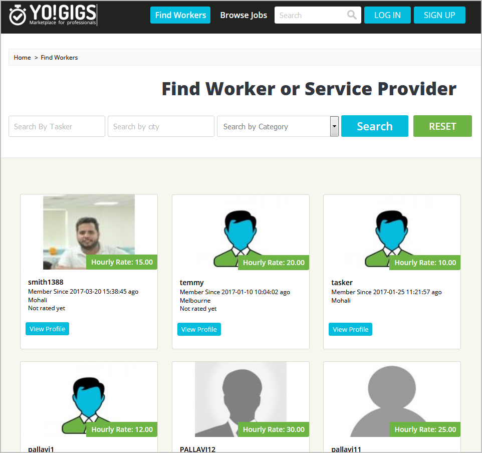
The listing page of professionals is basically their resume, based on which a user selects them. This is why it should house all the information without clogging the page. Advanced filters help in that aspect, making it easy for the users to streamline the results as per their requirement. Some of the essential filters include:
- Service Area
- Keywords
- Gender
- Hourly rate
- Type of profile: Verified/Not-verified
Users can also have the option to sort the results based on relevance, experience, reviews and latest login. Each listing needs to be displayed with all the details like contact number, location, forte, the number of years of experience as well as number of reviews.
Service Professional Profile Page
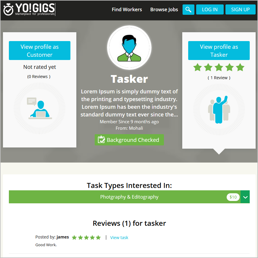
This is one of the most vital aspects for any task marketplace. Taking cognizance of this fact, the website ought to put all the information related to professionals on this page in such a way that it does not hinder the user experience. Information displayed on the profile page must include:
- Profile image, name, location, contact address and vital stats of account
- Gallery, reviews, and detailed description of the services provided by the professional
A related profile section can make it easy for the user to view additional profiles similar to the current professional.
Messaging
As discussed earlier, there must be a communication channel built right into the platform making it easy for users and professionals to communicate. FATbit analysts recommend either using contact details or a messaging engine. A real time chat would definitely enhance the user experience of both the parties.
Reasons for starting a services marketplace
- Consumers spent over $600 billion on local service providers in 2014 (both online and offline)
- Value of the online local service market is estimated around $400 billion.
- Major corporates like Google & Amazon are also trying to take a slice of this emerging market.
- About 2.6 billion local searches are made every month, and yearly growth in them is about 50%.
- About 50% of local searches are made on business directories, local service search platforms & apps.
- Online local service industry is growing at a rapid speed, especially with the introduction of mobile bookings.
- 55% of mobile searches are made to find a local business; and 61% of those to make the purchase.
Online local service marketplace is definitely a huge market, full of opportunities for new players. By entering in it, you will also be solving problem of millions of consumers who have trouble in finding skilled & trustworthy local service providers.
Final Thoughts
The fact of the matter is that service professional marketplace is growing at a very fast pace. Players like Zaask, Angie’s list and Thumbtack has already made a name for themselves. Still there is a huge untapped market for startups with advanced features so the suggestions made throughout the post can come handy. In order to ensure that your marketplace is able to capture the market, incorporate all the features suggested by our website analysts. You can also hire our professional UX developers for any assistance with website design and development. Our team will be happy to help you.
Want to launch your own service professional marketplace


Comments (2)
 swathi
 FATbit Chef Post author
thanks for the best contents
Hello Swathi,
Thank you so much for your appreciation.
Regards,
Team FATbit