Last Updated: 22nd Oct’ 2020
The homepage of a website plays a central role in showcasing brand value. It represents the brand’s voice in the shortest time with which visitors relate and stay on the page. For this reason, entrepreneurs spend thousands on custom web design packages instead of going with the default themes of a CMS. A custom web design enables business owners to gain full control over their website and tweak every little component of the UX/UI. Unfortunately, only a few succeed at developing a landing page that meets visitor expectations. Instead of aggressive color schemes and graphics, visitors demand a homepage with clear UX through which they can easily navigate. Looking at the increasing competition of today, you can consider the following proven design practices to enhance the UX of your website:
1.Hamburger Menu
 Source: Yo!Kart
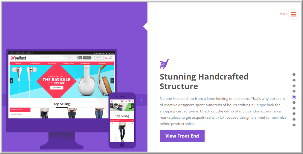
Everyone is aware of the traditional horizontal menu present on the homepage, where a visitor clicks on a link to go to other webpages. However, bringing a change to this traditional practice, web designers have started using the new hamburger menu, a completely new way to implement the menu system. This design trend has become so popular that currently, it is used in so many default WordPress themes. The Hamburger menu icon is showcased by three bars, which resemble a hamburger. When users click, a sliding drawer opens and brings the menu forth. A series of tests conducted by using an eye vision tracking software showed that the human eye gets accustomed to different shapes, which seems to be one reason why this hamburger menu has been accepted globally.
2.Hero Images
 Source: Google Analytics
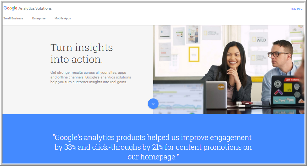
The use of hero images enables a brand to give an immersive experience to the visitor.Their large size improves the aesthetics of the homepage and provides the much-needed depth to the content. Hero images are extremely helpful for eCommerce stores as they help in the process of persuading visitors into buying products.You can either use illustrations, or even the pictures of your latest product as a hero image.
3.Video Background
 Source: Peach
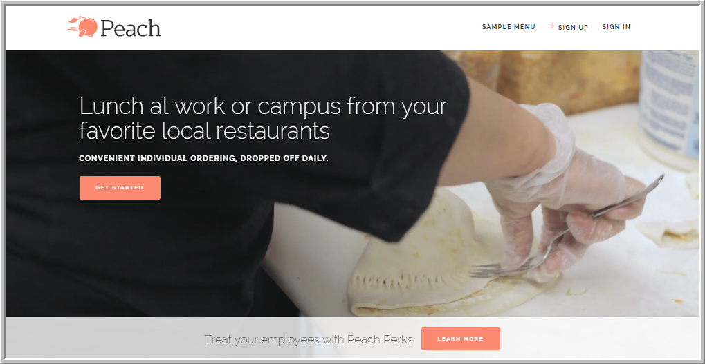
As more and more video content is generated every day, web designers have found a way to incorporate videos in homepages as well. Video backgrounds play an important role in making the visitor understand the products and services, but most importantly, they add the element of storytelling to deliver the brand message.
4.Micro Interactions
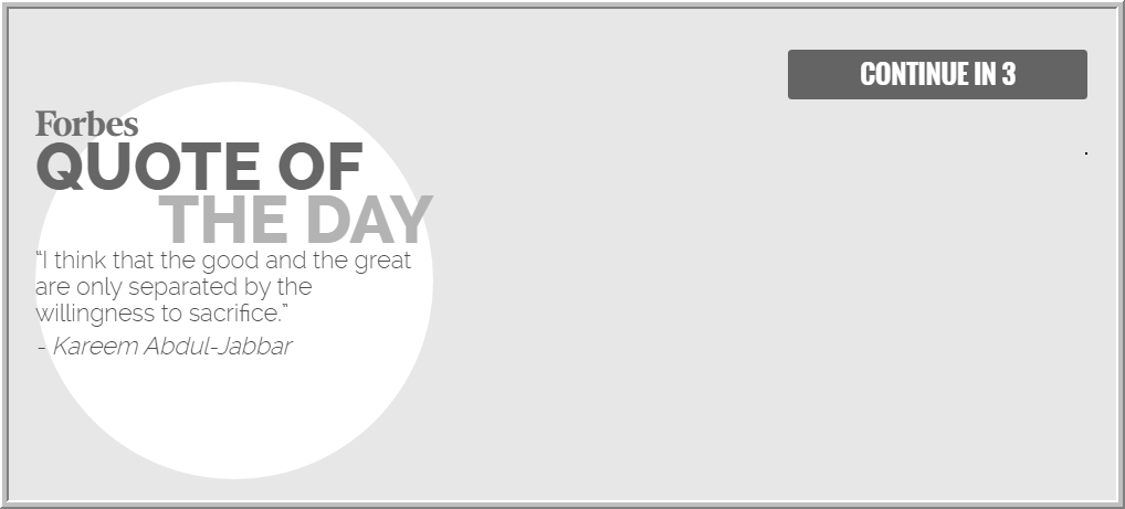 Source: Forbes
There are many things that a visitor experiences while browsing the homepage of a brand such as reading the quote of the day in case of Forbes. Micro interactions make the homepage more meaningful and appealing. There are several examples of micro moments such as “I’m feeling lucky” by Google, Facebook’s Like, and more, which became so famous that they became a signature moment of that brand.
5.Front-page Carousels
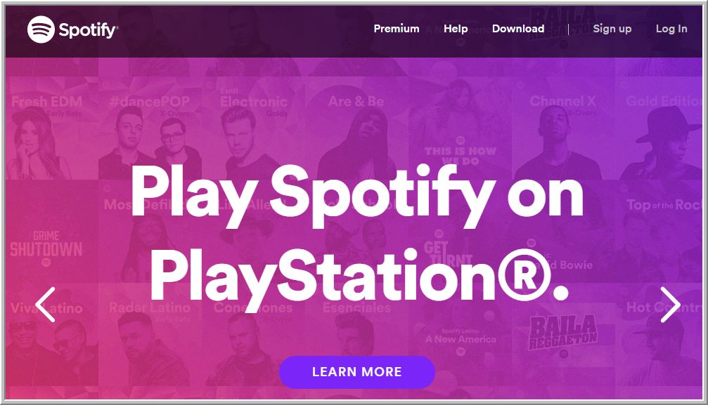 Source: Spotify
Front-page Carousels are considered to be the most important homepage elements for an eCommerce store. They play an important role in showcasing featured products on the homepage. Carousel is extremely helpful as it takes less space and displays a lot of information.
6.Parallax Scrolling
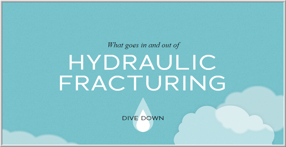 Source: Dangers of Fracking
Parallax scrolling takes homepage design to the next level and adds the fun part to it as not everyone enjoys browsing a static web content. It creates a new experience, which is beautiful and highly engaging for visitors. The use of the parallax scrolling technique makes the background move at a slower rate than the foreground, creating a 3D effect in the process. However, parallax scrolling requires timely maintenance so ensure that technical support is a part of your web design package when opting for this design trend.
7.Typography
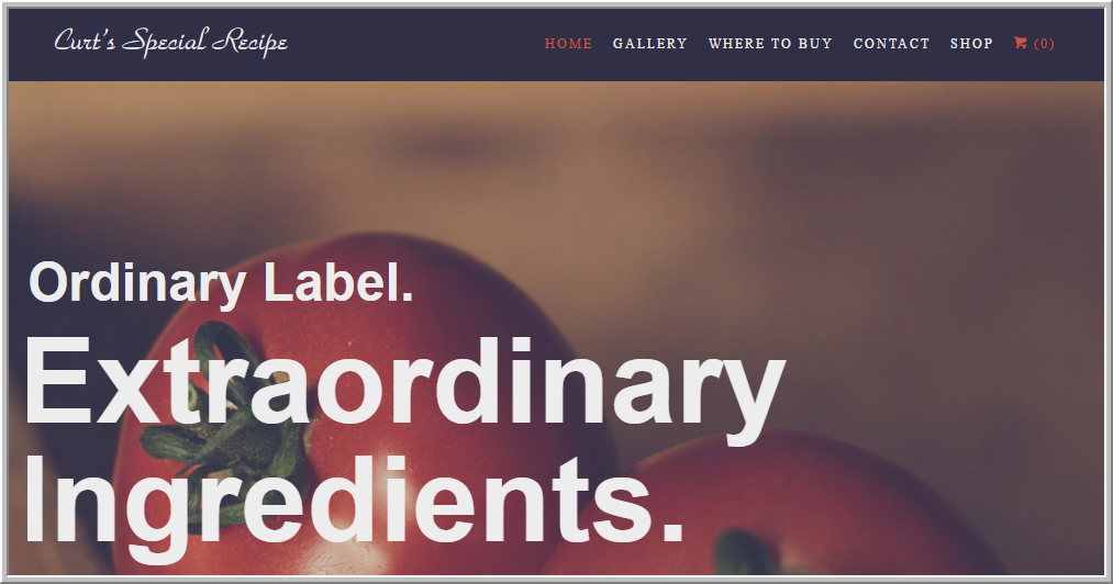 Source: Curt’s Special Recipe
Typography is one of the most important aspects of homepage designs that greatly influence the visitor’s perception of the brand. Important things such as user experience and readability depend on typography to provide the optimum experience. Web designers experiment with typography to set the vision and mood in accordance with the brand, which eventually helps with brand building.
8.Material Design
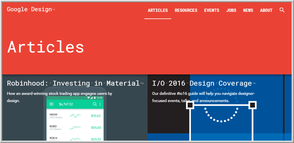 Source: Google Design | Articles
Material design greatly compliments the practice of flat-design, which is gradually over-throwing the concept of three-dimensional design. It brings a lot of added advantages with itself, such as easy to understand user interface, better user experience, and more.
Read: Latest design & technology trends for your website
9.Card Design
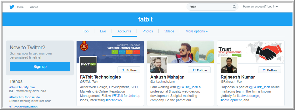 Source: Twitter
Google has been playing with card design for its Android operating system for quite some time. It has successfully shown that card design can be used to beautify the information on the homepage, making it much easier to comprehend. Following the same trend, websites also joined the same bandwagon and are widely using card designs.
The increasing number of programming languages have diversified the web design industry, giving rise to various new trends. Even industry leaders like Google are trying to set new standards for web designing.
Nevertheless, many large brands are on these design practices and incorporating them fully. The above design trends have proven their feasibility in attracting customers and are a part of the latest web design packages from WordPress, WebFlow, Magento and other CMSs. If you are not ready to take a risk by experimenting with something new, these trends can work for you as well.
Think we have missed a popular or recent homepage design trend? Drop by a comment telling us about it.
Get your website redesigned by experts
 Source: Yo!Kart
 Source: Google Analytics
 Source: Peach
 Source: Forbes
 Source: Spotify
 Source: Dangers of Fracking
 Source: Curt’s Special Recipe
 Source: Google Design | Articles
 Source: Twitter