Conversion – The magical moment when all your hard work gets paid off in the form of clicks, signups, sales, newsletter subscriptions, downloads, etc.
Conversion – The ultimate goal that every business strives towards with different optimization tactics– sometimes with the hit or miss approach of A/B testing on color, size, shape & placement of design elements; sometimes by reducing form length & putting clear headlines to enhance user experience; and sometimes by even taking a bit desperate measures like offering heavy discounts, free trials, & so on.
Traditionally, these conversion rate optimization (CRO) practices have produced excellent results for businesses (and they continue to do so). But today, the entire web world is aware of CRO’s importance. And these common practices are being repeatedly mentioned in every other ‘best CRO strategies’ post. Yet, the average conversion rate of ecommerce stores worldwide still appears to be stuck at the bottom of the ladder.
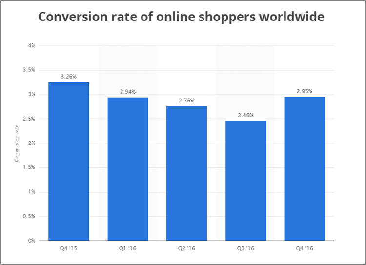 Source: Statista
So, it’s about time for your brand to dig deeper into the science of conversion optimization for a competitive advantage, as well as to reach new conversion rate milestones.
This post is prepared with the same goal – to help businesses unwind the power of some new conversion optimization tactics.
Note: If you also want to know about commonly practiced conversion rate optimization techniques, don’t be disheartened. At the bottom of the post, I have provided a checklist of some proven CRO methods.
Note 2: Most of the CRO techniques mentioned in the post are ecommerce focused, but a few of them are also applicable for any business with an online presence.
Now let’s resume with the post.
Use ‘Order Starters’ in Your Promotion Campaigns
Every ecommerce store keeps a record of its most popular products. But have you ever paid attention to the products that customers first put in their cart? Often called ‘order starters’, these are the products that customers actually want to buy when they visit your online store.
So, besides the most popular or best-selling products on your store, you should start using these order starters as well in your promotion campaign. Use them in your social media updates, use them in your visual ad copies, list them on your website’s homepage, and so on.
When you reach out to your customers with the products they want to buy, not the ones you want to sell them, conversion rate of your ecommerce store is bound to improve.
Implement Smart Pricing Tactics
FATbit team recently attended the Content Marketing Summit held in Gurgaon, India. At the event, AdvitSahdev, Head of Marketing at Infibeam gave a presentation on how implementing smart pricing improved their online store’s conversion rate*. Below are some pricing tricks he explained:
- Draw a bigger line: Meaning, when you have a product with price tags in thousands, you can put up larger number along with it to make it look smaller and make customer feel comfortable with high-priced products
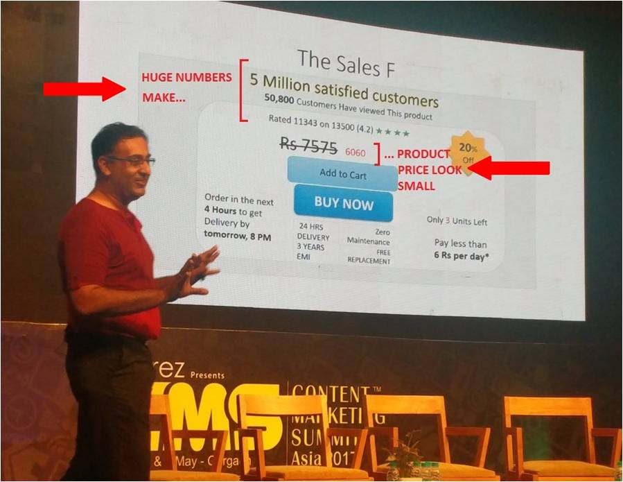
Price with rhythmic & familiar numbers: Price tags such as $3838, $91.91, etc.,or the ones that ones that represent a correlation with daily life (365, 247 or multiples of numbers, etc.) are more attention grabbing, thus, can persuade users to buy a product.
Other pricing tricks involve:
-
- Break down the cost if you are selling a yearly subscription. Display how little it will cost customers per day.
- When offering discounts, use the larger number between ‘%’ & ‘currency value’. Ex: if 20% of a product price is less than 20 bucks, use ‘20% off’; otherwise, use the currency value such as ‘$30 off’
* These are just some cues to convey how playing with pricing can impact conversion rate. It is possible that the exact same techniques that worked for Infibeam may not work for you. So, it is suggested that you first brainstorm over what can work with your target audience.
Increase Product Density on Homepage (number of products on homepage)
Design & marketing teams are always in the battle for what should go on the homepage & what not. Designers, by nature, want to make the brand impactful with aesthetics; while marketers, strives to achieve the same goal with sales & profit. Since we are on the subject of improving a website’s conversion rate, it is more logical than not to go with marketers’ approach.
Good user experience implies better conversion rate. And customers get good experience when they can perform the intended action with minimum efforts. Putting up more products right on the homepage will let a larger number of customers place the order without browsing.
Though, this doesn’t mean that you should put as many products on homepage as possible. Test for different product density on homepage (especially, don’t over-populate it) & go with the one which produces you maximum conversion.
Suggested read: Simple Web Design Practices – Adopt to Look Great & Convert More
Make Testimonials Actually Work for You
Building trust in customers is important for conversion, especially with the new ones. Putting up testimonials on website had come up with a good solution to that. But the practice has been so brutally misused with made up testimonials & fake reviews that today most online users don’t mind them (the ones businesses highlight on their website).
Now, there are two steps to curb this problem.
First, make them look real by asking clients to provide video or picture testimonials; and if it’s a text testimonial, then by providing complete client detail with relevant link.
Second, put your testimonials where they can actually influence the buyers’ decision.
Homepage is an obvious place to start with, as it will help build trust among new visitors. Checkout page is another place where testimonials/reviews can clear any doubts that might have left in customer’s mind. Another smart usage of testimonials is on ad copies & CTAs. Below are a couple of examples:
 A seller’s testimonial on an Etsy advertisement.
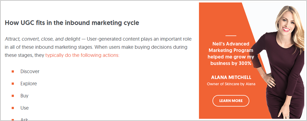 A client testimonial on CTA, on Neil Patel‘s blog.
Also notice that in both of the above examples, client/customer’s picture has been used for better engagement.
Related read: How to create Calls to Action that bring more leads & sales
Offer the Live Chat Feature to Save Lost Customers
Despite all your efforts to deliver a rich user experience to your customers (through intuitive navigation, detailed product listing, etc.), there can be instances when customer feel a bit doubtful about how to proceed with the purchase; or whatever the intended conversion action is.
In such instances, having someone to talk to from the company in real time (through live chat or phone) can be customer’s one last hope to carry on with the order before looking elsewhere; and your store’s last hope to save a leaving customer. Personally, as a customer, I have been to such situations many times, and I bet most of you too.
It is likely that you might not be able to assist your customers though live chat 24×7. So clearly mention the timings & provide customers an alternative such as email when you are offline. Also, display the customer-service phone number beside live chat feature, as sometimes customers are in hurry & want to get the issue resolved quickly by talking instead of typing.
Conclusion
Across the conversion funnel, a series of conversions happen at every stage – whether it is customer choosing your website over competitors, customer adding product to cart, or customer placing the order. While working on each of these intermediate conversion-funnel goals is important, in long term, your ultimate conversion goal should be turning customers into loyal consumers.
The points provided in this post are helpful in converting visitors into customers. But it is the value that your products provide & the quality of your customer service that eventually turn customers into a loyal consumer base. Then onwards, your brand name alone can drive a steady healthy conversion rate.
Want FATbit experts to help you reach new conversion milestones?
As promised earlier, here is the checklist of some common, but proven, conversion rate optimization techniques:
- Pay attention on color psychology & contrast to make your CTAs stand out
- Eliminate unnecessary fields from registration form
- Work on minimizing your website’s page load speed
- Use original, high quality images – but also optimize them so they don’t affect website speed
- Add security badges to assure customers that their details (personal & credit) are safe with you
- Do a thorough landing page analysis & implement these landing page optimization techniques
- Create urgency by adding a countdown widget on sales/discount/offer pages
- Be transparent about your return & cancellation policies; also offer price match guarantee
- Retarget customers who initiated a purchase but left without buying
- And lastly, don’t shy away from opting for a conversion rate optimization service provider if you don’t have the required skills or time to act upon above-mentioned points
Have some more ideas to improve conversion rate, share them in the comments. We would love to hear from you.
 Source: Statista
 A seller’s testimonial on an Etsy advertisement.
 A client testimonial on CTA, on
